如何在ggplot中复制smoothScatter的异常值绘图?

13

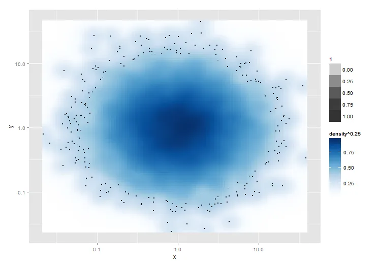
我想要实现类似于smoothScatter函数的效果,但是在ggplot中。除了绘制N个最稀疏的点以外,我已经弄清楚了所有的东西。有人能帮我吗?

library(grDevices)
library(ggplot2)

# Make two new devices
dev.new()
dev1 <- dev.cur()
dev.new()
dev2 <- dev.cur()

# Make some data that needs to be plotted on log scales
mydata <- data.frame(x=exp(rnorm(10000)), y=exp(rnorm(10000)))

# Plot the smoothScatter version
dev.set(dev1)
with(mydata, smoothScatter(log10(y)~log10(x)))

# Plot the ggplot version
dev.set(dev2)
ggplot(mydata) + aes(x=x, y=y) + scale_x_log10() + scale_y_log10() + 
  stat_density2d(geom="tile", aes(fill=..density..^0.25), contour=FALSE) +
  scale_fill_gradientn(colours = colorRampPalette(c("white", blues9))(256))

注意,在基本图形版本中,100个最“稀疏”的点会被绘制在平滑的密度图上。稀疏性是由点坐标处核密度估计值定义的,重要的是,核密度估计是在对数变换(或其他坐标变换)之后计算的。我可以通过添加+ geom_point(size=0.5)来绘制所有点,但我只想绘制稀疏的点。

有没有办法用ggplot实现这一点?这里实际上有两个部分:首先确定经过坐标转换之后的异常值,其次仅绘制这些点。

2个回答

14

这里有一个解决方案!它不能在最稠密的n个点上工作,但会绘制所有密度^0.25小于x的点。

实际上,它会先绘制stat_density2d()层,然后是geom_point(),最后再绘制一次stat_density2d(),利用alpha属性在最后一层中创建一个透明的“空洞”,其中密度^0.25大于(在本例中为)0.4。

显然,运行三个图的性能开销是不可避免的。

# Plot the ggplot version
ggplot(mydata) + aes(x=x, y=y) + scale_x_log10() + scale_y_log10() + 
  stat_density2d(geom="tile", aes(fill=..density..^0.25, alpha=1), contour=FALSE) + 
  geom_point(size=0.5) +
  stat_density2d(geom="tile", aes(fill=..density..^0.25,     alpha=ifelse(..density..^0.25<0.4,0,1)), contour=FALSE) + 
  scale_fill_gradientn(colours = colorRampPalette(c("white", blues9))(256))

在此输入图片描述


3

这里提供一种解决方案,用于计算数据中每个(双变量)观测值的稀疏程度,首先(或在应用您选择的转换之后)。

让我们首先根据从KernSmooth :: bkde2D 计算出的密度来计算每个观测值的最可能密度值,通过 grDevices :::.smoothScatterCalcDensity 方便地调用,以获取适当的binwidth的猜测,如果没有提供。 如果没有提供,则此函数对其他问题也很有用

densVals <- function(x, y = NULL, nbin = 128, bandwidth, range.x) {
  dat <- cbind(x, y)
  # limit dat to strictly finite values
  sel <- is.finite(x) & is.finite(y)
  dat.sel <- dat[sel, ]
  # density map with arbitrary graining along x and y
  map   <- grDevices:::.smoothScatterCalcDensity(dat.sel, nbin, bandwidth)
  map.x <- findInterval(dat.sel[, 1], map$x1)
  map.y <- findInterval(dat.sel[, 2], map$x2)
  # weighted mean of the fitted density map according to how close x and y are
  # to the arbitrary grain of the map
  den <- mapply(function(x, y) weighted.mean(x = c(
    map$fhat[x, y], map$fhat[x + 1, y + 1],
    map$fhat[x + 1, y], map$fhat[x, y + 1]), w = 1 / c(
    map$x1[x] + map$x2[y], map$x1[x + 1] + map$x2[y + 1],
    map$x1[x + 1] + map$x2[y], map$x1[x] + map$x2[y + 1])),
    map.x, map.y)
  # replace missing density estimates with NaN
  res <- rep(NaN, length(sel))
  res[sel] <- den
  res
}

我使用加权平均数作为“真实”密度值的(线性)近似值。可能只需要一个简单的查找就可以。

以下是实际计算过程。

mydata <- data.frame(x = exp(rnorm(10000)), y = exp(rnorm(10000)))
# the transformation applied will affect the local density estimate
mydata$point_density <- densVals(log10(mydata$x), log10(mydata$y))

现在,让我们进行绘图。(基于Troy的答案。)

library(ggplot2)

ggplot(mydata, aes(x = x, y = y)) +
  stat_density2d(geom = "raster", aes(fill = ..density.. ^ 0.25), contour = FALSE) +
  scale_x_log10() + scale_y_log10() +
  scale_fill_gradientn(colours = colorRampPalette(c("white", blues9))(256)) +
  # select only the 100 sparesest points
  geom_point(data = dplyr::top_n(mydata, 100, -point_density), size = .5)

(最终图) -- 抱歉,暂时不能嵌入图片。

不需要过度绘制。 :)


网页内容由stack overflow 提供, 点击上面的
可以查看英文原文,
原文链接