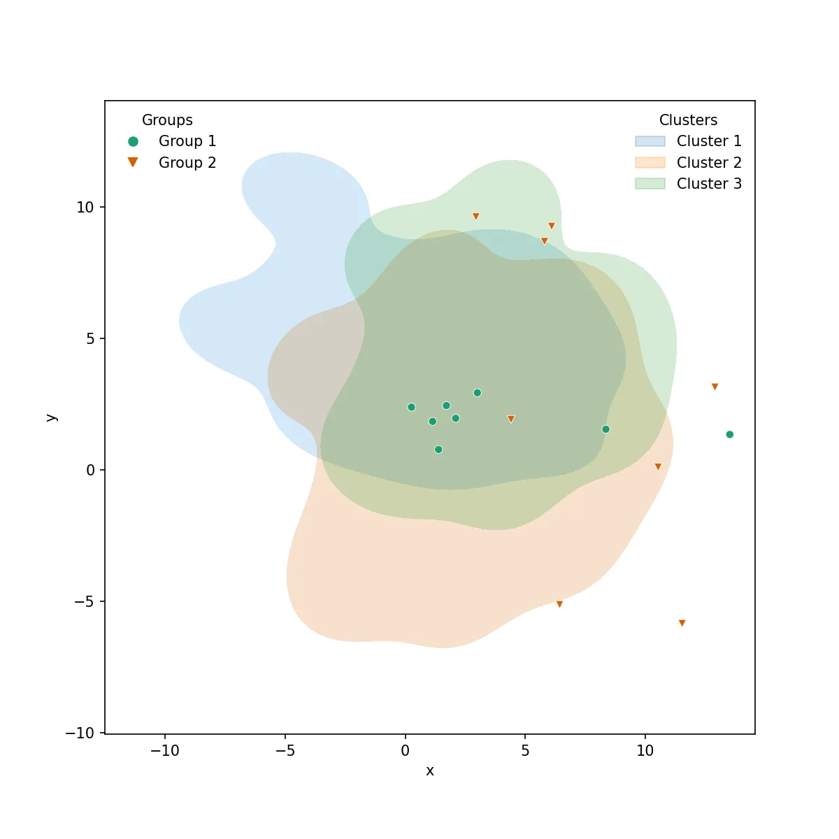
在Seaborn点图中添加图例

51

我正在使用seaborn将多个数据框绘制为点图。同时,我将所有的数据框绘制在同一坐标轴上

我该如何在图中添加图例?

我的代码将每个数据框逐个绘制在同一图形上。

每个数据框具有相同的列。

date        count
2017-01-01  35
2017-01-02  43
2017-01-03  12
2017-01-04  27 

我的代码:

f, ax = plt.subplots(1, 1, figsize=figsize)
x_col='date'
y_col = 'count'
sns.pointplot(ax=ax,x=x_col,y=y_col,data=df_1,color='blue')
sns.pointplot(ax=ax,x=x_col,y=y_col,data=df_2,color='green')
sns.pointplot(ax=ax,x=x_col,y=y_col,data=df_3,color='red')

这个图绘制了3条线在同一张图上,但是缺少图例。 文档 不接受 label 参数。

一个可行的解决方法是创建一个新的数据框架并使用 hue argument

df_1['region'] = 'A'
df_2['region'] = 'B'
df_3['region'] = 'C'
df = pd.concat([df_1,df_2,df_3])
sns.pointplot(ax=ax,x=x_col,y=y_col,data=df,hue='region')

但我想知道是否有一种方法可以为首先将点图逐个添加到图形中,然后再添加图例的代码创建图例。

样本输出:

Seaborn Image


date列的数据类型可以假定为datetime.date - Spandan Brahmbhatt
4个回答

45

我建议不要使用seaborn的pointplot进行绘图,这会使事情变得不必要地复杂。
相反,使用matplotlib的plot_date。这允许设置图表标签,并自动将它们放入一个带有ax.legend()的图例中。

import matplotlib.pyplot as plt
import pandas as pd
import seaborn as sns
import numpy as np

date = pd.date_range("2017-03", freq="M", periods=15)
count = np.random.rand(15,4)
df1 = pd.DataFrame({"date":date, "count" : count[:,0]})
df2 = pd.DataFrame({"date":date, "count" : count[:,1]+0.7})
df3 = pd.DataFrame({"date":date, "count" : count[:,2]+2})

f, ax = plt.subplots(1, 1)
x_col='date'
y_col = 'count'

ax.plot_date(df1.date, df1["count"], color="blue", label="A", linestyle="-")
ax.plot_date(df2.date, df2["count"], color="red", label="B", linestyle="-")
ax.plot_date(df3.date, df3["count"], color="green", label="C", linestyle="-")

ax.legend()

plt.gcf().autofmt_xdate()
plt.show()

在此输入图像描述


如果您仍然有兴趣获得点图的图例,下面是一种方法:

sns.pointplot(ax=ax,x=x_col,y=y_col,data=df1,color='blue')
sns.pointplot(ax=ax,x=x_col,y=y_col,data=df2,color='green')
sns.pointplot(ax=ax,x=x_col,y=y_col,data=df3,color='red')

ax.legend(handles=ax.lines[::len(df1)+1], labels=["A","B","C"])

ax.set_xticklabels([t.get_text().split("T")[0] for t in ax.get_xticklabels()])
plt.gcf().autofmt_xdate()

plt.show()

我同意 @ImportanceOfBeingErnest 的观点,使用 seaborn 会让高级事物变得有些复杂。就个人而言,Tradeoff 是在简单图和美学与复杂性以及文档少的 matplotlib 之间做出选择。我将等待几个小时看是否有人知道如何向 seaborn 图添加图例。如果没有,我认为这个答案是正确的,并将接受它。 - Spandan Brahmbhatt
3
好的,如果你真的对使用点图表感兴趣,我添加了一种获取这些图例的方式。 - ImportanceOfBeingErnest
[::len(df1)+1] 有什么用?据我所知,它复制了 ax.lines。但是为什么要使用 step 参数?你能否在代码示例中添加注释来解释一下? - exhuma
2
@exhuma pointplot会为每个调用创建len(df)条短错误线和一条主要线。使用[::len(df1)+1],您只选择主要线而不选择错误线(它们都具有相同的颜色)。 - JohanC

25

这是一个老问题,但有一个更简单的方法。

sns.pointplot(x=x_col,y=y_col,data=df_1,color='blue')
sns.pointplot(x=x_col,y=y_col,data=df_2,color='green')
sns.pointplot(x=x_col,y=y_col,data=df_3,color='red')
plt.legend(labels=['legendEntry1', 'legendEntry2', 'legendEntry3'])

这样可以让你按顺序添加绘图,而不必担心除定义图例项之外的任何matplotlib垃圾。


15
然而,对于这个解决方案,图例颜色都是“蓝色”,而不是“蓝色”、“绿色”和“红色”。 - S.A.
2
不过当我使用它时就不是这样了! - Adam B
AdamB,我得到了期望的行为。如果您提供seaborn的版本和平台信息,可能会有所帮助,以消除@S.A.指出的一些困惑。就目前而言,这个解决方案是最简单的,因为它有效 ;) - Joseph Wood
1
@JosephWood 你需要接受答案的最后一部分(由Ernest提供),它跳过所有短错误行。因此,ax.legend(handles=ax.lines[::len(df_1)+1], labels=["A","B","C"])。但是,如果你添加 ci=None,就没有误差线,也不需要跳过。在这种情况下,这里的简单解决方案将起作用。 - JohanC

6

我尝试使用Adam B的答案,但对我无效。相反,我找到了以下解决方案来添加点图例。

import matplotlib.patches as mpatches
red_patch = mpatches.Patch(color='#bb3f3f', label='Label1')
black_patch = mpatches.Patch(color='#000000', label='Label2')

在点图中,可以按照之前的答案提到的方式指定颜色。一旦设置了对应于不同数据集的这些补丁(patch),
plt.legend(handles=[red_patch, black_patch])

传说应该出现在点图中。


1
这有点超出原问题,但也基于@PSub对一些更普遍的回应---我知道Matplotlib直接做这些更容易,但Seaborn的许多默认样式选项非常好,所以我想弄清楚如何在一个点图(或其他Seaborn图)中拥有多个图例,而不是从一开始就陷入Matplotlib。

以下是其中一种解决方案:


import numpy as np
import pandas as pd
import seaborn as sns
import matplotlib.pyplot as plt

# We will need to access some of these matplotlib classes directly
from matplotlib.lines import Line2D # For points and lines
from matplotlib.patches import Patch # For KDE and other plots
from matplotlib.legend import Legend

from matplotlib import cm

# Initialise random number generator
rng = np.random.default_rng(seed=42)

# Generate sample of 25 numbers
n = 25
clusters = []

for c in range(0,3):
    
    # Crude way to get different distributions
    # for each cluster
    p = rng.integers(low=1, high=6, size=4)
    
    df = pd.DataFrame({
        'x': rng.normal(p[0], p[1], n),
        'y': rng.normal(p[2], p[3], n),
        'name': f"Cluster {c+1}"
    })
    clusters.append(df)

# Flatten to a single data frame
clusters = pd.concat(clusters)

# Now do the same for data to feed into
# the second (scatter) plot... 
n = 8
points = []

for c in range(0,2):
    
    p = rng.integers(low=1, high=6, size=4)
    
    df = pd.DataFrame({
        'x': rng.normal(p[0], p[1], n),
        'y': rng.normal(p[2], p[3], n),
        'name': f"Group {c+1}"
    })
    points.append(df)

points = pd.concat(points)

# And create the figure
f, ax = plt.subplots(figsize=(8,8))

# The KDE-plot generates a Legend 'as usual'
k = sns.kdeplot(
    data=clusters,
    x='x', y='y',
    hue='name',
    shade=True,
    thresh=0.05,
    n_levels=2,
    alpha=0.2,
    ax=ax,
)

# Notice that we access this legend via the
# axis to turn off the frame, set the title, 
# and adjust the patch alpha level so that
# it closely matches the alpha of the KDE-plot
ax.get_legend().set_frame_on(False)
ax.get_legend().set_title("Clusters")
for lh in ax.get_legend().get_patches(): 
    lh.set_alpha(0.2)

# You would probably want to sort your data 
# frame or set the hue and style order in order
# to ensure consistency for your own application
# but this works for demonstration purposes
groups  = points.name.unique()
markers = ['o', 'v', 's', 'X', 'D', '<', '>']
colors  = cm.get_cmap('Dark2').colors

# Generate the scatterplot: notice that Legend is
# off (otherwise this legend would overwrite the 
# first one) and that we're setting the hue, style,
# markers, and palette using the 'name' parameter 
# from the data frame and the number of groups in 
# the data.
p = sns.scatterplot(
    data=points,
    x="x",
    y="y",
    hue='name',
    style='name',
    markers=markers[:len(groups)],
    palette=colors[:len(groups)],
    legend=False,
    s=30,
    alpha=1.0
)

# Here's the 'magic' -- we use zip to link together 
# the group name, the color, and the marker style. You
# *cannot* retreive the marker style from the scatterplot
# since that information is lost when rendered as a 
# PathCollection (as far as I can tell). Anyway, this allows
# us to loop over each group in the second data frame and 
# generate a 'fake' Line2D plot (with zero elements and no
# line-width in our case) that we can add to the legend. If
# you were overlaying a line plot or a second plot that uses
# patches you'd have to tweak this accordingly.
patches = []
for x in zip(groups, colors[:len(groups)], markers[:len(groups)]):
    patches.append(Line2D([0],[0], linewidth=0.0, linestyle='', 
                   color=x[1], markerfacecolor=x[1],
                   marker=x[2], label=x[0], alpha=1.0))

# And add these patches (with their group labels) to the new
# legend item and place it on the plot.
leg = Legend(ax, patches, labels=groups, 
             loc='upper left', frameon=False, title='Groups')
ax.add_artist(leg);

# Done
plt.show();

这是输出结果: 2 Legends using Seaborn


网页内容由stack overflow 提供, 点击上面的
可以查看英文原文,
原文链接