Seaborn热力图中的离散图例

32
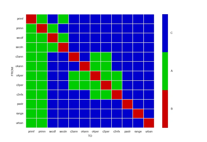
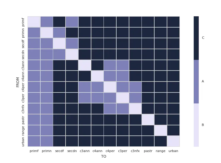
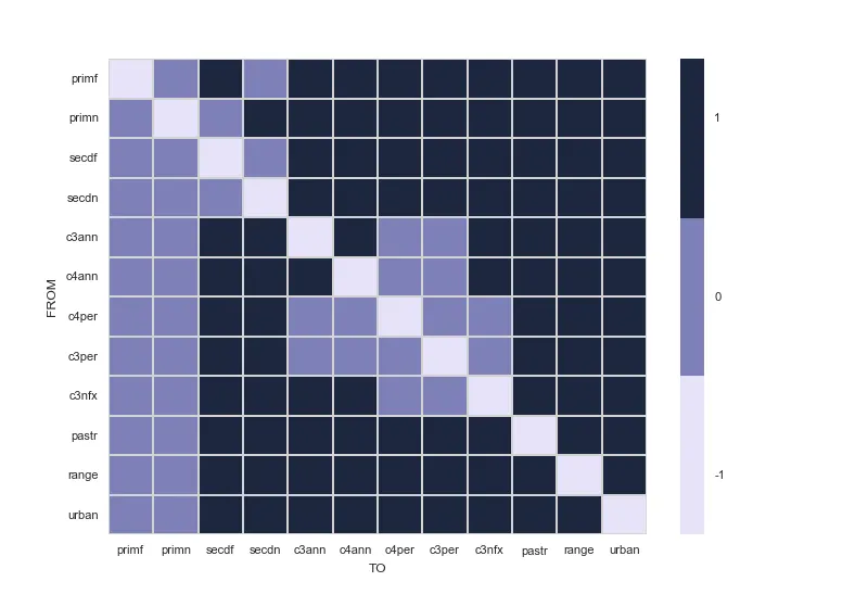
我正在使用此处提供的数据,利用seaborn和pandas构建这个热力图。
代码:
    import pandas
    import seaborn.apionly as sns

    # Read in csv file
    df_trans = pandas.read_csv('LUH2_trans_matrix.csv')

    sns.set(font_scale=0.8)
    cmap = sns.cubehelix_palette(start=2.8, rot=.1, light=0.9, as_cmap=True)
    cmap.set_under('gray')  # 0 values in activity matrix are shown in gray (inactive transitions)
    df_trans = df_trans.set_index(['Unnamed: 0'])
    ax = sns.heatmap(df_trans, cmap=cmap, linewidths=.5, linecolor='lightgray')

    # X - Y axis labels
    ax.set_ylabel('FROM')
    ax.set_xlabel('TO')

    # Rotate tick labels
    locs, labels = plt.xticks()
    plt.setp(labels, rotation=0)
    locs, labels = plt.yticks()
    plt.setp(labels, rotation=0)

    # revert matplotlib params
    sns.reset_orig()

从csv文件中可以看到,它包含3个离散值:0、-1和1。我想要一个离散的图例而不是色条。将0标记为A,-1标记为B,1标记为C。我该怎么做?


请在文本中包含数据样本,这样人们就不太可能下载未知文件到他们的计算机上。 - Merlin
1
谢谢@Merlin,我也添加了文本形式的数据。 - user308827
1
您IP地址为143.198.54.68,由于运营成本限制,当前对于免费用户的使用频率限制为每个IP每72小时10次对话,如需解除限制,请点击左下角设置图标按钮(手机用户先点击左上角菜单按钮)。 - Fabio Lamanna
4个回答

34

在这种情况下,有多种方法可以实现。如果只需要三种颜色,我会自己选择颜色,通过创建LinearSegmentedColormap而不是使用cubehelix_palette来生成它们。如果有足够多的颜色需要使用cubehelix_palette,那么可以使用cbar_kws参数的boundaries选项来定义colormap上的分段。在任何一种方式中,都可以使用set_ticksset_ticklabels手动指定刻度。

以下代码示例演示了如何手动创建LinearSegmentedColormap,并包括有关如何指定边界(如果使用cubehelix_palette)的注释。

import matplotlib.pyplot as plt
import pandas
import seaborn.apionly as sns
from matplotlib.colors import LinearSegmentedColormap

sns.set(font_scale=0.8)
dataFrame = pandas.read_csv('LUH2_trans_matrix.csv').set_index(['Unnamed: 0'])

# For only three colors, it's easier to choose them yourself.
# If you still really want to generate a colormap with cubehelix_palette instead,
# add a cbar_kws={"boundaries": linspace(-1, 1, 4)} to the heatmap invocation
# to have it generate a discrete colorbar instead of a continous one.
myColors = ((0.8, 0.0, 0.0, 1.0), (0.0, 0.8, 0.0, 1.0), (0.0, 0.0, 0.8, 1.0))
cmap = LinearSegmentedColormap.from_list('Custom', myColors, len(myColors))

ax = sns.heatmap(dataFrame, cmap=cmap, linewidths=.5, linecolor='lightgray')

# Manually specify colorbar labelling after it's been generated
colorbar = ax.collections[0].colorbar
colorbar.set_ticks([-0.667, 0, 0.667])
colorbar.set_ticklabels(['B', 'A', 'C'])

# X - Y axis labels
ax.set_ylabel('FROM')
ax.set_xlabel('TO')

# Only y-axis labels need their rotation set, x-axis labels already have a rotation of 0
_, labels = plt.yticks()
plt.setp(labels, rotation=0)

plt.show()

使用红、绿和蓝三种颜色的热力图,带有离散的颜色条


14
这里有一个简单的解决方案,基于其他回答,并且可以推广到3个以上的类别,使用字典(vmap)来定义标签。
import seaborn as sns
import numpy as np

# This just makes some sample 2D data and a corresponding vmap dict with labels for the values in the data
data = [[1, 2, 3], [4, 5, 6], [7, 8, 9]]
vmap = {i: chr(65 + i) for i in range(len(np.ravel(data)))}
n = len(vmap)

print(vmap)

cmap = sns.color_palette("deep", n)
ax = sns.heatmap(data, cmap=cmap)

# Get the colorbar object from the Seaborn heatmap
colorbar = ax.collections[0].colorbar
# The list comprehension calculates the positions to place the labels to be evenly distributed across the colorbar
r = colorbar.vmax - colorbar.vmin
colorbar.set_ticks([colorbar.vmin + 0.5 * r / (n) + r * i / (n) for i in range(n)])
colorbar.set_ticklabels(list(vmap.values()))

在这里输入图片描述


此外,最好明确设置热力图的vmin和vmax,如下所示:ax = sns.heatmap(data, cmap=cmap, vmin=np.amin(data), vmax=np.amax(data)),因为如果数组中不存在最小值或最大值,则颜色条将指示错误的值。 - Vijayraj S

7

我发现如果你使用ListedColormap,在seaborn里创建离散的色条要容易得多。没有必要定义自己的函数,只需要添加几行代码就可以基本上自定义你的坐标轴。

import pandas
import matplotlib.pyplot as plt
import seaborn as sns
from matplotlib.colors import ListedColormap


# Read in csv file
df_trans = pandas.read_csv('LUH2_trans_matrix.csv')

sns.set(font_scale=0.8)
# cmap is now a list of colors
cmap = sns.cubehelix_palette(start=2.8, rot=.1, light=0.9, n_colors=3)
df_trans = df_trans.set_index(['Unnamed: 0'])

# Create two appropriately sized subplots
grid_kws = {'width_ratios': (0.9, 0.03), 'wspace': 0.18}
fig, (ax, cbar_ax) = plt.subplots(1, 2, gridspec_kw=grid_kws)

ax = sns.heatmap(df_trans, ax=ax, cbar_ax=cbar_ax, cmap=ListedColormap(cmap),
                 linewidths=.5, linecolor='lightgray',
                 cbar_kws={'orientation': 'vertical'})

# Customize tick marks and positions
cbar_ax.set_yticklabels(['B', 'A', 'C'])
cbar_ax.yaxis.set_ticks([ 0.16666667, 0.5, 0.83333333])


# X - Y axis labels
ax.set_ylabel('FROM')
ax.set_xlabel('TO')

# Rotate tick labels
locs, labels = plt.xticks()
plt.setp(labels, rotation=0)
locs, labels = plt.yticks()
plt.setp(labels, rotation=0)

enter image description here


3

@Fabio Lamanna提供的链接是一个很好的开始。

从那里开始,您仍然希望在正确的位置设置colorbar标签,并使用与您的数据相对应的刻度标签。

假设您的数据具有等间隔级别,则可以产生一个漂亮的离散colorbar:

基本上,这归结为关闭seaborn colorbar并自己替换离散化的colorbar。

enter image description here

import pandas
import seaborn.apionly as sns
import matplotlib.pyplot as plt
import numpy as np
import matplotlib

def cmap_discretize(cmap, N):
    """Return a discrete colormap from the continuous colormap cmap.

        cmap: colormap instance, eg. cm.jet. 
        N: number of colors.

    Example
        x = resize(arange(100), (5,100))
        djet = cmap_discretize(cm.jet, 5)
        imshow(x, cmap=djet)
    """

    if type(cmap) == str:
        cmap = plt.get_cmap(cmap)
    colors_i = np.concatenate((np.linspace(0, 1., N), (0.,0.,0.,0.)))
    colors_rgba = cmap(colors_i)
    indices = np.linspace(0, 1., N+1)
    cdict = {}
    for ki,key in enumerate(('red','green','blue')):
        cdict[key] = [ (indices[i], colors_rgba[i-1,ki], colors_rgba[i,ki]) for i in xrange(N+1) ]
    # Return colormap object.
    return matplotlib.colors.LinearSegmentedColormap(cmap.name + "_%d"%N, cdict, 1024)

def colorbar_index(ncolors, cmap, data):

    """Put the colorbar labels in the correct positions
        using uique levels of data as tickLabels
    """

    cmap = cmap_discretize(cmap, ncolors)
    mappable = matplotlib.cm.ScalarMappable(cmap=cmap)
    mappable.set_array([])
    mappable.set_clim(-0.5, ncolors+0.5)
    colorbar = plt.colorbar(mappable)
    colorbar.set_ticks(np.linspace(0, ncolors, ncolors))
    colorbar.set_ticklabels(np.unique(data))


# Read in csv file
df_trans = pandas.read_csv('d:/LUH2_trans_matrix.csv')

sns.set(font_scale=0.8)
cmap = sns.cubehelix_palette(n_colors=3,start=2.8, rot=.1, light=0.9, as_cmap=True)
cmap.set_under('gray')  # 0 values in activity matrix are shown in gray (inactive transitions)
df_trans = df_trans.set_index(['Unnamed: 0'])

N = df_trans.max().max() - df_trans.min().min() + 1

f, ax = plt.subplots()
ax = sns.heatmap(df_trans, cmap=cmap, linewidths=.5, linecolor='lightgray',cbar=False)
colorbar_index(ncolors=N, cmap=cmap,data=df_trans)    

# X - Y axis labels
ax.set_ylabel('FROM')
ax.set_xlabel('TO')

# Rotate tick labels
locs, labels = plt.xticks()
plt.setp(labels, rotation=0)
locs, labels = plt.yticks()
plt.setp(labels, rotation=0)

# revert matplotlib params
sns.reset_orig()

这里的“bits and pieces”是从这里这里中回收和调整过来的。


网页内容由stack overflow 提供, 点击上面的
可以查看英文原文,
原文链接