回答:
这篇文章How to define the structure of a sankey diagram using a dataframe?的答案会告诉你,把Sankey数据源强制放入一个数据框中可能会很快导致混乱。最好分离节点和链接,因为它们的构建方式不同。
因此,您的节点数据框应该长这样:
ID Label Color
0 AKJ Education
1 Amazon
2 Flipkart
3 Books
4 Computers & tablets
5 Other
而您的链接数据框应该像这样:
Source  Target      Value      Link Color
0       3          846888      rgba(127, 194, 65, 0.2)
0       4            1045      rgba(127, 194, 65, 0.2)
1       3         1294423      rgba(211, 211, 211, 0.5)
1       4           42165      rgba(211, 211, 211, 0.5)
1       5             415      rgba(211, 211, 211, 0.5)
2       5               1      rgba(253, 227, 212, 1)
如果您使用与plot.ly上的苏格兰公投图表类似的设置,您将能够构建这个图表:
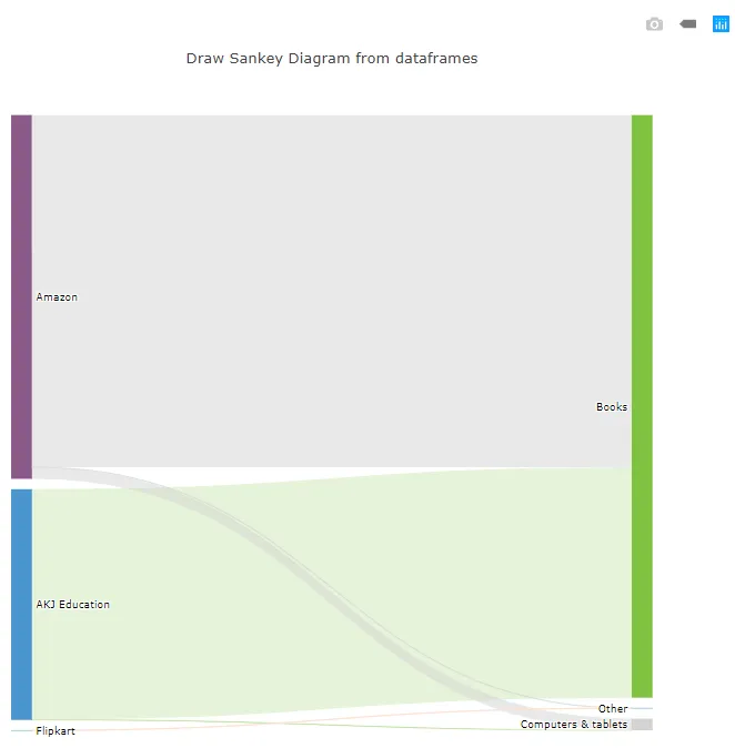
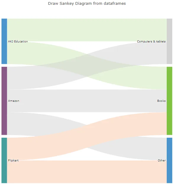
那个特定的图表看起来有点奇怪,因为数字之间差异很大。为了说明问题,我用1替换了所有数字:
以下是整个内容,方便复制并粘贴到Jupyter Notebook中:
import pandas as pd
import numpy as np
import plotly.graph_objs as go
from plotly.offline import download_plotlyjs, init_notebook_mode, plot, iplot
init_notebook_mode(connected=True)
nodes = [['ID', 'Label', 'Color'],
[0,'AKJ Education','#4994CE'],
[1,'Amazon','#8A5988'],
[2,'Flipkart','#449E9E'],
[3,'Books','#7FC241'],
[4,'Computers & tablets','#D3D3D3'],
[5,'Other','#4994CE'],]
links = [['Source','Target','Value','Link Color'],
[0,3,1,'rgba(127, 194, 65, 0.2)'],
[0,4,1,'rgba(127, 194, 65, 0.2)'],
[1,3,1,'rgba(211, 211, 211, 0.5)'],
[1,4,1,'rgba(211, 211, 211, 0.5)'],
[1,5,1,'rgba(211, 211, 211, 0.5)'],
[2,5,1,'rgba(253, 227, 212, 1)'],
[2,3,1,'rgba(253, 227, 212, 1)'],]
nodes_headers = nodes.pop(0)
links_headers = links.pop(0)
df_nodes = pd.DataFrame(nodes, columns = nodes_headers)
df_links = pd.DataFrame(links, columns = links_headers)
data_trace = dict(
type='sankey',
domain = dict(
x = [0,1],
y = [0,1]
),
orientation = "h",
valueformat = ".0f",
node = dict(
pad = 10,
line = dict(
color = "black",
width = 0
),
label = df_nodes['Label'].dropna(axis=0, how='any'),
color = df_nodes['Color']
),
link = dict(
source = df_links['Source'].dropna(axis=0, how='any'),
target = df_links['Target'].dropna(axis=0, how='any'),
value = df_links['Value'].dropna(axis=0, how='any'),
color = df_links['Link Color'].dropna(axis=0, how='any'),
)
)
layout = dict(
title = "Draw Sankey Diagram from dataframes",
height = 772,
font = dict(
size = 10),)
fig = dict(data=[data_trace], layout=layout)
iplot(fig, validate=False)