我使用 Bokeh 在 Python 中创建了一个直方图:
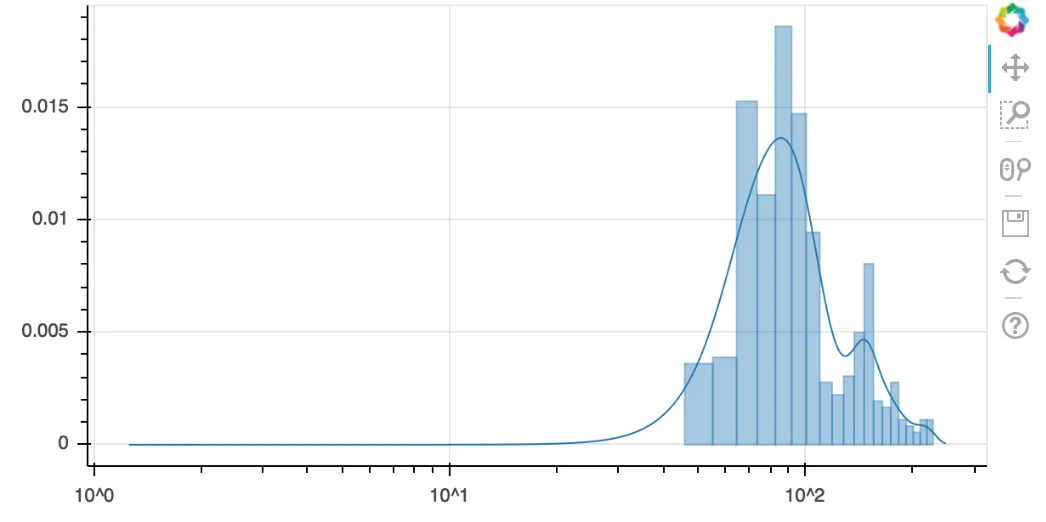
我希望您可以帮忙做出以下调整: - 将X轴刻度更改为log10 - 不再使用条形图,而是使用平滑线(例如分布图)
请问有谁知道如何进行这些调整?
from bokeh.charts import Histogram
from bokeh.sampledata.autompg import autompg as df
#from bokeh.charts import defaults, vplot, hplot, show, output_file

p = Histogram(df, values='hp', color='cyl',
              title="HP Distribution (color grouped by CYL)",
              legend='top_right')
output_notebook()  ## output inline

show(p)
我希望您可以帮忙做出以下调整: - 将X轴刻度更改为log10 - 不再使用条形图,而是使用平滑线(例如分布图)
请问有谁知道如何进行这些调整?