优雅地更改Matplotlib绘图框架的颜色

47
这是对this帖子的后续问题,讨论了轴线、刻度和标签的着色。我希望可以开一个新的、扩展的问题来讨论。
通过
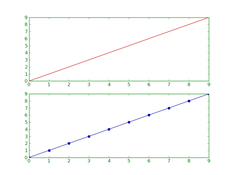
add_subplot添加轴线[ax1, ax2],更改双图的完整框架(刻度和轴线)的颜色需要大量的代码。此代码片段更改了上图的框架颜色。
ax1.spines['bottom'].set_color('green')
ax1.spines['top'].set_color('green')
ax1.spines['left'].set_color('green')
ax1.spines['right'].set_color('green')
for t in ax1.xaxis.get_ticklines(): t.set_color('green')
for t in ax1.yaxis.get_ticklines(): t.set_color('green')
for t in ax2.xaxis.get_ticklines(): t.set_color('green')
for t in ax2.yaxis.get_ticklines(): t.set_color('green')

所以,要更改带有两个y轴的两个图的框架颜色,我需要16行代码... 这就是它的样子:

enter image description here

到目前为止,我挖掘出来的其他方法有:

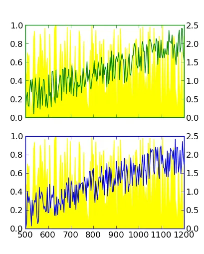
  • matplotlib.rc: discussed here; changes globally, not locally. I want to have some other plots in different colors. Please, no discussions about too many colors in plots... :-)

    matplotlib.rc('axes',edgecolor='green')
    
  • dig out the spines of the axis, then change it: also discussed here; not really elegant, I think.

    for child in ax.get_children():
        if isinstance(child, matplotlib.spines.Spine):
            child.set_color('#dddddd')
    

有没有一种更加"Pythonic"的优雅方式来压缩上面的代码块?

我正在使用在Ubuntu下的Python 2.6.5和matplotlib 0.99.1.1。

4个回答

38

假设您正在使用一个相当新的版本的matplotlib(>= 1.0),也许可以尝试像这样:

import matplotlib.pyplot as plt

# Make the plot...
fig, axes = plt.subplots(nrows=2)
axes[0].plot(range(10), 'r-')
axes[1].plot(range(10), 'bo-')

# Set the borders to a given color...
for ax in axes:
    ax.tick_params(color='green', labelcolor='green')
    for spine in ax.spines.values():
        spine.set_edgecolor('green')

plt.show()

在这里输入图片描述


我运行的是matplotlib 0.99.1.1(呃!)。而且我没有很好地解释双图。我更新了初始问题并添加了一个图形。您展示了另一种轴线着色的可能性,我可以将其添加到我的列表中(如果运行最新版本的m.p.l.)。如果在一个图中用两个y轴着色一个框架,您的方法是否仍然更短? - Boffin

29

重构你上面的代码:

import matplotlib.pyplot as plt

for ax, color in zip([ax1, ax2, ax3, ax4], ['green', 'green', 'blue', 'blue']):
    plt.setp(ax.spines.values(), color=color)
    plt.setp([ax.get_xticklines(), ax.get_yticklines()], color=color)

很棒。请添加双色,我会“接受”您的回答。(像这样: for ax, color in zip([ax1, ax2, ax3, ax4], ['green', 'green', 'blue', 'blue']): plt.setp(ax.spines.values(), color=color); plt.setp([ax.get_xticklines(), ax.get_yticklines()], color=color)) - Boffin
在你的最后一行,我认为你想让 ax1 变成 ax - Joel
是的,@Joel。 :) 我现在已经纠正了它(超过4年后)。 - Christian Alis
3
提供信息,ax.spines.values() 在 Py3 中无法使用,因为 plt.setp 只接受可索引的对象。在 Py3 中,字典的值是可迭代的,但不是可索引的。我正在制作一个 PR 来解决这个问题(我的意思是让 setp 接受任何可迭代的对象,而不是修复 Py3 中的 values())。 - Mad Physicist
@MadPhysicist 谢谢,是的,现在我只是使用 tuple(ax.spines.values()) 通过 plt.setp 更改它们的颜色。如果可以用于任意可迭代对象,那将非常有用。 - Luke Davis

10

也许自问自答有些粗糙,但我想分享一下我目前找到的解决方案。这个版本可以给两个子图添加坐标轴[ax1, ax2][ax3,ax4]分别着不同的颜色。它比我在问题中提到的 16 行代码要短得多。它的灵感来自 Joe Kington 在这里的回答以及在twinx kills tick label color

import matplotlib.pyplot as plt
import numpy as np

# Generate some data
num = 200
x = np.linspace(501, 1200, num)
yellow_data, green_data , blue_data= np.random.random((3,num))
green_data += np.linspace(0, 3, yellow_data.size)/2
blue_data += np.linspace(0, 3, yellow_data.size)/2

fig = plt.figure()
plt.subplot(211) # Upper Plot
ax1 = fig.add_subplot(211)
ax1.fill_between(x, 0, yellow_data, color='yellow')
ax2 = ax1.twinx()
ax2.plot(x, green_data, 'green')
plt.setp(plt.gca(), xticklabels=[])
plt.subplot(212) # Lower Plot
ax3 = fig.add_subplot(212)
ax3.fill_between(x, 0, yellow_data, color='yellow')
ax4 = ax3.twinx()
ax4.plot(x, blue_data, 'blue')

# Start coloring
for ax, color in zip([ax1, ax2, ax3, ax4], ['green', 'green', 'blue', 'blue']):
    for ticks in ax.xaxis.get_ticklines() + ax.yaxis.get_ticklines():
        ticks.set_color(color)
    for pos in ['top', 'bottom', 'right', 'left']:
        ax.spines[pos].set_edgecolor(color)
# End coloring

plt.show()

color_plots

我将这个答案标记为被采纳,因为这是目前我能找到最简洁的解决方案。但是,我仍然乐于接受其他可能更加优雅的解决方法。


3

在最新版本的Matplotlib中,这变得更加简单了。现在,要按照OP想要的样式对刻度、刻度标签和脊柱进行着色:

for ax, color in zip([ax1, ax2, ax3, ax4], ['green', 'green', 'blue', 'blue']):
    ax.tick_params(color=color, labelcolor=color)
    ax.spines[:].set_color(color)

网页内容由stack overflow 提供, 点击上面的
可以查看英文原文,
原文链接