如何计算给定波的频率和时间

5

我有一个速度和时间的数据集。时间步长并不统一,但速度数据是一个波形。如何使用Python的FFT计算速度的主频率?大多数我在网上看到的示例都是针对统一的时间步进的。

我的数据类似于:

7.56683038E+02  2.12072850E-01 
7.56703750E+02  2.13280844E-01
7.56724461E+02  2.14506402E-01
7.56745172E+02  2.15748934E-01
7.56765884E+02  2.17007907E-01
7.56786595E+02  2.18282753E-01

有类似这样的10000行代码。

看到一些在线回复,我写了如下代码,但是它并没有起作用:

#!/usr/bin/env python

import numpy as np
import scipy as sy
import scipy.fftpack as syfp
import pylab as pyl

# Calculate the number of data points
length = 0
for line in open("data.dat"):
    length = length + 1

# Read in data from file here
t = np.zeros(shape=(length,1))
u = np.zeros(shape=(length,1))


length = 0
for line in open("data.dat"):
    columns = line.split(' ')
    t[length] = float(columns[0])
    u[length] = float(columns[1])
    length = length + 1

# Do FFT analysis of array
FFT = sy.fft(u)

# Getting the related frequencies
freqs = syfp.fftfreq(len(u))

# Create subplot windows and show plot
pyl.subplot(211)
pyl.plot(t, u)
pyl.xlabel('Time')
pyl.ylabel('Amplitude')
pyl.subplot(212)
pyl.plot(freqs, sy.log10(FFT), 'x')
pyl.show()

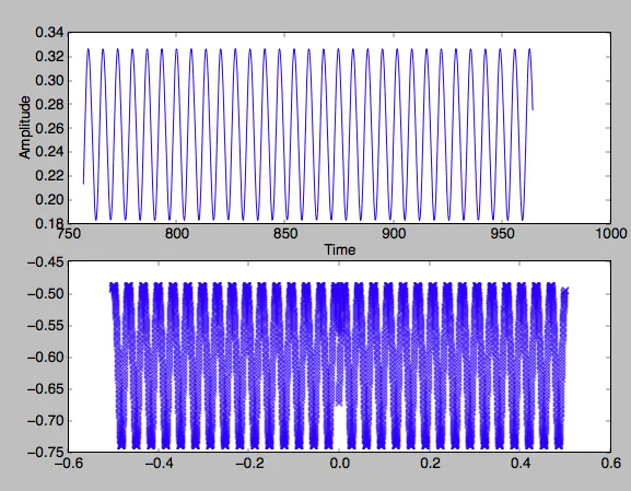
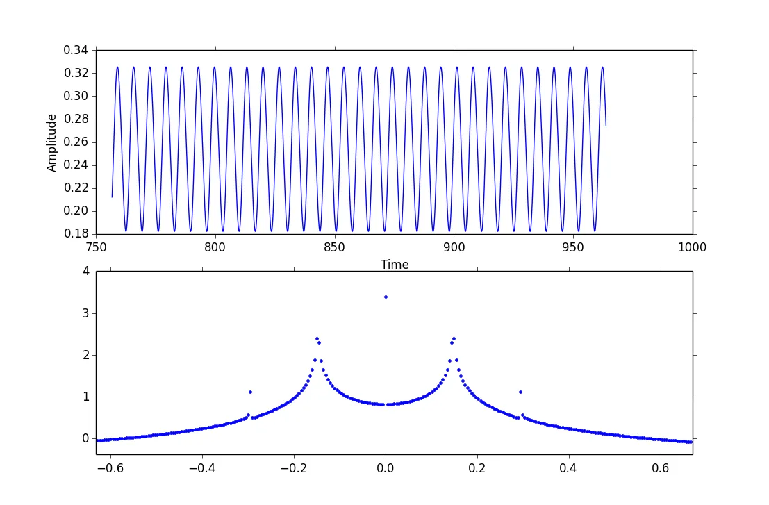
使用这段代码,我得到了类似以下图片的输出。我不确定这个图像表示什么。我原本期望在FFT图表中只看到一个峰值。 python程序的输出结果 使用下面评论中建议的sin函数模拟数据后,我的结果如下图所示: 模拟数据的结果

1
“it is not working”是什么意思?另外,“principal frequency”是什么意思? - tom10
在FFT图中,如果绘制
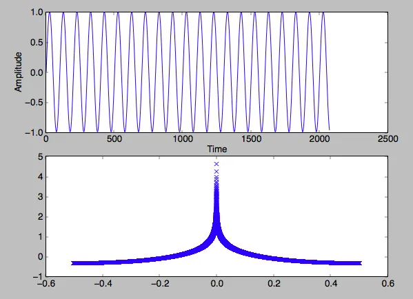
sy.log10(np.abs(FFT))(即注意使用abs),您会看到什么? - tom10
很难用我们没有的数据来诊断结果。不妨尝试一些虚假数据,你知道结果应该是什么样子的:t = 0.02071*np.arange(100000)u = np.sin(2*np.pi*t*.01) - tom10
就我个人而言,我会等待您使用模拟数据进行尝试。这将有助于您,也更容易让我处理。 - tom10
@tom10 我已经在顶部添加了您的模拟数据结果。但我还是没有看到频率。我感觉我在这里缺少一些基本的东西 :) - Pradeep Kumar Jha
显示剩余2条评论
1个回答

7

根据我所见,你的代码基本上没问题,但缺少一些细节。我认为你的问题主要是解释方面的。因此,现在最好查看模拟数据,这里提供了一个示例,其中包含我在评论中建议的模拟数据(并添加了重要行的注释,并使用 ## 进行了更改):

import numpy as np
import scipy as sy
import scipy.fftpack as syfp
import pylab as pyl

dt = 0.02071 
t = dt*np.arange(100000)             ## time at the same spacing of your data
u = np.sin(2*np.pi*t*.01)            ## Note freq=0.01 Hz

# Do FFT analysis of array
FFT = sy.fft(u)

# Getting the related frequencies
freqs = syfp.fftfreq(len(u), dt)     ## added dt, so x-axis is in meaningful units

# Create subplot windows and show plot
pyl.subplot(211)
pyl.plot(t, u)
pyl.xlabel('Time')
pyl.ylabel('Amplitude')
pyl.subplot(212)
pyl.plot(freqs, sy.log10(abs(FFT)), '.')  ## it's important to have the abs here
pyl.xlim(-.05, .05)                       ## zoom into see what's going on at the peak
pyl.show()

输入图像描述

正如您所看到的,有两个峰值,在输入频率(0.01 Hz)的正负两侧,这是预期的。

编辑:
对于为什么这种方法不能用于OP的数据感到困惑,我也看了一下。问题在于样本时间不是均匀的。以下是时间的直方图(下面是代码)。

输入图像描述

因此,样本之间的时间大致平均分配在短时间和长时间之间。我快速查看了一下是否存在模式,但没有发现明显的模式。

要进行FFT,需要均匀间隔的时间样本,因此我进行了插值,得到了以下结果:

输入图像描述

这是合理的(一个DC偏移、一个主峰和一个小谐波)。以下是代码:

data = np.loadtxt("data.dat", usecols=(0,1))
t = data[:,0]
u = data[:,1]

tdiff = t[1:]-t[:-1]
plt.hist(tdiff)

new_times = np.linspace(min(t), max(t), len(t))
new_data = np.interp(new_times, t, u)

t, u = new_times, new_data

FFT = sy.fft(u)
freqs = syfp.fftfreq(len(u), dt)

# then plot as above

谢谢您的回复。看起来代码确实是在做正确的事情。我已经按照您的建议进行了更改。但是,即使在输入我的数据之后,我得到的FFT输出也像一条波浪(如我问题中的第一张图所示)。我的原始数据看起来像一条平滑的波浪,所以我不知道如何解释我的输出。 - Pradeep Kumar Jha
1
@jhaprade:我最终被这个问题困扰了,所以我做了它,并在编辑中包含了解决你的数据问题的答案。 - tom10

网页内容由stack overflow 提供, 点击上面的
可以查看英文原文,
原文链接