使用多个色图的matplotlib热图

3
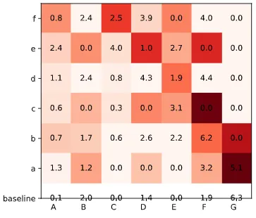
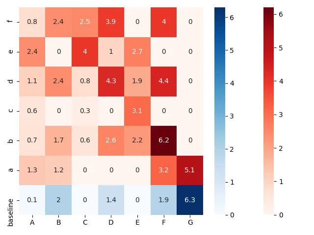
我想创建一个热力图,并为特定的行使用不同的。例如,我希望基准行使用,而其他行使用。到目前为止,我有以下代码。我无法弄清如何实现这一点。
谢谢。
import numpy as np
import matplotlib.pyplot as plt

y_ticks = ["f", "e", "d", "c",
              "b", "a", "baseline"]
x_ticks = ["A", "B", "C",
           "D", "E", "F", "G"]

data = np.array([[0.8, 2.4, 2.5, 3.9, 0.0, 4.0, 0.0],
                    [2.4, 0.0, 4.0, 1.0, 2.7, 0.0, 0.0],
                    [1.1, 2.4, 0.8, 4.3, 1.9, 4.4, 0.0],
                    [0.6, 0.0, 0.3, 0.0, 3.1, 0.0, 0.0],
                    [0.7, 1.7, 0.6, 2.6, 2.2, 6.2, 0.0],
                    [1.3, 1.2, 0.0, 0.0, 0.0, 3.2, 5.1],
                    [0.1, 2.0, 0.0, 1.4, 0.0, 1.9, 6.3]])

data_1 = np.delete(data, (1,2,3,4,5,6), axis=0)
data_2 = np.delete(data, (0), axis=0)


fig, ax = plt.subplots()

im_1 = ax.imshow(data_1, cmap='Blues')
im_2 = ax.imshow(data_2, cmap='Reds')
im = np.vstack((im_1, im_2))


ax.set_xticks(np.arange(len(x_ticks)))
ax.set_yticks(np.arange(len(y_ticks)))

ax.set_xticklabels(x_ticks)
ax.set_yticklabels(y_ticks)


plt.setp(ax.get_xticklabels(), ha="right", rotation_mode="anchor")

# Loop over data dimensions and create text annotations.
for i in range(len(y_ticks)):
    for j in range(len(x_ticks)):
        text = ax.text(j, i, data[i, j], ha="center", va="center")

fig.tight_layout()
plt.show()

enter image description here

1个回答

4

此答案所述,您可以分割矩阵并屏蔽不需要的部分:

import numpy as np
import matplotlib.pyplot as plt
import seaborn as sns

y_ticks = ["f", "e", "d", "c", "b", "a", "baseline"]
x_ticks = ["A", "B", "C", "D", "E", "F", "G"]

data = np.array([[0.8, 2.4, 2.5, 3.9, 0.0, 4.0, 0.0],
                    [2.4, 0.0, 4.0, 1.0, 2.7, 0.0, 0.0],
                    [1.1, 2.4, 0.8, 4.3, 1.9, 4.4, 0.0],
                    [0.6, 0.0, 0.3, 0.0, 3.1, 0.0, 0.0],
                    [0.7, 1.7, 0.6, 2.6, 2.2, 6.2, 0.0],
                    [1.3, 1.2, 0.0, 0.0, 0.0, 3.2, 5.1],
                    [0.1, 2.0, 0.0, 1.4, 0.0, 1.9, 6.3]])

data_1 = data.copy()
data_1[6, :] = float('nan')

data_2 = data.copy()
data_2[:6, :] = float('nan')


fig, ax = plt.subplots()

sns.heatmap(ax = ax, data = data_1, annot = True, cmap = 'Reds')
sns.heatmap(ax = ax, data = data_2, annot = True, cmap = 'Blues')

ax.set_xticklabels(x_ticks)
ax.set_yticklabels(y_ticks)

fig.tight_layout()
plt.show()

enter image description here


将相同的概念应用于您的代码,而不使用 seaborn.heatmap

import numpy as np
import matplotlib.pyplot as plt

y_ticks = ["f", "e", "d", "c", "b", "a", "baseline"]
x_ticks = ["A", "B", "C", "D", "E", "F", "G"]

data = np.array([[0.8, 2.4, 2.5, 3.9, 0.0, 4.0, 0.0],
                    [2.4, 0.0, 4.0, 1.0, 2.7, 0.0, 0.0],
                    [1.1, 2.4, 0.8, 4.3, 1.9, 4.4, 0.0],
                    [0.6, 0.0, 0.3, 0.0, 3.1, 0.0, 0.0],
                    [0.7, 1.7, 0.6, 2.6, 2.2, 6.2, 0.0],
                    [1.3, 1.2, 0.0, 0.0, 0.0, 3.2, 5.1],
                    [0.1, 2.0, 0.0, 1.4, 0.0, 1.9, 6.3]])

data_1 = data.copy()
data_1[6, :] = float('nan')

data_2 = data.copy()
data_2[:6, :] = float('nan')


fig, ax = plt.subplots()

im_1 = ax.imshow(data_1, cmap='Reds')
im_2 = ax.imshow(data_2, cmap='Blues')
im = np.vstack((im_1, im_2))


ax.set_xticks(np.arange(len(x_ticks)))
ax.set_yticks(np.arange(len(y_ticks)))

ax.set_xticklabels(x_ticks)
ax.set_yticklabels(y_ticks)


plt.setp(ax.get_xticklabels(), ha="right", rotation_mode="anchor")

# Loop over data dimensions and create text annotations.
for i in range(len(y_ticks)):
    for j in range(len(x_ticks)):
        text = ax.text(j, i, data[i, j], ha="center", va="center")

fig.tight_layout()
plt.show()

enter image description here


网页内容由stack overflow 提供, 点击上面的
可以查看英文原文,
原文链接