非线性色图,Matplotlib。

3

是否有任何颜色映射或简单的方法可以将matplotlib颜色映射转换为在0.5附近提供更大颜色范围和极端位置提供较小颜色范围的方式?我正在创建一堆子图,其中一个具有大约10倍于其他图的颜色值,因此它的值占主导地位,其余绘图都看起来相同。举个简单例子,假设我们有:

import numpy as np
import matplotlib.pyplot as plt

x = np.linspace(1,10,10)
y = np.linspace(1,10,10)

t1 = np.random.normal(2,0.3,10)
t2 = np.random.normal(9,0.01,10)
t2_max = max(t2)

plt.figure(figsize=(22.0, 15.50))

p = plt.subplot(1,2,1)
colors = plt.cm.Accent(t1/t2_max)
p.scatter(x, y, edgecolors=colors, s=15, linewidths=4)

p = plt.subplot(1,2,2)
colors = plt.cm.Accent(t2/t2_max)
p.scatter(x, y, edgecolors=colors, s=15, linewidths=4)

plt.subplots_adjust(left=0.2)
cbar_ax = plt.axes([0.10, 0.15, 0.05, 0.7])
sm = plt.cm.ScalarMappable(cmap=plt.cm.Accent, norm=plt.Normalize(vmin=0, vmax=t2_max))
sm._A = []
cbar = plt.colorbar(sm,cax=cbar_ax)

plt.show()

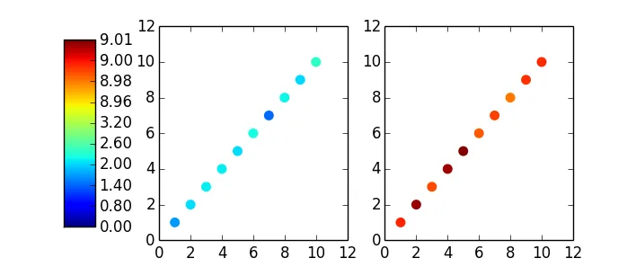
t1的变化比t2更大,但由于t2的值很高,因此无法看到变化。我想要一张地图,在不改变数据本身的情况下,提供围绕t1均值更大的颜色渐变。我已经在这里找到了一个解决方案http://protracted-matter.blogspot.co.nz/2012/08/nonlinear-colormap-in-matplotlib.html,但不能在我的散点图中工作。
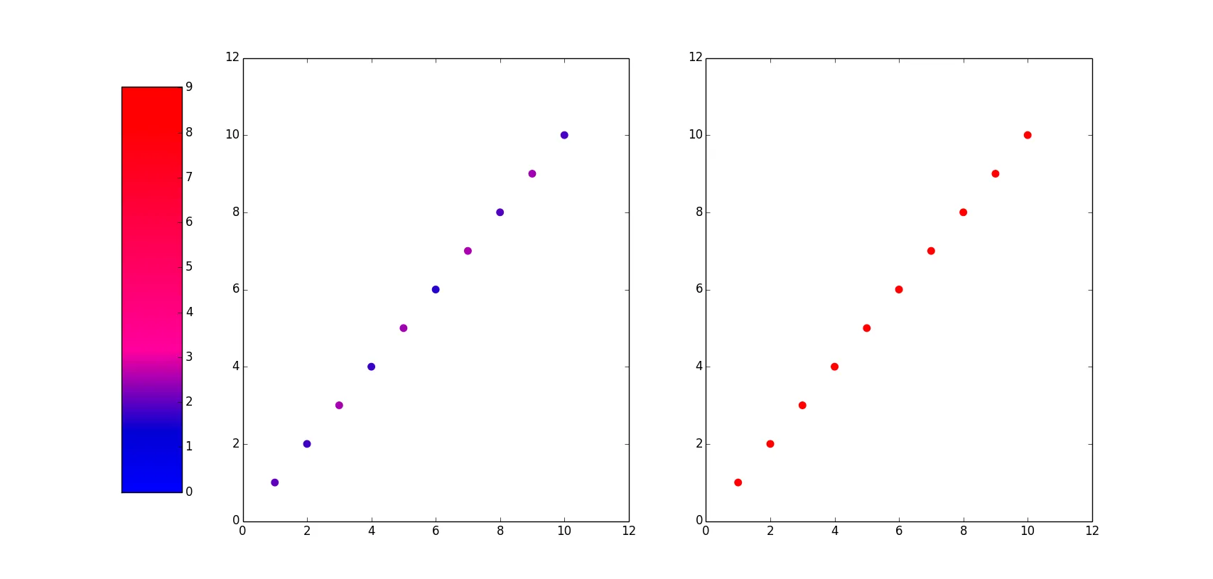
编辑:从下面的答案可以看出,该类可以修改以接受负数,并修复边界。
import numpy as np
import matplotlib.pyplot as plt

x = y = np.linspace(1, 10, 10)

t1mean, t2mean = -6, 9
sigma1, sigma2 = .3, .01
t1 = np.random.normal(t1mean, sigma1, 10)
t2 = np.random.normal(t2mean, sigma2, 10)

class nlcmap(object):
    def __init__(self, cmap, levels):
        self.cmap = cmap
        self.N = cmap.N
        self.monochrome = self.cmap.monochrome
        self.levels = np.asarray(levels, dtype='float64')
        self._x = self.levels
        self.levmax = self.levels.max()
        self.levmin = self.levels.min()
        self.transformed_levels = np.linspace(self.levmin, self.levmax,
             len(self.levels))

    def __call__(self, xi, alpha=1.0, **kw):
        yi = np.interp(xi, self._x, self.transformed_levels)
        return self.cmap(yi / (self.levmax-self.levmin)+0.5, alpha)

tmax = 10
tmin = -10
#the choice of the levels depends on the data:
levels = np.concatenate((
    [tmin, tmax],
    np.linspace(t1mean - 2 * sigma1, t1mean + 2 * sigma1, 5),
    np.linspace(t2mean - 2 * sigma2, t2mean + 2 * sigma2, 5),
    ))
levels = levels[levels <= tmax]
levels.sort()
print levels
cmap_nonlin = nlcmap(plt.cm.jet, levels)

fig, (ax1, ax2) = plt.subplots(1, 2)

ax1.scatter(x, y, edgecolors=cmap_nonlin(t1), s=15, linewidths=4)
ax2.scatter(x, y, edgecolors=cmap_nonlin(t2), s=15, linewidths=4)

fig.subplots_adjust(left=.25)
cbar_ax = fig.add_axes([0.10, 0.15, 0.05, 0.7])

#for the colorbar we map the original colormap, not the nonlinear one:
sm = plt.cm.ScalarMappable(cmap=plt.cm.jet, 
                norm=plt.Normalize(vmin=tmin, vmax=tmax))
sm._A = []

cbar = fig.colorbar(sm, cax=cbar_ax)
#here we are relabel the linear colorbar ticks to match the nonlinear ticks
cbar.set_ticks(cmap_nonlin.transformed_levels)
cbar.set_ticklabels(["%.2f" % lev for lev in levels])

plt.show()

1
你尝试过使用 norm=colors.LogNorm 吗? - askewchan
我有代码,但无法让它正常工作。说实话,我总是在颜色映射方面遇到困难。您能否修改上面的示例以展示其工作原理? - Nick
2个回答

5
您提供的链接提供了一种非常好的颜色映射解决方案。我进行了一些编辑,但它包含了所有必要的内容。您需要为非线性颜色映射选择一些合理的级别。我使用两个范围,以平均值为中心,在样本的标准差+- 4之间。通过将其更改为其他数字,您可以获得围绕两个平均值的颜色的不同局部梯度。

对于色条,您可以:

  • 保留颜色的非线性间隔,并使用线性间隔的标签
  • 使用线性间隔的颜色和非线性间隔的标签。

第二种方法在查看数据时具有更高的分辨率,外观更加美观,下面是实现方法:

import numpy as np
import matplotlib.pyplot as plt

x = y = np.linspace(1, 10, 10)

t1mean, t2mean = 2, 9
sigma1, sigma2 = .3, .01
t1 = np.random.normal(t1mean, sigma1, 10)
t2 = np.random.normal(t2mean, sigma2, 10)

class nlcmap(object):
    def __init__(self, cmap, levels):
        self.cmap = cmap
        self.N = cmap.N
        self.monochrome = self.cmap.monochrome
        self.levels = np.asarray(levels, dtype='float64')
        self._x = self.levels
        self.levmax = self.levels.max()
        self.transformed_levels = np.linspace(0.0, self.levmax,
             len(self.levels))

    def __call__(self, xi, alpha=1.0, **kw):
        yi = np.interp(xi, self._x, self.transformed_levels)
        return self.cmap(yi / self.levmax, alpha)

tmax = max(t1.max(), t2.max())
#the choice of the levels depends on the data:
levels = np.concatenate((
    [0, tmax],
    np.linspace(t1mean - 4 * sigma1, t1mean + 4 * sigma1, 5),
    np.linspace(t2mean - 4 * sigma2, t2mean + 4 * sigma2, 5),
    ))

levels = levels[levels <= tmax]
levels.sort()

cmap_nonlin = nlcmap(plt.cm.jet, levels)

fig, (ax1, ax2) = plt.subplots(1, 2)

ax1.scatter(x, y, edgecolors=cmap_nonlin(t1), s=15, linewidths=4)
ax2.scatter(x, y, edgecolors=cmap_nonlin(t2), s=15, linewidths=4)

fig.subplots_adjust(left=.25)
cbar_ax = fig.add_axes([0.10, 0.15, 0.05, 0.7])

#for the colorbar we map the original colormap, not the nonlinear one:
sm = plt.cm.ScalarMappable(cmap=plt.cm.jet, 
                norm=plt.Normalize(vmin=0, vmax=tmax))
sm._A = []

cbar = fig.colorbar(sm, cax=cbar_ax)
#here we are relabel the linear colorbar ticks to match the nonlinear ticks
cbar.set_ticks(cmap_nonlin.transformed_levels)
cbar.set_ticklabels(["%.2f" % lev for lev in levels])

plt.show()

在结果中,请注意色条的刻度并不是等距的:

enter image description here


谢谢,那个很好用。但我还是不太明白 cmap 是怎么工作的,如果有人能详细解释一下这个类是如何工作的,那就太好了。请参见编辑后的版本,它可以处理负数和固定边界。 - Nick
好的,但您需要具体说明。您能告诉我哪一行难以理解,以及不清楚的是什么吗? - gg349

1
你可以使用线性分段颜色映射
使用此方法,你需要在一个字典内设置一个颜色查找表,例如下面的'cdict'。
cdict = {'red':   [(0.0,  0.0, 0.0),
                   (0.15,  0.01, 0.01),
                   (0.35,  1.0, 1.0),
                   (1.0,  1.0, 1.0)],

         'green': [(0.0,  0.0, 0.0),
                   (1.0,  0.0, 1.0)],

         'blue':  [(0.0,  0.0, 1.0),
                   (0.9,  0.01, 0.01),
                   (1.0,  0.0, 1.0)]}

这显示了值之间的转换。我已将红色设置为在t1/t2_max(0.15到0.35)的值周围变化很大,蓝色设置为在t2/t2_max(0.9到1.0)的值周围变化很大。绿色什么也没做。建议阅读文档以了解其工作原理。(请注意,这可以自动化以自动围绕您的值变化)。然后我调整了您的代码以显示图形:
import matplotlib.colors as col

my_cmap = col.LinearSegmentedColormap('my_colormap', cdict)

plt.figure(figsize=(22.0, 15.50))

p = plt.subplot(1,2,1)
colors = my_cmap(t1/t2_max)

p.scatter(x, y, edgecolors=colors, s=15, linewidths=4)

p = plt.subplot(1,2,2)
colors = my_cmap(t2/t2_max)

p.scatter(x, y, edgecolors=colors, s=15, linewidths=4)

plt.subplots_adjust(left=0.2)
cbar_ax = plt.axes([0.10, 0.15, 0.05, 0.7])
sm = plt.cm.ScalarMappable(cmap=my_cmap, norm=plt.Normalize(vmin=0, vmax=t2_max))
sm._A = []
cbar = plt.colorbar(sm,cax=cbar_ax)

plt.show()

enter image description here


网页内容由stack overflow 提供, 点击上面的
可以查看英文原文,
原文链接