如何在散点图中绘制线条

10
我无法相信这是如此复杂,但我已经尝试了一段时间并进行了谷歌搜索。
我只想分析我的散点图,并添加一些图形特征。首先,我想简单地添加一条线。
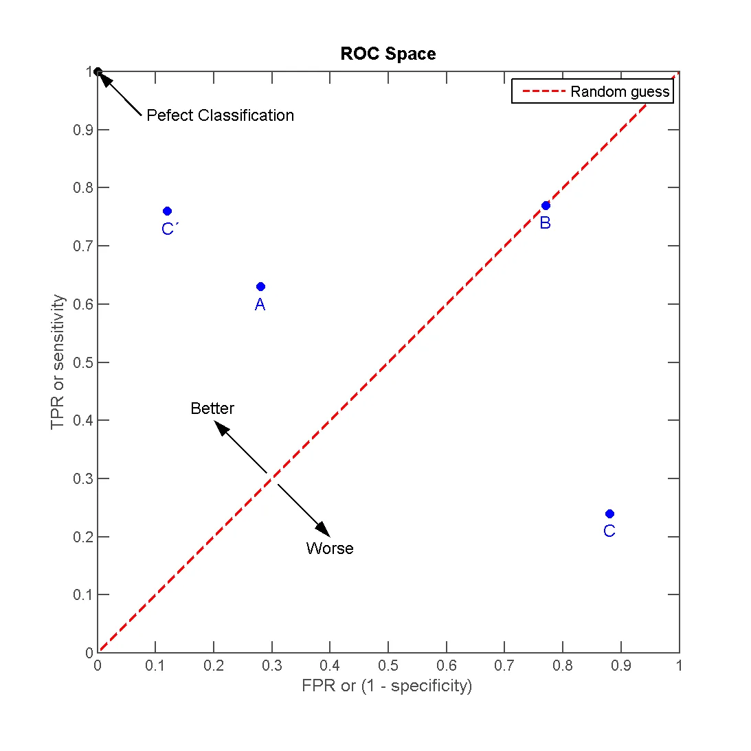
所以,我有几个(4)点,我想在它上面添加一条线,就像这个图中一样(来源:http://en.wikipedia.org/wiki/File:ROC_space-2.png)。

enter image description here

现在,这样做是不行的。坦白地说,matplotlib 的文档、示例和图库组合以及内容都不是一个好的信息来源。
我的代码基于画廊中的一个简单散点图:
# definitions for the axes
left, width = 0.1, 0.85 #0.65
bottom, height = 0.1, 0.85 #0.65
bottom_h = left_h = left+width+0.02

rect_scatter = [left, bottom, width, height]

# start with a rectangular Figure
fig = plt.figure(1, figsize=(8,8))
axScatter = plt.axes(rect_scatter)

# the scatter plot:
p1 = axScatter.scatter(x[0], y[0], c='blue', s = 70)
p2 = axScatter.scatter(x[1], y[1], c='green', s = 70)
p3 = axScatter.scatter(x[2], y[2], c='red', s = 70)
p4 = axScatter.scatter(x[3], y[3], c='yellow', s = 70)
p5 = axScatter.plot([1,2,3], "r--")

plt.legend([p1, p2, p3, p4, p5], [names[0], names[1], names[2], names[3], "Random guess"], loc = 2)

# now determine nice limits by hand:
binwidth = 0.25
xymax = np.max( [np.max(np.fabs(x)), np.max(np.fabs(y))] )
lim = ( int(xymax/binwidth) + 1) * binwidth

axScatter.set_xlim( (-lim, lim) )
axScatter.set_ylim( (-lim, lim) )

xText = axScatter.set_xlabel('FPR / Specificity')
yText = axScatter.set_ylabel('TPR / Sensitivity')

bins = np.arange(-lim, lim + binwidth, binwidth)
plt.show()

除了p5是一条线之外,一切正常。

现在这应该如何工作呢?这里有什么好的做法吗?


1
除了图例中的行仅未出现外,该行对我来说画得很好。这是你的意思吗? 我使用了names = ['1', '2', '3', '4'],x = [1,2,3,4,5],y = [1,2,3,4,5]并粘贴了你的代码。 - abdulhaq-e
谢谢!我的点坐标范围完全偏离了。 - ruffy
2个回答

19

plot接受y值并使用x作为索引数组0..N-1,或者根据文档中的描述使用x和y值。因此,您可以这样使用:

p5 = axScatter.plot((0, 1), "r--")

在您的代码中绘制线条。

然而,您正在寻求“最佳实践”的建议。 以下代码(希望)展示了一些“最佳实践”以及matplotlib创建您在问题中提到的图形的能力。

import numpy as np
import matplotlib.pyplot as plt 

# create some data
xy = np.random.rand(4, 2)
xy_line = (0, 1)

# set up figure and ax
fig, ax = plt.subplots(figsize=(8,8))

# create the scatter plots
ax.scatter(xy[:, 0], xy[:, 1], c='blue')
for point, name in zip(xy, 'ABCD'):
    ax.annotate(name, xy=point, xytext=(0, -10), textcoords='offset points',
                color='blue', ha='center', va='center')
ax.scatter([0], [1], c='black', s=60)
ax.annotate('Perfect Classification', xy=(0, 1), xytext=(0.1, 0.9),
            arrowprops=dict(arrowstyle='->'))

# create the line
ax.plot(xy_line, 'r--', label='Random guess')
ax.annotate('Better', xy=(0.3, 0.3), xytext=(0.2, 0.4),
            arrowprops=dict(arrowstyle='<-'), ha='center', va='center')
ax.annotate('Worse', xy=(0.3, 0.3), xytext=(0.4, 0.2),
            arrowprops=dict(arrowstyle='<-'), ha='center', va='center')
# add labels, legend and make it nicer
ax.set_xlabel('FPR or (1 - specificity)')
ax.set_ylabel('TPR or sensitivity')
ax.set_title('ROC Space')
ax.set_xlim(0, 1)
ax.set_ylim(0, 1)
ax.legend()
plt.tight_layout()
plt.savefig('scatter_line.png', dpi=80)

scatter_with_line.png

顺便提一下:我认为目前matplotlib的文档非常有用。


当我运行你的代码时,我收到警告:tight_layout: falling back to Agg renderer。我正在运行Mac OS。我需要安装Python包才能使其工作吗? - ruffy
我看了一下代码:这个函数发出了警告,所以可能在检测您的后端时出现了问题。我不太了解在Mac OS下matplotlib的问题(只知道有一些问题)。也许你应该把这个问题作为另一个问题发布。 - bmu

4

第5行代码应该是:

p5 = axScatter.plot([1,2,3],[1,2,3], "r--")

参数1是x值的列表,参数2是y值的列表。

如果你只想要一条直线,你只需要提供线的两个端点的值。


好的。我错了。这是我的错,因为我没有正确理解行用。 - ruffy
仅强调我在这个答案中错过的一个细节:如果你想在(x1,y1)和(x2,y2)之间绘制一条线,则x是第一个参数,y是第二个参数,即plt.plot([x1, x2], [y1, y2])。这不是 plt.plot((x1, y1), (x2, y2)) - Galen Long

网页内容由stack overflow 提供, 点击上面的
可以查看英文原文,
原文链接