R中可用于Tufte箱线图的函数有哪些?

18

我有一些数据,将它们分成了足够多的组,标准箱形图看起来非常拥挤。 Tufte 提出了自己的箱形图,基本上是删除全部或一半的框,像这样:

tufte boxplots

一些示例数据:

cw <- transform(ChickWeight, 
  Time = cut(ChickWeight$Time,4)
  )
cw$Chick <- as.factor( sample(LETTERS[seq(3)], nrow(cw), replace=TRUE) )
levels(cw$Diet) <- c("Low Fat","Hi Fat","Low Prot.","Hi Prot.")

我想要一个针对每个Diet * Time * Chick组合的体重箱线图。

几年前我遇到了这个问题,使用网格图形拼凑出了一个解决方案,稍后我会发布它。但是在解决这个新问题(和类似问题)时,我想知道是否有一种固定的方法来处理它们,而不是修复我的拼凑示例。

顺便说一句,这些似乎是Tufte创作中最不受欢迎的,但我真的很喜欢它们,因为它们可以密集地显示大量分组的分布模式,如果在ggplot2或lattice中有好的函数支持它们,我会更多地使用它们。


7
你可能需要先阅读《W. A. Stock and J. T. Behrens. Box, line, and midgap plots: Effects of display characteristics on the accuracy and bias of estimates of whisker length. Journal of Educational Statistics, 16(1): 1–20, 1991》这篇论文,它发现Tukey的箱线图变形版本不如经典版本准确。 - hadley
1
@hadley:好的,谢谢你提供的参考。我猜你是指Tufte的版本,因为Tukey的是经典形式? - Ari B. Friedman
啊,是的,我的意思是 Tufte 的变体较差。希望你能编辑评论。 - hadley
@hadley:非常棒的论文。再次感谢您的推荐。不过,我要指出,他们的“线图”(显示结果几乎与经典箱线图相同)更类似于第二个 Tufte 设计,这是我一直喜欢的设计。还有一个关于外部有效性的问题,因为本科生几乎肯定看过比 Tufte 箱线图更多的 Tukey 箱线图。但我会适当谨慎地使用它们,而不是随意使用它们 :-)。 - Ari B. Friedman
5个回答

19

这是一种不使用任何程序包的解决方案,只需操纵箱线图pars绘图参数。我的建议与@DWin最接近,但去掉了颜色和轴线,只使用几行代码。@gsk3和@Ramnath的两个建议都非常好,并且比我的更先进,但是如果我可以评论-它们没有解决Tufte的主要哲学。如果我们摆脱灰色背景、白色“囚犯栏杆”和不必要的颜色,以上所有解决方案都会在清晰度、简洁性和正确的数据墨水平衡方面得到改善。

应该归功于PerformanceAnalytics的创建者,他们包括受Tufte工作启发的可爱的chart.Boxplot包装器。我只是提取了函数的一些元素,使其更加简单。只需从@gsk3上面附加'cw'样本数据即可。

attach(cw)
par(mfrow=c(1,3))
boxplot(weight~Time, horizontal = F, main = "", xlab="Time", ylab="Weight", 
        pars = list(boxcol = "white", medlty = "blank", medpch=16, medcex = 1.3, 
        whisklty = c(1, 1), staplelty = "blank", outcex = 0.5), axes = FALSE)
axis(1,at=1:4,label=c(1:4))
axis(2)
boxplot(weight~Chick, horizontal = F, main = "", xlab = "Chick", 
        ylab = "", pars = list(boxcol = "white", medlty = "blank", medpch=16, 
        medcex = 1.3, whisklty = c(1, 1), staplelty = "blank", outcex = 0.5), 
        axes = FALSE)
axis(1,at=1:3,label=c("A","B","C"))
boxplot(weight~Diet, horizontal = F, main = "", xlab = "Diet", ylab = "", 
        pars = list(boxcol = "white", medlty = "blank", medpch=16, medcex = 1.3, 
        whisklty = c(1, 1), staplelty = "blank", outcex = 0.5), axes = FALSE)
axis(1,at=1:4,label=c("LoFat","HiFat","LoProt","HiProt"))

enter image description here


干得好。是的,肯定比其他人更像 Tufte 风格。 - Aaron left Stack Overflow

15

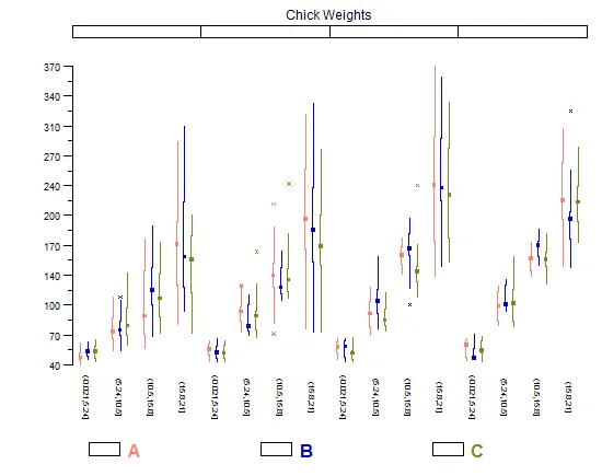
您显然只需要一个垂直版本,因此我采用了panel.bwplot代码,剥离了所有非必要的部分,如方框和帽子,并在参数中设置了horizontal=FALSE,并创建了一个panel.tuftebxp函数。还将点的cex设置为默认值的一半。仍有许多选项可以根据您的喜好进行调整。 "Time"的“numeric”因子名称看起来很潦草,但我认为“概念证明”是清晰的,您可以清理重要的内容:

panel.tuftebxp <- 
function (x, y, box.ratio = 1, box.width = box.ratio/(1 + box.ratio), horizontal=FALSE,
    pch = box.dot$pch, col = box.dot$col, 
    alpha = box.dot$alpha, cex = box.dot$cex, font = box.dot$font, 
    fontfamily = box.dot$fontfamily, fontface = box.dot$fontface, 
    fill = box.rectangle$fill, varwidth = FALSE, notch = FALSE, 
    notch.frac = 0.5, ..., levels.fos = if (horizontal) sort(unique(y)) else sort(unique(x)), 
    stats = boxplot.stats, coef = 1.5, do.out = TRUE, identifier = "bwplot") 
{
    if (all(is.na(x) | is.na(y))) 
        return()
    x <- as.numeric(x)
    y <- as.numeric(y)
    box.dot <- trellis.par.get("box.dot")
    box.rectangle <- trellis.par.get("box.rectangle")
    box.umbrella <- trellis.par.get("box.umbrella")
    plot.symbol <- trellis.par.get("plot.symbol")
    fontsize.points <- trellis.par.get("fontsize")$points
    cur.limits <- current.panel.limits()
    xscale <- cur.limits$xlim
    yscale <- cur.limits$ylim
    if (!notch) 
        notch.frac <- 0
    #removed horizontal code
     blist <- tapply(y, factor(x, levels = levels.fos), stats, 
            coef = coef, do.out = do.out)
        blist.stats <- t(sapply(blist, "[[", "stats"))
        blist.out <- lapply(blist, "[[", "out")
        blist.height <- box.width
        if (varwidth) {
            maxn <- max(table(x))
            blist.n <- sapply(blist, "[[", "n")
            blist.height <- sqrt(blist.n/maxn) * blist.height
        }
        blist.conf <- if (notch) 
            sapply(blist, "[[", "conf")
        else t(blist.stats[, c(2, 4), drop = FALSE])
        ybnd <- cbind(blist.stats[, 3], blist.conf[2, ], blist.stats[, 
            4], blist.stats[, 4], blist.conf[2, ], blist.stats[, 
            3], blist.conf[1, ], blist.stats[, 2], blist.stats[, 
            2], blist.conf[1, ], blist.stats[, 3])
        xleft <- levels.fos - blist.height/2
        xright <- levels.fos + blist.height/2
        xbnd <- cbind(xleft + notch.frac * blist.height/2, xleft, 
            xleft, xright, xright, xright - notch.frac * blist.height/2, 
            xright, xright, xleft, xleft, xleft + notch.frac * 
                blist.height/2)
        xs <- cbind(xbnd, NA_real_)
        ys <- cbind(ybnd, NA_real_)
        panel.segments(rep(levels.fos, 2), c(blist.stats[, 2], 
            blist.stats[, 4]), rep(levels.fos, 2), c(blist.stats[, 
            1], blist.stats[, 5]), col = box.umbrella$col, alpha = box.umbrella$alpha, 
            lwd = box.umbrella$lwd, lty = box.umbrella$lty, identifier = paste(identifier, 
                "whisker", sep = "."))

        if (all(pch == "|")) {
            mult <- if (notch) 
                1 - notch.frac
            else 1
            panel.segments(levels.fos - mult * blist.height/2, 
                blist.stats[, 3], levels.fos + mult * blist.height/2, 
                blist.stats[, 3], lwd = box.rectangle$lwd, lty = box.rectangle$lty, 
                col = box.rectangle$col, alpha = alpha, identifier = paste(identifier, 
                  "dot", sep = "."))
        }
        else {
            panel.points(x = levels.fos, y = blist.stats[, 3], 
                pch = pch, col = col, alpha = alpha, cex = cex, 
                 identifier = paste(identifier, 
                  "dot", sep = "."))
        }
        panel.points(x = rep(levels.fos, sapply(blist.out, length)), 
            y = unlist(blist.out), pch = plot.symbol$pch, col = plot.symbol$col, 
            alpha = plot.symbol$alpha, cex = plot.symbol$cex*0.5, 
            identifier = paste(identifier, "outlier", sep = "."))

}
bwplot(weight ~ Diet + Time + Chick, data=cw, panel= 
         function(x,y, ...) panel.tuftebxp(x=x,y=y,...))

enter image description here


11

这里是通常的ggplot解决方案(或者说是一种具有优雅空间的hack方法)

require(ggplot2)

# melt the data frame
cw2 = melt(cw, id = 'weight')

# create a data frame with boxplot stats
cw3 = ddply(cw2, .(value, variable), function(df) boxplot.stats(df$weight)$stats)

# generate the plot
ggplot(cw2, aes(value, weight)) +
  geom_boxplot(fill = 'gray90', colour = 'gray90', alpha = 0) +      
  geom_segment(data = cw3, aes(xend = value, y = V1, yend = V2)) + 
  geom_segment(data = cw3, aes(xend = value, y = V4, yend = V5)) + 
  geom_point(data = cw3, aes(y = V3), size = 3) + 
  facet_wrap(~ variable, scales = 'free_x', nrow = 1)      

在此输入图片描述


也很好。但可惜没有ggbwTufte功能。 - Ari B. Friedman

8

这是我非常笨拙的函数。不幸的是,虽然它引用了一个panel.tuftebox,但我在学习R的前几个月为了一个非常特定的目的编写了这段代码(因此很遗憾没有将其编写为一个单独的panel函数)。

library(lattice)
library(taRifx)
compareplot(~weight | Diet * Time * Chick, 
  data.frame=cw , 
  main = "Chick Weights",
  box.show.mean=FALSE,
  box.show.whiskers=FALSE,
  box.show.box=FALSE
  )

compareplot


7

github上,Jeffrey Arnold创建的ggthemes包中有一些函数可用于制作几种Tufte风格的图表。该包是ggplot的一组主题,包括:

geom_tufterangeframe:Tufte的范围框架

geom_tufteboxplot:Tufte的箱线图

theme_tufte:基于Tufte的《量化信息的视觉展示》的最小油墨主题。

这是该包在github上README中Tufte最小箱线图的示例:

enter image description here


网页内容由stack overflow 提供, 点击上面的
可以查看英文原文,
原文链接