R直方图和箱线图对齐

3

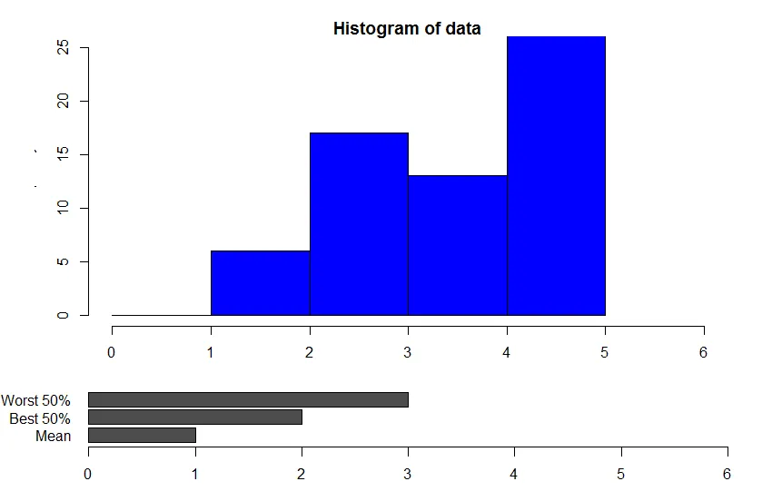
我有一个问题,我想将条形图放在直方图下面,其中值的条形图恰好位于直方图的某个特定值下方。不幸的是,直方图的比例尺与条形图不同,并且直方图中还有一个小间隙。

有没有可能重新排列呢?

# data
set.seed(4566)
a <- rnorm(100)
a <- dnorm(a)*10+1 
data <- a

#data plot 2
values <- matrix(,,3)
values[1,1] <- 1
values[1,2] <- 2
values[1,3] <- 3
colnames(values) <- c('Mean','Best 50%','Worst 50%')

# layout boxplot is at the bottom 
nf <- layout(mat = matrix(c(1,2),2,1, byrow=TRUE), height = c(3,1))
par(mar=c(3.1, 3.1, 1.1, 2.1),oma=c(0,2,1,1))
b <- c(0,1,2,3,4,5)
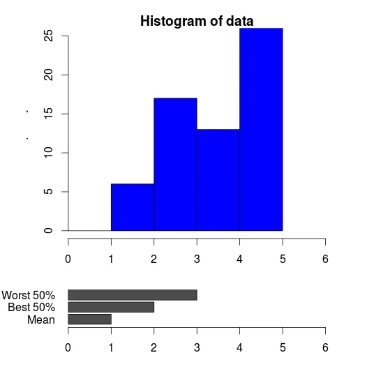
hist(data,xlim = range(0:6),ylim=range(0:25),col = "blue",breaks=b)
barplot(values, horiz=T, xlim=range(0:6),ylim=range(0:3),las=1)

enter image description here

1个回答

3

一种方法是在hist调用中使用xaxs参数。

nf <- layout(mat = matrix(c(1,2),2,1, byrow=TRUE), height = c(3,1))
par(mar=c(3.1, 3.1, 1.1, 2.1),oma=c(0,2,1,1))
hist(data,xlim = range(0:6),ylim=range(0:25),col = "blue", breaks=b, xaxs="i")
barplot(values, horiz=T, xlim=range(0:6),ylim=range(0:3), las=1)

该参数用于计算x轴(参见?par)。

看看它的作用

默认为xaxs = "r"

enter image description here

hist(data,xlim = range(0:6),ylim=range(0:25),col = "blue", breaks=b, xaxs="r")
par("usr")
#[1] -0.24  6.24 -1.00 26.00

前两个点指定了x轴的范围 - 可以看到它已经扩展了。为了强制将其限制在数据范围内,可以使用xaxs="i"选项。

hist(data,xlim = range(0:6),ylim=range(0:25),col = "blue", breaks=b, xaxs="i")
par("usr")
#[1]  0  6 -1 26

这与您的条形图相符

barplot(values, horiz=T, xlim=range(0:6),ylim=range(0:3), las=1)
par("usr")
#[1]  0.00  6.00 -0.12  3.12

网页内容由stack overflow 提供, 点击上面的
可以查看英文原文,
原文链接