使用ggplot2制作组合箱线图和直方图

25

我想要将直方图和箱线图结合起来以可视化一个连续变量。这是我目前的代码:

require(ggplot2)
require(gridExtra)
p1 = qplot(x = 1, y = mpg, data = mtcars, xlab = "", geom = 'boxplot') + 
     coord_flip()
p2 = qplot(x = mpg, data = mtcars, geom = 'histogram')
grid.arrange(p2, p1, widths = c(1, 2))

plot

这个图看起来不错,除了x轴的对齐方式。请问有谁可以告诉我如何对齐它们? 或者,如果有更好的使用 ggplot2 生成这个图表的方法,也将不胜感激。


你最初的问题是关于如何使用ggplot,然而你标记为“接受”的答案却使用了qplot。这是不同的东西。虽然它可能达到了目的,但现在我们可以看到下面有一个ggplot的答案。 - Droid-Bird
4个回答

20

您可以通过使用ggExtra中的coord_cartesian()和align.plots来实现这一点。

library(ggplot2)
library(ggExtra) # from R-forge

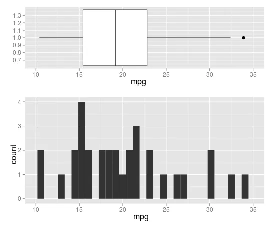
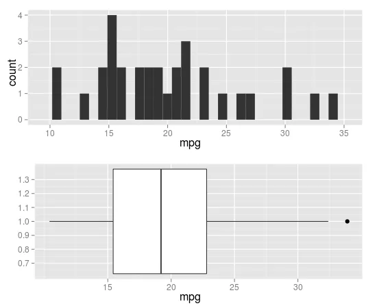
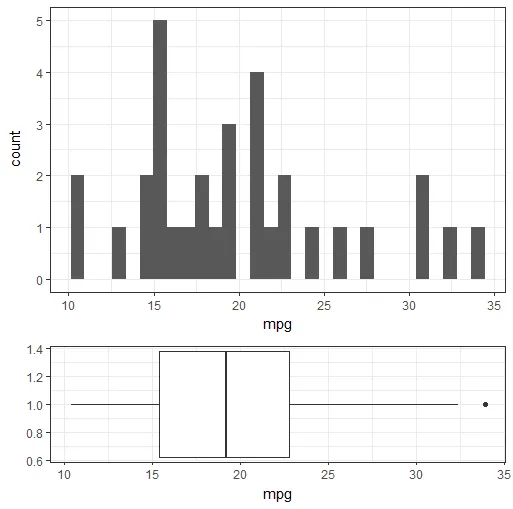
p1 <- qplot(x = 1, y = mpg, data = mtcars, xlab = "", geom = 'boxplot') + 
  coord_flip(ylim=c(10,35), wise=TRUE)
p2 <- qplot(x = mpg, data = mtcars, geom = 'histogram') + 
  coord_cartesian(xlim=c(10,35), wise=TRUE)

align.plots(p1, p2)

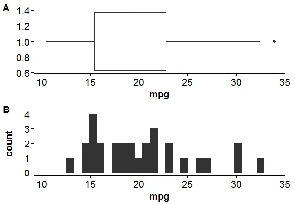
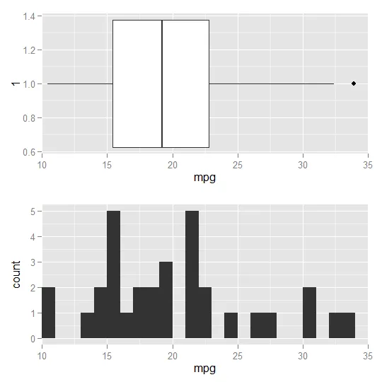
这是 align.plot 的修改版,可以指定每个面板的相对大小:

align.plots2 <- function (..., vertical = TRUE, pos = NULL) 
{
    dots <- list(...)
    if (is.null(pos)) pos <- lapply(seq(dots), I)
    dots <- lapply(dots, ggplotGrob)
    ytitles <- lapply(dots, function(.g) editGrob(getGrob(.g, 
        "axis.title.y.text", grep = TRUE), vp = NULL))
    ylabels <- lapply(dots, function(.g) editGrob(getGrob(.g, 
        "axis.text.y.text", grep = TRUE), vp = NULL))
    legends <- lapply(dots, function(.g) if (!is.null(.g$children$legends)) 
        editGrob(.g$children$legends, vp = NULL)
    else ggplot2:::.zeroGrob)
    gl <- grid.layout(nrow = do.call(max,pos))
    vp <- viewport(layout = gl)
    pushViewport(vp)
    widths.left <- mapply(`+`, e1 = lapply(ytitles, grobWidth), 
        e2 = lapply(ylabels, grobWidth), SIMPLIFY = F)
    widths.right <- lapply(legends, function(g) grobWidth(g) + 
        if (is.zero(g)) 
            unit(0, "lines")
        else unit(0.5, "lines"))
    widths.left.max <- max(do.call(unit.c, widths.left))
    widths.right.max <- max(do.call(unit.c, widths.right))
    for (ii in seq_along(dots)) {
        pushViewport(viewport(layout.pos.row = pos[[ii]]))
        pushViewport(viewport(x = unit(0, "npc") + widths.left.max - 
            widths.left[[ii]], width = unit(1, "npc") - widths.left.max + 
            widths.left[[ii]] - widths.right.max + widths.right[[ii]], 
            just = "left"))
        grid.draw(dots[[ii]])
        upViewport(2)
    }
}

使用方法:

# 5 rows, with 1 for p1 and 2-5 for p2
align.plots2(p1, p2, pos=list(1,2:5))
# 5 rows, with 1-2 for p1 and 3-5 for p2
align.plots2(p1, p2, pos=list(1:2,3:5))

align.plots2 第二个例子


1
谢谢Koshke!我之前尝试过align.plots,但没有使用coord_cartesian选项,结果与grid.arrange相同。有没有办法像grid.arrange一样指定两个图的高度?我希望箱线图的高度比直方图小。 - Ramnath
再次感谢Kohske。这个完美地解决了问题。也许你应该把这个补丁发送给ggExtra的作者,因为我认为这是一个非常有用的功能!! - Ramnath

5
使用cowplot包。
library(cowplot)

#adding xlim and ylim to align axis.
p1 = qplot(x = 1, y = mpg, data = mtcars, xlab = "", geom = 'boxplot') + 
  coord_flip() +
  ylim(min(mtcars$mpg),max(mtcars$mpg))

p2 = qplot(x = mpg, data = mtcars, geom = 'histogram')+
  xlim(min(mtcars$mpg),max(mtcars$mpg))

#result
plot_grid(p1, p2, labels = c("A", "B"), align = "v",ncol = 1)

enter image description here


2

另一种可能的解决方案是使用ggplot2,但是到目前为止我不知道如何在高度上缩放这两个图:

require(ggplot2)
require(grid)

fig1 <- ggplot(data = mtcars, aes(x = 1, y = mpg)) +
  geom_boxplot( ) +
  coord_flip() +
  scale_y_continuous(expand = c(0,0), limit = c(10, 35))

fig2 <- ggplot(data = mtcars, aes(x = mpg)) +
  geom_histogram(binwidth = 1) +
  scale_x_continuous(expand = c(0,0), limit = c(10, 35))

grid.draw(rbind(ggplotGrob(fig1),
                ggplotGrob(fig2),
                size = "first"))

plot


1
我知道的最好解决方案是使用ggpubr包:
require(ggplot2)
require(ggpubr)
p1 = qplot(x = 1, y = mpg, data = mtcars, xlab = "", geom = 'boxplot') + 
     coord_flip()
p2 = qplot(x = mpg, data = mtcars, geom = 'histogram')
ggarrange(p2, p1, heights = c(2, 1), align = "hv", ncol = 1, nrow = 2)

enter image description here


网页内容由stack overflow 提供, 点击上面的
可以查看英文原文,
原文链接