在 ggplot2 中将箱线图叠加在直方图上

4

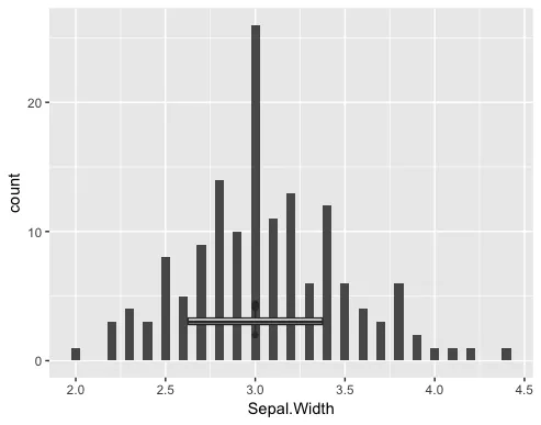
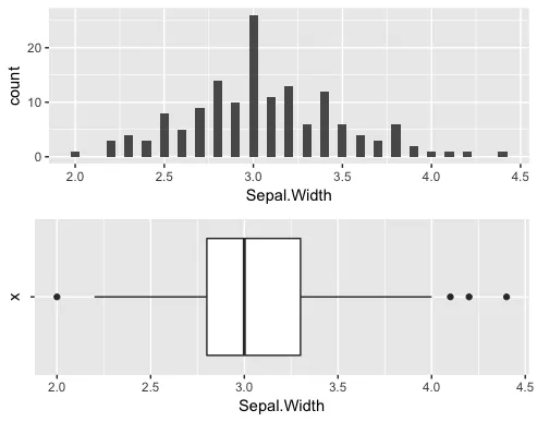
您好,我想用R脚本创建与下图类似的图表:

enter image description here

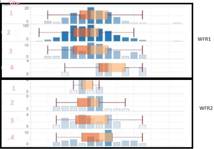
图片来源:https://community.tableau.com/thread/194440

这是我的R代码:

library(ggplot2)

ifile <- read.table("C:/ifiles/test.txt", skip = 2, header = TRUE, sep="\t")
ifileVI <- data.frame(ifile["VI"], ifile["Site"])
x<-quantile(ifileVI$VI,c(0.01,0.99))
data_clean <- ifileVI[bfileVI$VI >=x[1] & ifileVI$VI <=x[2],]

p <- ggplot(data_clean, aes(x = Site, y = VI, group=Site)) + geom_boxplot() + geom_histogram(binwidth = 0.05)

p

然而,我遇到了以下错误:
Error: stat_bin() must not be used with a y aesthetic.

bfileVI:

Id     VI Site
WFR1 2.91 1
WFR1 2.89 2
WFR1 2.86 3
WFR1 2.91 4
WFR1 2.87 1
WFR1 2.67 2
WFR1 2.76 3
WFR1 2.74 4
WFR1 2.98 4
WFR1 2.89 3
WFR1 2.55 4
WFR1 2.96 3
WFR1 2.71 1
WFR1 2.98 2
WFR1 2.89 3
WFR2 2.55 2
WFR2 2.86 4
WFR2 2.91 3
WFR2 287 1
WFR2 2.74 2
WFR2 2.98 1
WFR2 2.89 2
WFR2 2.55 3
WFR2 2.96 4
WFR2 2.71 1
WFR2 2.86 2
WFR2 2.91 3
WFR2 287 4
WFR2 2.67 1
WFR2 2.76 2
WFR2 2.74 3
WFR2 2.98 4
WFR2 2.89 1
WFR2 2.55 2
WFR2 2.96 3
WFR2 2.71 4
WFR2 2.98 1
WFR2 2.89 2
WFR2 2.55 3
WFR2 2.86 4


1
请使用 dput() 函数分享您的数据。 - Tung
2
这可能是 https://dev59.com/B2855IYBdhLWcg3wFABu 的重复 - 不会将图表放在彼此上方,但我认为像示例中那样重叠它们不是一个好主意... 会让人感到不知所措。 - mysteRious
3个回答

7

您可以尝试使用矩形替换直方图来生成如下图所示的绘图:

enter image description here


如何实现:

生成随机数据

df <- data.frame(State = LETTERS[1:3],
                 Y = sample(1:10, 30, replace = TRUE),
                 X = rep(1:10, 3))

用矩形替换直方图

library(ggplot2)

# You can plot geom_histogram or bar (pre-counted stats)
ggplot(df, aes(X, Y)) +
    geom_bar(stat = "identity", position = "dodge") +
    facet_grid(State ~ .)
# Or you can plot similar figure with geom_rect
ggplot(df)  +
    geom_rect(aes(xmin = X - 0.4, xmax = X + 0.4, ymin = 0, ymax = Y)) +
    facet_grid(State ~ .)

添加箱线图

要添加箱线图,我们需要执行以下操作:

  1. 翻转坐标轴(使用函数 coord_flip
  2. geom_rect 中交换 X 和 Y 值

代码:

ggplot(df)  +
    geom_rect(aes(xmin = 0, xmax = Y, ymin = X - 0.4, ymax = X + 0.4)) +
    geom_boxplot(aes(X, Y)) +
    coord_flip() +
    facet_grid(State ~ .)

结果:

在这里输入图片描述

最终的图形代码,具有更好的可视化效果

ggplot(df)  +
    geom_rect(aes(xmin = 0, xmax = Y, ymin = X - 0.4, ymax = X + 0.4),
              fill = "blue", color = "black") +
    geom_boxplot(aes(X, Y), alpha = 0.7, fill = "salmon2") +
    coord_flip() +
    facet_grid(State ~ .) +
    theme_classic() +
    scale_y_continuous(breaks = 1:max(df$X))

嗨,我在我的回答中展示了我的样本数据在blufileVf2中,如何调整你的脚本以处理该文件?您的Y是我的Vf2 Bins,而X是频率吗?有4个离散的“站点”1,2,3,4。 - Adhil
@Adhil 添加更多数据并使用 dput 函数(不是图片) - pogibas
抱歉,我不理解,我是R的新手 :) - Adhil
@Adhil,请将您的数据粘贴到问题中(不要使用图片,这没有任何用处)。 - pogibas
我已经粘贴了数据。 - Adhil
我已经做了一些更改,请给予建议。 - Adhil

4
一个很好的例子是 ggstance 包的应用。
library(ggplot2)
library(ggstance)

ggplot(iris, aes(x = Sepal.Length)) +
  geom_histogram() +
  geom_boxploth(aes(y = 3), width = 2, color = "blue", lwd = 2, alpha = .5) +
  theme_minimal() +
  facet_wrap(~Species, ncol = 1)

enter image description here


3

你看到的错误信息 Error: stat_bin() must not be used with a y aesthetic. 是因为在直方图的美学中不能指定 y。如果你想混合具有不同参数的图形,需要提供不同的美学。我将以 iris 为例进行演示:

ggplot(iris, aes(x = Sepal.Width)) + 
  geom_histogram(binwidth = 0.05) +
  geom_boxplot(aes(x = 3, y = Sepal.Width))

很不幸,箱线图默认是垂直的,直方图则是水平的,而coord_flip()只能全盘改变方向,所以你只能得到这样一个糟糕的结果:enter image description here 我想到的最好方法是使用gridExtra包,将它们叠放在一起,而非重叠在一起。
a <- ggplot(iris, aes(x = Sepal.Width)) + 
  geom_histogram(binwidth = 0.05) 

b <- ggplot(iris, aes(x = "", y = Sepal.Width)) + 
  geom_boxplot() + 
  coord_flip()

grid.arrange(a,b,nrow=2)

这给了我们一个相当不错的东西:在此输入图片描述

3
@mysteRious 提供的链接提供了更多细节,例如如何匹配您绘图中当前不对齐的轴范围(例如,顶部图中的2.0与底部图中的2.0不对齐)。 - Maurits Evers

网页内容由stack overflow 提供, 点击上面的
可以查看英文原文,
原文链接