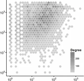
我正在尝试在Python中生成如下图所示的图形:
我的代码是:
plt.scatter(x,y,marker="h",s=100,c=color)
plt.xscale('log')
plt.yscale('log')
plt.xlim([1, 10**3])
plt.ylim([1, 10**3])
plt.colorbar()
plt.show()
有没有办法让当前的色条看起来像顶部的那个?使其更小并添加轴?
非常感谢任何帮助。
我正在尝试在Python中生成如下图所示的图形:
我的代码是:
plt.scatter(x,y,marker="h",s=100,c=color)
plt.xscale('log')
plt.yscale('log')
plt.xlim([1, 10**3])
plt.ylim([1, 10**3])
plt.colorbar()
plt.show()
有没有办法让当前的色条看起来像顶部的那个?使其更小并添加轴?
非常感谢任何帮助。
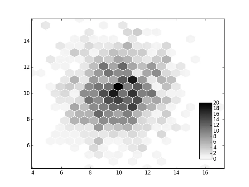
colorbar 的 cax 参数。您需要创建一个插图轴,然后将该轴用于颜色条。import numpy as np
import matplotlib.pyplot as plt
npoints = 1000
x, y = np.random.normal(10, 2, (2, npoints))
fig, ax = plt.subplots()
artist = ax.hexbin(x, y, gridsize=20, cmap='gray_r', edgecolor='white')
# Create the inset axes and use it for the colorbar.
cax = fig.add_axes([0.8, 0.15, 0.05, 0.3])
cbar = fig.colorbar(artist, cax=cax)
plt.show()
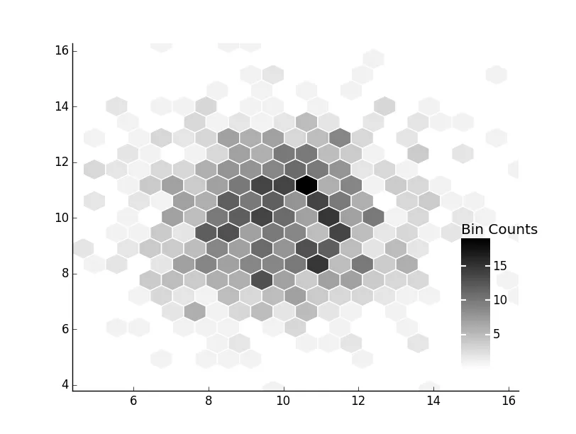
如果你想要更精确地匹配数据(注意:我在这里使用的是 hexbin,它不支持对数轴,所以我将省略该部分)。
import numpy as np
import matplotlib.pyplot as plt

npoints = 1000
x, y = np.random.normal(10, 2, (2, npoints))

fig, ax = plt.subplots()
artist = ax.hexbin(x, y, gridsize=20, cmap='gray_r', edgecolor='white')

cax = fig.add_axes([0.8, 0.15, 0.05, 0.3])
cbar = fig.colorbar(artist, cax=cax)

ax.spines['right'].set(visible=False)
ax.spines['top'].set(visible=False)
ax.tick_params(top=False, right=False)

cbar.set_ticks([5, 10, 15])
cbar.ax.set_title('Bin Counts', ha='left', x=0)
cbar.ax.tick_params(axis='y', color='white', left=True, right=True,
                    length=5, width=1.5)
cbar.outline.remove()

plt.show()
xscale ='log',yscale ='log' - tmdavison