Matplotlib离散色条

144

我正在尝试在Matplotlib中为散点图制作离散的颜色条。

我有我的x、y数据,对于每个点我有一个整数标签值,我想用独特的颜色来表示它,例如:

plt.scatter(x, y, c=tag)

通常标签将是一个介于0至20之间的整数,但确切的范围可能会发生变化。

到目前为止,我仅使用了默认设置,例如:

plt.colorbar()

我希望能得到一组离散的颜色,而不是连续的。比如在这个例子中,我想要包含20种颜色的一组。更好的是,当标签值为0时,产生灰色,而1-20则产生彩色。

我找到了一些“食谱”脚本,但它们非常复杂,我不认为它们是解决一个看似简单的问题的正确方法。


2
这个链接有帮助吗?这个或者这个 - Francesco Montesano
谢谢提供链接,但第二个例子是我所说的极度复杂的方法来执行(看似)微不足道的任务 - 第一个链接很有用。 - bph
2
我发现此链接对于离散化现有颜色映射非常有帮助:https://gist.github.com/jakevdp/91077b0cae40f8f8244a - BallpointBen
9个回答

133

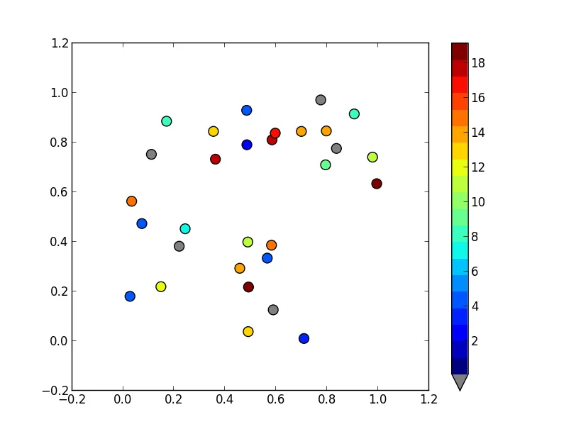
通过使用BoundaryNorm作为散点图的规范化器,您可以轻松地创建自定义离散色条。 在我的方法中,有点古怪的是将0显示为灰色。

对于图像,我经常使用cmap.set_bad()并将数据转换为numpy掩膜数组。 这将更容易使0变为灰色,但我无法让它在散点图或自定义cmap中起作用。

作为替代方案,您可以从头开始制作自己的cmap,或读取现有的cmap并覆盖其中某些特定条目。

import numpy as np
import matplotlib as mpl
import matplotlib.pylab as plt

fig, ax = plt.subplots(1, 1, figsize=(6, 6))  # setup the plot

x = np.random.rand(20)  # define the data
y = np.random.rand(20)  # define the data
tag = np.random.randint(0, 20, 20)
tag[10:12] = 0  # make sure there are some 0 values to show up as grey

cmap = plt.cm.jet  # define the colormap
# extract all colors from the .jet map
cmaplist = [cmap(i) for i in range(cmap.N)]
# force the first color entry to be grey
cmaplist[0] = (.5, .5, .5, 1.0)

# create the new map
cmap = mpl.colors.LinearSegmentedColormap.from_list(
    'Custom cmap', cmaplist, cmap.N)

# define the bins and normalize
bounds = np.linspace(0, 20, 21)
norm = mpl.colors.BoundaryNorm(bounds, cmap.N)

# make the scatter
scat = ax.scatter(x, y, c=tag, s=np.random.randint(100, 500, 20),
                  cmap=cmap, norm=norm)

# create a second axes for the colorbar
ax2 = fig.add_axes([0.95, 0.1, 0.03, 0.8])
cb = plt.colorbar.ColorbarBase(ax2, cmap=cmap, norm=norm,
    spacing='proportional', ticks=bounds, boundaries=bounds, format='%1i')

ax.set_title('Well defined discrete colors')
ax2.set_ylabel('Very custom cbar [-]', size=12)

在此输入图像说明

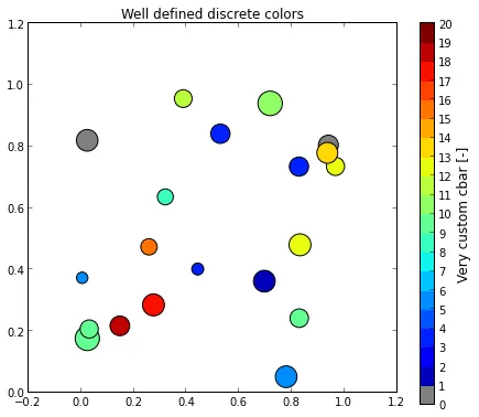
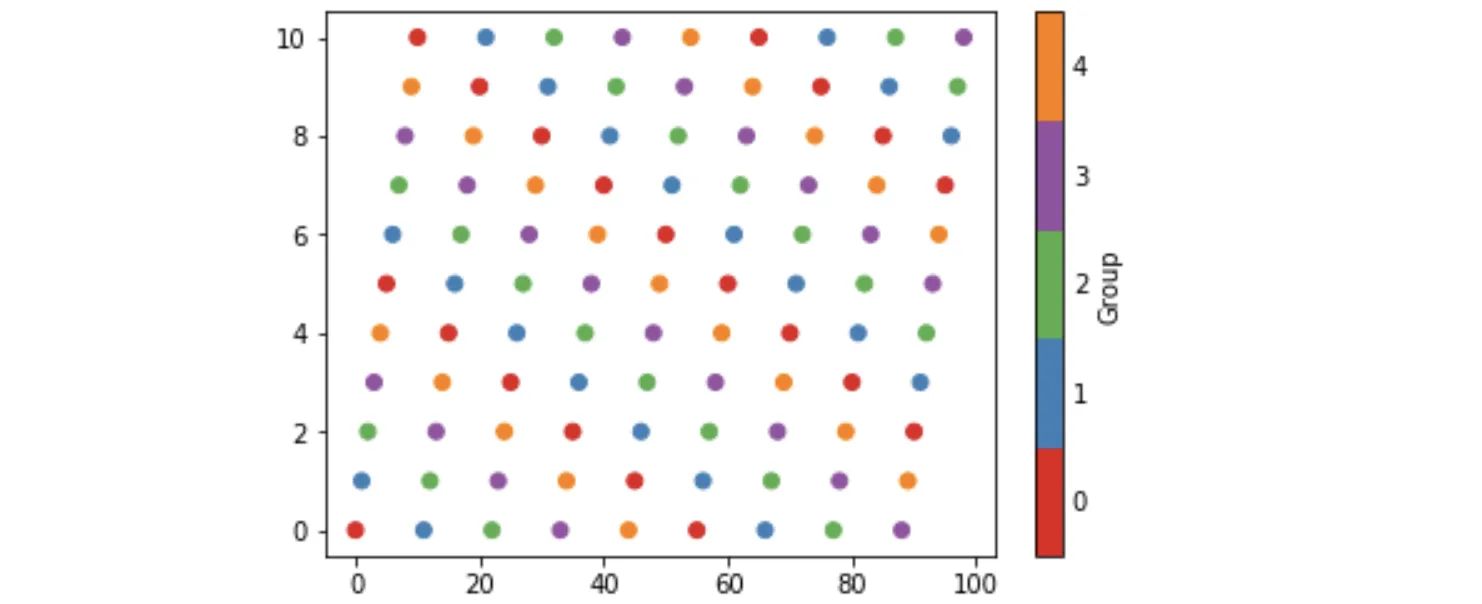
我个人认为,使用20种不同的颜色阅读特定值有点困难,但当然这取决于您。


我不确定这是否被允许,但你能否看一下我的问题这里 - Amos
15
plt.colorbar.ColorbarBase 报错。请使用 mpl.colorbar.ColorbarBase - zeeshan khan
1
以下是再现等分映射的代码:q=np.arange(0.0, 1.01, 0.1) cmap = mpl.cm.get_cmap('jet') cmaplist = [cmap(x) for x in q] cmap = mpl.colors.LinearSegmentedColormap.from_list('Custom cmap', cmaplist, len(q)-1) norm = mpl.colors.BoundaryNorm(q, cmap.N) - jlandercy
如果您不想使用数字0-20,而是要使用字符串,应该如何操作? - Satyapriya Krishna
@SatyapriyaKrishna,您仍需要一个值来将其映射到颜色(即“bounds”)。但是,您可以使用cb.set_ticklabels(...)覆盖刻度标签,并可能首先使用cb.get_ticklabels(...)将原始值映射到字符串。 - Rutger Kassies
显示剩余3条评论

89

您可以跟随下面的示例或文档中新增的示例(链接)

#!/usr/bin/env python
"""
Use a pcolor or imshow with a custom colormap to make a contour plot.

Since this example was initially written, a proper contour routine was
added to matplotlib - see contour_demo.py and
http://matplotlib.sf.net/matplotlib.pylab.html#-contour.
"""

from pylab import *


delta = 0.01
x = arange(-3.0, 3.0, delta)
y = arange(-3.0, 3.0, delta)
X,Y = meshgrid(x, y)
Z1 = bivariate_normal(X, Y, 1.0, 1.0, 0.0, 0.0)
Z2 = bivariate_normal(X, Y, 1.5, 0.5, 1, 1)
Z = Z2 - Z1 # difference of Gaussians

cmap = cm.get_cmap('PiYG', 11)    # 11 discrete colors

im = imshow(Z, cmap=cmap, interpolation='bilinear',
            vmax=abs(Z).max(), vmin=-abs(Z).max())
axis('off')
colorbar()

show()

这将产生以下图像:

poormans_contour


21
使用cm.get_cmap('jet', 20)获取cmap,然后使用scatter(x,y,c=tags,cmap=cmap)可以帮助我实现部分功能。但是在matplotlib中很难找到有用的文档。 - bph

70

以上答案不错,但是它们在色条上没有正确的刻度位置。我喜欢将刻度放在颜色中间,这样数字与颜色的映射更加清晰。您可以通过更改matshow调用的限制来解决此问题:

import matplotlib.pyplot as plt
import numpy as np

def discrete_matshow(data):
    # get discrete colormap
    cmap = plt.get_cmap('RdBu', np.max(data) - np.min(data) + 1)
    # set limits .5 outside true range
    mat = plt.matshow(data, cmap=cmap, vmin=np.min(data) - 0.5, 
                      vmax=np.max(data) + 0.5)
    # tell the colorbar to tick at integers
    cax = plt.colorbar(mat, ticks=np.arange(np.min(data), np.max(data) + 1))

# generate data
a = np.random.randint(1, 9, size=(10, 10))
discrete_matshow(a)

离散色条示例


3
我认同在查看离散数据时,在相应颜色的中央放置标记是非常有帮助的。你的第二种方法是正确的。然而,你的第一种方法通常是错误的:你正在使用与它们在色条上的位置不一致的值来标记这些标记。set_ticklabels(...)应仅用于控制标签格式(例如小数位数等)。如果数据确实是离散的,你可能不会注意到任何问题。如果系统中存在噪声(例如2->1.9),这种不一致的标记将导致误导和不正确的色条。 - E. Davis
我认为你是对的,改变限制是更好的解决方案,所以我删除了另一个--尽管两者都无法很好地处理“噪音”。需要进行一些调整来处理连续数据。 - ben.dichter
1
是否可以将右侧的图例替换为字符串值(例如森林、城市),而不是从1到8的值? - Geosphere
这个可行!虽然我认为使用“'tab20'”而不是“'RdBu'”更适合我来区分颜色。 - Louis Yang

44

如果您想将值设置为色图范围之上或之下,您需要使用色图的 set_overset_under 方法。如果您想标记特定的值,请掩盖它(即创建一个掩盖数组),然后使用 set_bad 方法。(请查看基础色图类的文档:http://matplotlib.org/api/colors_api.html#matplotlib.colors.Colormap

听起来您需要这样的东西:

import matplotlib.pyplot as plt
import numpy as np

# Generate some data
x, y, z = np.random.random((3, 30))
z = z * 20 + 0.1

# Set some values in z to 0...
z[:5] = 0

cmap = plt.get_cmap('jet', 20)
cmap.set_under('gray')

fig, ax = plt.subplots()
cax = ax.scatter(x, y, c=z, s=100, cmap=cmap, vmin=0.1, vmax=z.max())
fig.colorbar(cax, extend='min')

plt.show()

输入图片说明


这真的很好 - 我尝试使用set_under,但没有包括vmin,所以我认为它什么也没做。 - bph
优秀。这使您可以使用内置的颜色映射。 - Prakhar Sharma

30
这个主题已经被很好地涵盖了,但我想添加一些更具体的内容:我想确保某个特定值将被映射到该颜色(而不是任何颜色)。
虽然这并不复杂,但它花费了我一些时间,希望对其他人有所帮助,让他们不要像我一样浪费时间 :)
import matplotlib
from matplotlib.colors import ListedColormap

# Let's design a dummy land use field
A = np.reshape([7,2,13,7,2,2], (2,3))
vals = np.unique(A)

# Let's also design our color mapping: 1s should be plotted in blue, 2s in red, etc...
col_dict={1:"blue",
          2:"red",
          13:"orange",
          7:"green"}

# We create a colormar from our list of colors
cm = ListedColormap([col_dict[x] for x in col_dict.keys()])

# Let's also define the description of each category : 1 (blue) is Sea; 2 (red) is burnt, etc... Order should be respected here ! Or using another dict maybe could help.
labels = np.array(["Sea","City","Sand","Forest"])
len_lab = len(labels)

# prepare normalizer
## Prepare bins for the normalizer
norm_bins = np.sort([*col_dict.keys()]) + 0.5
norm_bins = np.insert(norm_bins, 0, np.min(norm_bins) - 1.0)
print(norm_bins)
## Make normalizer and formatter
norm = matplotlib.colors.BoundaryNorm(norm_bins, len_lab, clip=True)
fmt = matplotlib.ticker.FuncFormatter(lambda x, pos: labels[norm(x)])

# Plot our figure
fig,ax = plt.subplots()
im = ax.imshow(A, cmap=cm, norm=norm)

diff = norm_bins[1:] - norm_bins[:-1]
tickz = norm_bins[:-1] + diff / 2
cb = fig.colorbar(im, format=fmt, ticks=tickz)
fig.savefig("example_landuse.png")
plt.show()

在此输入图片描述


尝试复制这个,但代码无法运行,因为“tmp”未定义。此外,lambda函数中的“pos”不清楚是什么意思。谢谢! - George Liu
@GeorgeLiu 您说得对!我做了一个复制粘贴错误,现在已经修复了!代码片段正在运行!关于pos,我不太确定它为什么出现在这里,但是FuncFormatter()要求使用它...也许其他人可以给我们更多的启示! - Enzoupi
这非常接近我所寻找的,但不幸的是,我认为有一个错误——7应该是绿色的,但却是橙色的,而13应该是橙色的,但却是绿色的。 - undefined

10

我一直在研究这些想法,以下是我的看法。它避免了调用BoundaryNorm以及将norm作为参数传递给scattercolorbar。然而,我发现无法消除对matplotlib.colors.LinearSegmentedColormap.from_list的冗长调用。

背景是,matplotlib提供所谓的定性色图,旨在与离散数据一起使用。Set1具有9种易于区分的颜色,例如tab20可用于20种颜色。使用这些色图,可以使用它们的前n种颜色来为具有n个类别的散点图着色,就像以下示例所示。该示例还生成了一个带标签的n个离散颜色的颜色条。

import matplotlib, numpy as np, matplotlib.pyplot as plt
n = 5
from_list = matplotlib.colors.LinearSegmentedColormap.from_list
cm = from_list(None, plt.cm.Set1(range(0,n)), n)
x = np.arange(99)
y = x % 11
z = x % n
plt.scatter(x, y, c=z, cmap=cm)
plt.clim(-0.5, n-0.5)
cb = plt.colorbar(ticks=range(0,n), label='Group')
cb.ax.tick_params(length=0)

这会生成下面的图像。在调用Set1时,n指定了该色图的前n个颜色;在调用from_list时,最后的n指定要构建一个由n种颜色组成的映射(默认为256种)。为了将cm设置为默认的色图并使用plt.set_cmap,我发现必须给它命名并注册,方法如下:

cm = from_list('Set15', plt.cm.Set1(range(0,n)), n)
plt.cm.register_cmap(None, cm)
plt.set_cmap(cm)
...
plt.scatter(x, y, c=z)

离散颜色的散点图


短小精悍,高效完美! - Nisba
它对图像也适用吗? - Royi
对于图片也适用吗? - undefined

0
我的使用情况类似,但有一些额外的要求:
  1. 应该将任意整数列表映射到任意颜色。
  2. 不应假设整数是连续的、排序的或在数据中表示的。
感谢 @Enzoupi 提供的起点,我对其进行了重构,使其更具可重用性,并对其进行了调试,以正确地将颜色映射到整数。
import numpy as np
import matplotlib as mpl
import pylab as plt


class Label:
    def __init__(self, integer, color, label):
        self.integer = integer
        self.color = color
        self.label = label


class DiscreteColormapGenerator:
    def __init__(self, labels):
        self.labels = labels
        self.labels.sort(key=lambda x: x.integer)

    def get_colormap(self):
        return mpl.colors.ListedColormap([l.color for l in self.labels])

    def get_normalizer(self):
        bins = [l.integer for l in self.labels]
        bins = [self.labels[0].integer - 1] + bins + [self.labels[-1].integer + 1]
        bins = np.array(bins[0:-1] + bins[1:]).reshape(2, -1).mean(0)
        return mpl.colors.BoundaryNorm(bins, len(self.labels), clip=True)

    def get_legend_patches(self):
        return [mpl.patches.Patch(color=l.color, label=l.label) for l in labels]


if __name__ == "__main__":
    labels = [
        Label(1, "blue", "Sea"),
        Label(2, "red", "City"),
        Label(13, "orange", "Sand"),
        Label(7, "green", "Forest"),
    ]

    cmpr = DiscreteColormapGenerator(labels)
    cmpr.get_normalizer()

    A = np.reshape([7, 2, 13, 7, 2, 2], (2, 3))

    fig, ax = plt.subplots()
    im = ax.imshow(A, cmap=cmpr.get_colormap(), norm=cmpr.get_normalizer())
    fig.legend(handles=cmpr.get_legend_patches())
    plt.show()

0
@Enzoupi的回答中有很多好东西。我稍微分解了一下,看看其中的要点。这是我的注释版本。所有的功劳归给他们。
import numpy as np
import matplotlib
from matplotlib import pyplot as plt
from matplotlib.colors import ListedColormap

# Let's design a dummy land use field
A = np.reshape([7, 2, 13, 7, 2, 2], (2, 3))

# Let's also design our color mapping: 1s should be plotted in blue, 2s in red, etc...
col_dict = {1: "blue",
            2: "red",
            13: "orange",
            7: "green"}

# We create a colormar from our list of colors
cm = ListedColormap(colors=list(col_dict.values()))

# Note the colormap `cm` has no information as to the values we want each color
# to represent... to do that, we have to normalize the image.
# We create bins by adding 0.5 to each value (this assumes no two values are
# less than 0.5 apart)
norm_bins = np.sort([*col_dict.keys()]) + 0.5
# We must also add a bin at the bottom; doesn't matter really where as long as
# it's below the minimum value. This is because `BoundaryNorm` needs bins on
# either side of a value to map that value to a particular color.
norm_bins = np.insert(norm_bins, 0, np.min(norm_bins) - 1.0)  # add one below the minimum
norm = matplotlib.colors.BoundaryNorm(norm_bins, len(col_dict), clip=True)

# Let's also define the description of each category : 1 (blue) is Sea; 2 (red) is burnt, etc...
# Order should be respected here ! Or using another dict maybe could help.
labels = ["Sea", "City", "Sand", "Forest"]

# We need a tick formatter that takes the value `x` and maps it to a label.
# We use the normalizer we created to take land use values and convert to the
# color index, and then use that to pick from our label list.
fmt = matplotlib.ticker.FuncFormatter(lambda x, pos: labels[norm(x)])

# But, as-is, the ticks will be at the boundary limits, which will appear to
# show incorrect labels. So we must also put the ticks at the center of each bin
# in the normalizer.
diff = norm_bins[1:] - norm_bins[:-1]
ticks = norm_bins[:-1] + diff / 2

# So in summary:
# Plot `A` using a list of colors `cm`. Normalize the values in `A` using `norm`
# (so that discontinous values map to the correct colors)
im = plt.imshow(A, cmap=cm, norm=norm)
# Add a colorbar which positions ticks at the center of each color band and
# formats them so they're labeled according to the meaning of the value.
plt.colorbar(im, format=fmt, ticks=ticks)
plt.show()

0

我认为你可能想要查看colors.ListedColormap来生成你的颜色地图,或者如果你只需要一个静态的颜色地图,我一直在开发一个应用程序可能会有所帮助。


看起来很酷,但可能对我的需求过于复杂了 - 你能否建议一种将灰度值标记到现有色图上的方法?这样0值就会呈现为灰色,其他值则呈现为颜色。 - bph
@Hiett 你可以根据y值生成一个RGB数组color_list,并将其传递给ListedColormap吗?你可以使用color_list[y==value_to_tag] = gray_color来标记一个值。 - ChrisC

网页内容由stack overflow 提供, 点击上面的
可以查看英文原文,
原文链接