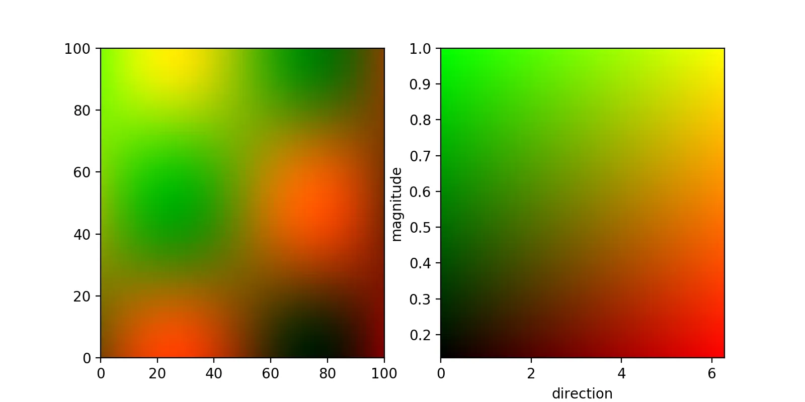
首先,如果您想同时显示两个不同的参数,可以通过为它们分配两个不同的通道(比如红色和绿色)来实现。这可以通过对两个2D数组进行归一化处理,并将它们类似于
此答案中的方式堆叠后,传递给
imshow函数来完成。
如果您满意一个正方形的2D颜色映射,那么可以通过创建一个
meshgrid并再次堆叠和传递给
imshow函数来获取这个颜色映射:
from matplotlib import pyplot as plt
import numpy as np
x,y = np.meshgrid(
np.linspace(0,1,100),
np.linspace(0,1,100),
)
directions = (np.sin(2*np.pi*x)*np.cos(2*np.pi*y)+1)*np.pi
magnitude = np.exp(-(x*x+y*y))
def normalize(M):
return (M-np.min(M))/(np.max(M)-np.min(M))
d_norm = normalize(directions)
m_norm = normalize(magnitude)
fig,(plot_ax, bar_ax) = plt.subplots(nrows=1,ncols=2,figsize=(8,4))
plot_ax.imshow(
np.dstack((d_norm,m_norm, np.zeros_like(directions))),
aspect = 'auto',
extent = (0,100,0,100),
)
bar_ax.imshow(
np.dstack((x, y, np.zeros_like(x))),
extent = (
np.min(directions),np.max(directions),
np.min(magnitude),np.max(magnitude),
),
aspect = 'auto',
origin = 'lower',
)
bar_ax.set_xlabel('direction')
bar_ax.set_ylabel('magnitude')
plt.show()
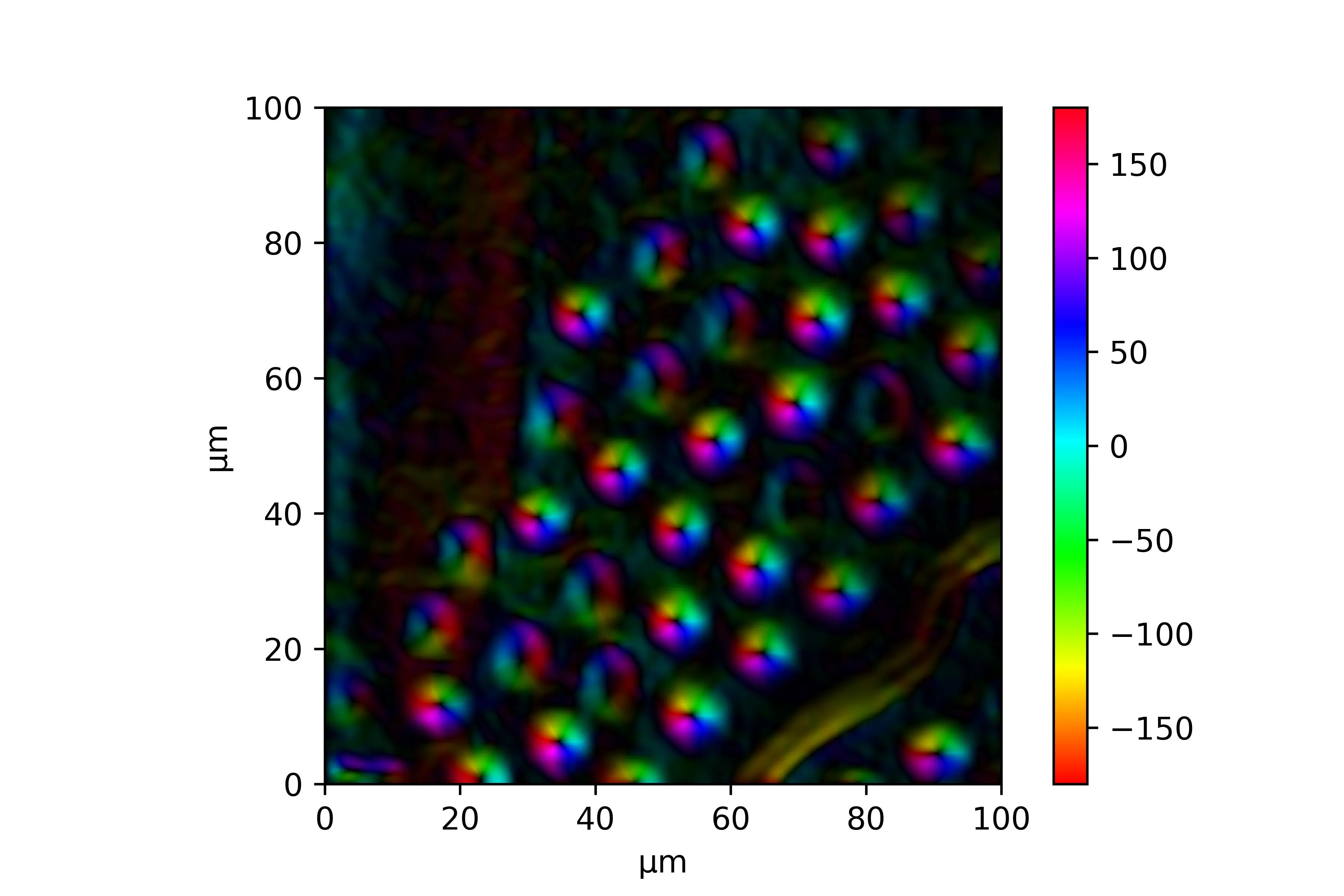
结果看起来像这样:
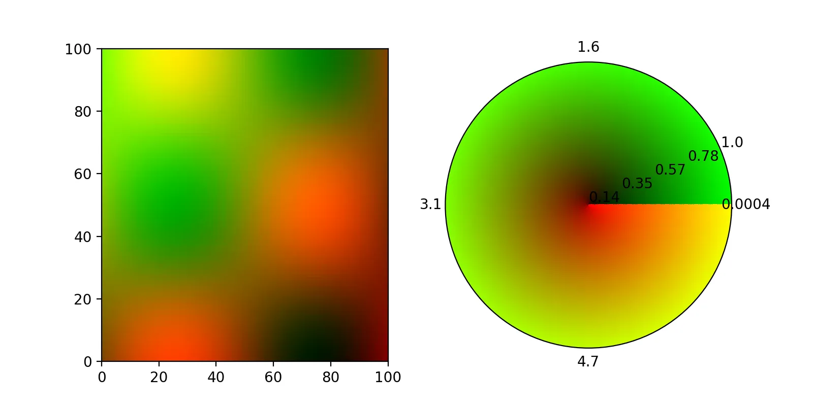
原则上,使用极坐标
Axes也应该是可行的,但根据
此 github 票中的评论,
imshow不支持极坐标轴,我无法使
imshow填充整个圆盘。
编辑:
感谢ImportanceOfBeingErnest和
他对另一个问题的回答(关键字
color做到了这一点),现在可以在极坐标轴上使用
pcolormesh显示二维颜色图。有一些注意事项,最值得注意的是,在
theta方向上,
colors维度需要比
meshgrid小一个,否则颜色图将呈螺旋形状:
fig= plt.figure(figsize=(8,4))
plot_ax = fig.add_subplot(121)
bar_ax = fig.add_subplot(122, projection = 'polar')

plot_ax.imshow(
    np.dstack((d_norm,m_norm, np.zeros_like(directions))),
    aspect = 'auto',
    extent = (0,100,0,100),
)

theta, R = np.meshgrid(
    np.linspace(0,2*np.pi,100),
    np.linspace(0,1,100),
)

t,r = np.meshgrid(
    np.linspace(0,1,99),
    np.linspace(0,1,100),
)

image = np.dstack((t, r, np.zeros_like(r)))

color = image.reshape((image.shape[0]*image.shape[1],image.shape[2]))

bar_ax.pcolormesh(
    theta,R,
    np.zeros_like(R),
    color = color,
)

bar_ax.set_xticks(np.linspace(0,2*np.pi,5)[:-1])
bar_ax.set_xticklabels(
    ['{:.2}'.format(i) for i in np.linspace(np.min(directions),np.max(directions),5)[:-1]]
)
bar_ax.set_yticks(np.linspace(0,1,5))
bar_ax.set_yticklabels(
    ['{:.2}'.format(i) for i in np.linspace(np.min(magnitude),np.max(magnitude),5)]
)
bar_ax.grid('off')

plt.show()
这将产生这个图像:
 理想情况下,我希望添加一个颜色轮,它编码方向和大小(也许可以作为极坐标图)? 如果不可能,就添加一个二维图,将当前色条延伸到包括梯度大小的x轴。
pcolormesh应该可以正常工作。 - ImportanceOfBeingErnestpcolormesh,但它抱怨矩阵的维度(仅允许2D)。 我另一个想法是使用alpha = 0.5,但那看起来不太好看。 - Thomas Kühn.set_array(None)来解决pcolormesh的问题,就像这个答案的最后一部分所示? - ImportanceOfBeingErnest