如何在时间序列线图中突出显示周末

5
我正在尝试对一个自行车共享数据集进行分析。分析的一部分是展示日期为单位的周末需求情况。 我的pandas数据框的最后5行如下所示。

enter image description here

这是我的日期与总骑行量绘图代码。
import seaborn as sns 
sns.set_style("darkgrid")
plt.plot(d17_day_count)
plt.show()

enter image description here

我想在图表中突出显示周末。这样它看起来可能类似于这个图表。 enter image description here

我正在使用Python和matplotlib、seaborn库。


1
请阅读如何创建一个最小、完整和可验证的示例,并相应地编辑您的问题。 - Mr. T
3个回答

9
您可以使用
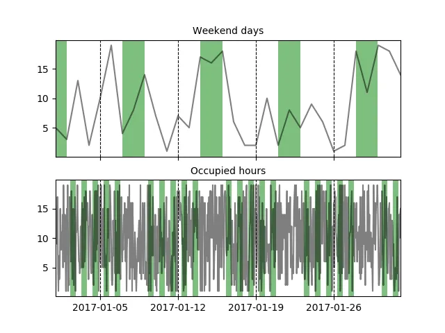
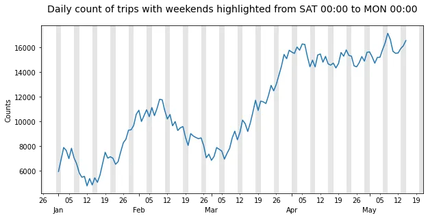
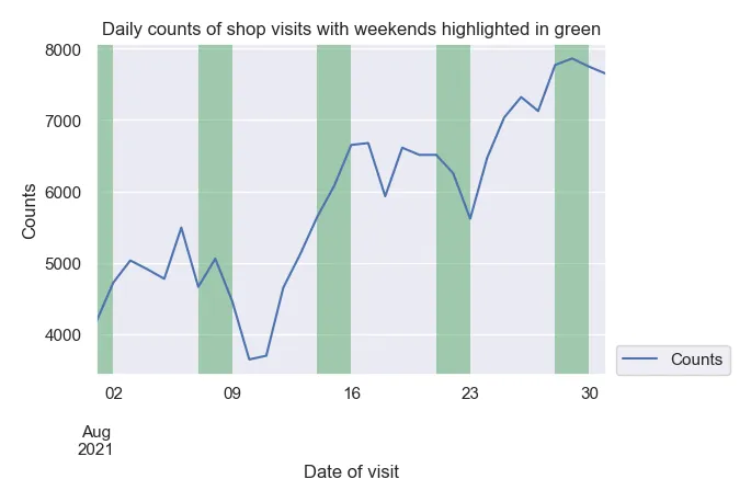
axvspan轻松突出显示区域,要突出显示的区域可以通过遍历数据帧的索引并搜索周末来实现。我还添加了一个示例,以突出显示工作周中的“占用时间”(希望这不会让事情变得更加复杂)。
我已经为基于日期的数据框创建了虚拟数据,另外还有一个基于小时数的虚拟数据。
import pandas as pd
import numpy as np
import matplotlib.pyplot as plt

# dummy data (Days)
dates_d = pd.date_range('2017-01-01', '2017-02-01', freq='D')
df = pd.DataFrame(np.random.randint(1, 20, (dates_d.shape[0], 1)))
df.index = dates_d

# dummy data (Hours)
dates_h = pd.date_range('2017-01-01', '2017-02-01', freq='H')
df_h = pd.DataFrame(np.random.randint(1, 20, (dates_h.shape[0], 1)))
df_h.index = dates_h

#two graphs
fig, axes = plt.subplots(nrows=2, ncols=1, sharex=True)

#plot lines
dfs = [df, df_h]
for i, df in enumerate(dfs):
    for v in df.columns.tolist():
        axes[i].plot(df[v], label=v, color='black', alpha=.5)

def find_weekend_indices(datetime_array):
    indices = []
    for i in range(len(datetime_array)):
        if datetime_array[i].weekday() >= 5:
            indices.append(i)
    return indices

def find_occupied_hours(datetime_array):
    indices = []
    for i in range(len(datetime_array)):
        if datetime_array[i].weekday() < 5:
            if datetime_array[i].hour >= 7 and datetime_array[i].hour <= 19:
                indices.append(i)
    return indices

def highlight_datetimes(indices, ax):
    i = 0
    while i < len(indices)-1:
        ax.axvspan(df.index[indices[i]], df.index[indices[i] + 1], facecolor='green', edgecolor='none', alpha=.5)
        i += 1

#find to be highlighted areas, see functions
weekend_indices = find_weekend_indices(df.index)
occupied_indices = find_occupied_hours(df_h.index)
#highlight areas
highlight_datetimes(weekend_indices, axes[0])
highlight_datetimes(occupied_indices, axes[1])

#formatting..
axes[0].xaxis.grid(b=True, which='major', color='black', linestyle='--', alpha=1) #add xaxis gridlines
axes[1].xaxis.grid(b=True, which='major', color='black', linestyle='--', alpha=1) #add xaxis gridlines
axes[0].set_xlim(min(dates_d), max(dates_d))
axes[0].set_title('Weekend days', fontsize=10)
axes[1].set_title('Occupied hours', fontsize=10)

plt.show()

enter image description here


为什么我尝试这个之后,我的高亮显示一旦添加了我的行就消失了。有任何想法吗?我无法弄清楚。 - ai.jennetta
对于更大的数据集,这将非常缓慢。 - Petr Peller
这段代码出了问题:当你运行for i, df in enumerate(dfs)时,df数据帧会被df_h覆盖。因此,在此脚本中实际上是以find_weekend_indices(df_h.index)而不是以find_weekend_indices(df.index)运行的。我建议您通过将数据帧名称从df更改为df_d等来更正此问题。highlight_datetimes函数还应进行编辑,以明确使用正确的数据框。一旦完成了这些步骤,您将发现axes[0]绘图与图像中显示的不同:上周末的周日将不会被突出显示。 - Patrick FitzGerald
@PetrPeller,我已发布了一篇您可能更喜欢的答案。 - Patrick FitzGerald

7

我尝试使用最佳答案中的代码,但是由于索引的使用方式不同,时间序列中的最后一个周末没有完全高亮显示,尽管当前显示的图像表明了这一点(在频率为6小时或更高时尤为明显)。此外,如果数据的频率高于每日,它也不能正常工作。因此,我在这里分享一种解决方案,它使用x轴单位,使周末(或任何其他重复出现的时间段)可以被高亮显示,而不会涉及到索引相关的任何问题。

这个解决方案只需要6行代码,并且适用于任何频率。 在下面的示例中,它会突出显示整个周末,这使得它比接受的答案更有效,因为小频率(例如30分钟)将产生许多多边形来覆盖整个周末。

x轴限制用于计算图表覆盖的时间范围,以天为单位,这是matplotlib dates使用的单位。然后计算一个weekends掩码,并将其传递给fill_between绘图函数的where参数。掩码被处理为右排除,因此在此情况下,它们必须包含星期一,以便在星期一00:00之前绘制高亮部分。由于在周末接近限制时绘制这些高亮部分可能会改变x轴限制,因此在绘制后将x轴限制设置回原始值。
请注意,与 axvspan 相反,fill_between 函数需要 y1y2 参数。由于某种原因,使用默认的 y 轴限制会在周末亮点的顶部和底部与绘图框架之间留下一个小间隙。这个问题可以通过在创建图表后立即运行 ax.set_ylim(*ax.get_ylim()) 来解决。
import numpy as np                   # v 1.19.2
import pandas as pd                  # v 1.1.3
import matplotlib.pyplot as plt      # v 3.3.2
import matplotlib.dates as mdates

# Create sample dataset
rng = np.random.default_rng(seed=1234) # random number generator
dti = pd.date_range('2017-01-01', '2017-05-15', freq='D')
counts = 5000 + np.cumsum(rng.integers(-1000, 1000, size=dti.size))
df = pd.DataFrame(dict(Counts=counts), index=dti)

# Draw pandas plot: x_compat=True converts the pandas x-axis units to matplotlib
# date units (not strictly necessary when using a daily frequency like here)
ax = df.plot(x_compat=True, figsize=(10, 5), legend=None, ylabel='Counts')
ax.set_ylim(*ax.get_ylim()) # reset y limits to display highlights without gaps
    
# Highlight weekends based on the x-axis units
xmin, xmax = ax.get_xlim()
days = np.arange(np.floor(xmin), np.ceil(xmax)+2)
weekends = [(dt.weekday()>=5)|(dt.weekday()==0) for dt in mdates.num2date(days)]
ax.fill_between(days, *ax.get_ylim(), where=weekends, facecolor='k', alpha=.1)
ax.set_xlim(xmin, xmax) # set limits back to default values

# Create appropriate ticks using matplotlib date tick locators and formatters
ax.xaxis.set_major_locator(mdates.MonthLocator())
ax.xaxis.set_minor_locator(mdates.MonthLocator(bymonthday=np.arange(5, 31, step=7)))
ax.xaxis.set_major_formatter(mdates.DateFormatter('\n%b'))
ax.xaxis.set_minor_formatter(mdates.DateFormatter('%d'))

# Additional formatting
ax.figure.autofmt_xdate(rotation=0, ha='center')
title = 'Daily count of trips with weekends highlighted from SAT 00:00 to MON 00:00'
ax.set_title(title, pad=20, fontsize=14);

weekend_highlights

正如您所看到的,无论数据从何处开始和结束,周末始终被完全突出显示。


您可以在我发布的答案这里这里中找到更多此解决方案的示例。


0

在这方面,我有另一个建议,它受到其他贡献者之前的帖子的启发。代码如下:

import datetime

import numpy as np
import pandas as pd
import matplotlib.pyplot as plt
import seaborn as sns

rng = np.random.default_rng(seed=42) # random number generator
dti = pd.date_range('2021-08-01', '2021-08-31', freq='D')
counts = 5000 + np.cumsum(rng.integers(-1000, 1000, size=dti.size))
df = pd.DataFrame(dict(Counts=counts), index=dti)

weekends = [d for d in df.index if d.isoweekday() in [6,7]]
weekend_list = []
for weekendday in weekends:
    d1 = weekendday
    d2 = weekendday + datetime.timedelta(days=1)
    weekend_list.append((d1, d2))

weekend_df = pd.DataFrame(weekend_list)

sns.set()
plt.figure(figsize=(15, 10), dpi=100)
df.plot()
plt.legend(bbox_to_anchor=(1.02, 0), loc="lower left", borderaxespad=0)
plt.ylabel("Counts")
plt.xlabel("Date of visit")
plt.xticks(rotation = 0)
plt.title("Daily counts of shop visits with weekends highlighted in green")
ax = plt.gca()
for d in weekend_df.index:
    print(weekend_df[0][d], weekend_df[1][d])
    ax.axvspan(weekend_df[0][d], weekend_df[1][d], facecolor="g", edgecolor="none", alpha=0.5)
ax.relim()
ax.autoscale_view()
plt.savefig("junk.png", dpi=100, bbox_inches='tight', pad_inches=0.2)

结果将类似于以下图示: 在此输入图像描述

网页内容由stack overflow 提供, 点击上面的
可以查看英文原文,
原文链接