使用Plotly,无论您的数据源是数据库连接还是CSV文件,都不应该成为问题。您可以通过Pandas数据帧处理这部分内容。但由于您谈论的是数据库,我将向您展示如何在具有典型数据库结构的数据集上轻松构建一个Plotly图表,其中您经常需要依靠对数据进行分组和子集操作,以显示不同子类别的数据随时间变化的情况。 Plotly Express有一些有趣的数据集(尝试dir(px.data)),例如Gapminder数据集:
    country continent   year    lifeExp pop gdpPercap   iso_alpha   iso_num
0   Afghanistan Asia    1952    28.801  8425333 779.445314  AFG 4
1   Afghanistan Asia    1957    30.332  9240934 820.853030  AFG 4
2   Afghanistan Asia    1962    31.997  10267083    853.100710  AFG 4
3   Afghanistan Asia    1967    34.020  11537966    836.197138  AFG 4
4   Afghanistan Asia    1972    36.088  13079460    739.981106  AFG 4
如果您使用正确的方法,可以轻松地使用
px.line()在这样的数据集上构建图形,并让图形函数为您处理分组。甚至可以在以后使用相同的函数向该图形添加数据。
图1:使用
px.line()构建的图形,此图显示欧洲大陆上人均国内生产总值最高的五个国家。使用像
color='country'之类的参数对数据进行分组。
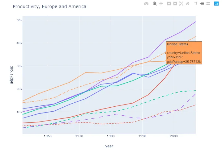
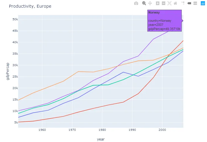 图2:
图2:向同一图形添加了新数据。 此图将在第一张图的基础上添加美洲大陆上人均国内生产总值最高的五个国家。这需要以一种更多的方式辨别数据,以便查看数据是欧洲还是美洲的。使用
line_dash='country'参数处理,以使所有新数据与原始绘图具有虚线。
这只是其中一种方法。如果您满意最终结果,我们还可以讨论其他方法。
完整代码:
import plotly.graph_objs as go
import plotly.express as px
import pandas as pd
gapminder = px.data.gapminder()
df_eur = gapminder[gapminder['continent']=='Europe']
df_eur_2007 = df_eur[df_eur['year']==2007]
eur_gdp_top5=df_eur_2007.nlargest(5, 'gdpPercap')['country'].tolist()
df_eur_gdp_top5 = df_eur[df_eur['country'].isin(eur_gdp_top5)]
df_ame = gapminder[gapminder['continent']=='Americas']
df_ame_2007 = df_ame[df_ame['year']==2007]
df_ame_top5=df_ame_2007.nlargest(5, 'gdpPercap')['country'].tolist()
df_ame_gdp_top5 = df_ame[df_ame['country'].isin(df_ame_top5)]
fig = px.line(df_eur_gdp_top5, x='year', y='gdpPercap',
color="country",
line_group="country", hover_name="country")
fig.update_layout(title='Productivity, Europe' , showlegend=False)
fig2 = go.Figure(fig.add_traces(
data=px.line(df_ame_gdp_top5, x='year', y='gdpPercap',
color="country",
line_group="country", line_dash='country', hover_name="country")._data))
fig2.update_layout(title='Productivity, Europe and America', showlegend=False)
fig2.show()