我在ggplot中的条形图中遇到了误差棒问题。 我有一个分类(条件)和连续(调节变量)变量之间的交互作用。我想显示误差棒,但它们与条形图颜色相同,这使它们难以解释。 我尝试为误差棒添加color =“black”等颜色,但它不会改变任何东西。 以下是代码:
moderator = runif(n = 100, min = 1, max = 7)
condition <- rep(letters[1:2], length.out = 100)
y = runif(n = 100, min = 1, max = 100)

df <- data.frame(moderator, condition, y)


lm21 <- lm(y~ condition* moderator, data = df)
summary(lm21)

library(ggeffects)
library(ggplot2)
library(magrittr)


    pd <- position_dodge()
ggeffect(lm21, terms = c("condition", "moderator")) %>%
  plot(show.title = FALSE) +
  stat_summary(fun.y = mean, geom = "bar", position = pd, width = 0.25) +
  stat_summary(fun.data = mean_cl_boot, geom = "errorbar",
               position = pd, size = 8.5, alpha=13.2) +
  scale_y_continuous("Voting", limits = c(0, 100)) +
  scale_color_discrete(name = "Control", labels = c("Low", "Medium", "High")) +
  scale_x_continuous(name = "Condition",
                     breaks = 0:1,
                     labels = c("Low","High"))
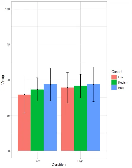
图形如下所示:
如何改变误差线的颜色,以便它们完全可见?
提前致谢!