我想在R的qplot上绘制均值和误差线。这里提供一个我所说的示例: 如您所见,黄色的轴上画有均值和误差线。我希望我的qplot上也有这个功能。考虑以下数据子集:
它应该给你一个像这样的图表: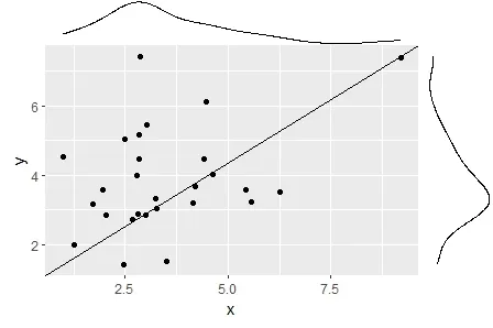 那么,如何绘制我的平均值和误差条?在R中基本绘图中使用的axes()在ggplot2中不起作用。
我感激任何建议,即使它需要更改软件包或以不同的方式处理问题。
谢谢!
如您所见,黄色的轴上画有均值和误差线。我希望我的qplot上也有这个功能。考虑以下数据子集:x <- c(2.037820, 3.247560, 1.259053, 4.200520, 1.960179, 6.247880, 2.830693, 5.565390, 4.476610,
4.627420, 2.500470, 4.156422, 2.855426, 9.210740, 2.663490, 4.412452, 3.270280, 2.838081,
1.705650, 5.440690, 3.014000, 3.513820, 3.002930, 2.453080, 2.787320, 0.979227, 2.815368);
y <- c(2.855820, 3.332350, 1.991730, 3.688240, 3.565680, 3.525511, 4.451860, 3.233950, 6.125230,
4.039360, 5.043330, 3.194650, 7.419020, 7.389600, 2.734740, 4.456250, 3.037665, 5.147140,
3.184790, 3.595890, 5.457550, 1.527680, 2.848046, 1.418289, 3.996330, 4.516640, 2.884100);
fp <- qplot(x, y) + annotate("segment", x=-Inf, xend=Inf,y=-Inf, yend=Inf);
ggExtra::ggMarginal(fp, type = "density", margins = 'both')
它应该给你一个像这样的图表:
那么,如何绘制我的平均值和误差条?在R中基本绘图中使用的axes()在ggplot2中不起作用。我感激任何建议,即使它需要更改软件包或以不同的方式处理问题。
谢谢!
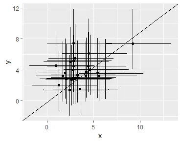
x=0和y=0替换为-Inf。这样它就会被绘制在坐标轴上,而不是在原点 0,0 上的图表上。 - Brian