好的,我需要一些时间来熟悉我的plotly技能。由于您的第一个要点最困难,因此我将反向解释您的要点。
- 通过在
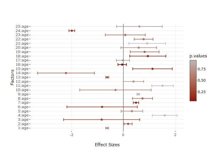
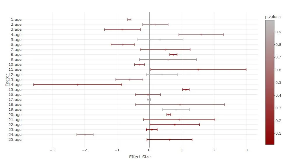
yaxis列表中使用categoryorder和categoryarray来操作layout以实现这一目标(参见motos的回答here)
- 设置
showlegend=FALSE
- 这有点棘手。我不得不将您的第二行(误差线)移动到第一行。为其添加了一个颜色向量。将其放入
plot_ly函数中。使用split允许正确的分组着色。在marker-list中添加了点的颜色。此外,我通过colorRamp 将p.values转换为十六进制,因为每个更简单的解决方案对我都不起作用。
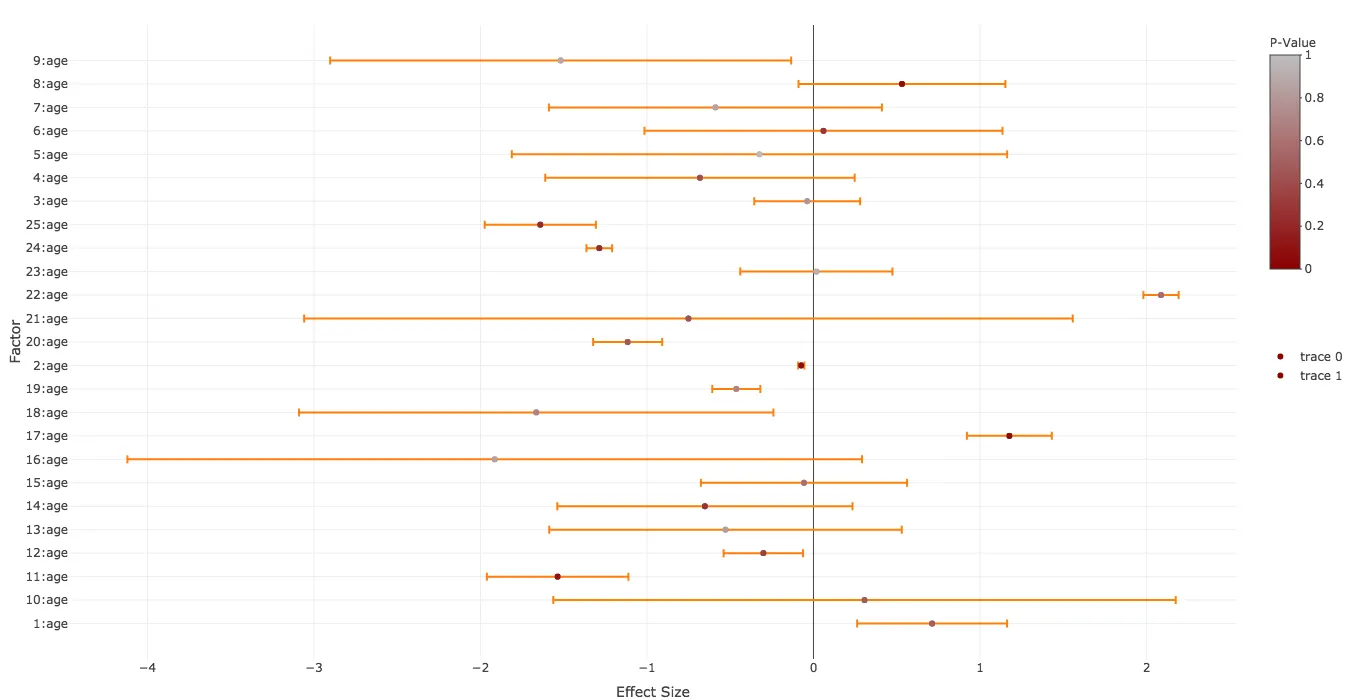
结果如下:
代码(颜色条创建了一些问题):
yform <- list(categoryorder = "array",
categoryarray = rev(factors),
title="Factor",zeroline=F,showticklabels=T)
library(grDevices)
mycramp<-colorRamp(c("darkred","gray"))
mycolors<-rgb(mycramp(p.values),maxColorValue = 255)
library(plotly)
plot_ly(type='scatter',mode="markers",y=~factors,x=~effect.sizes,
color=~p.values,colors=grDevices::colorRamp(c("darkred","gray")),
error_x=list(array=effect.errors,color=mycolors),split=factors,showlegend=FALSE,marker=list(color=mycolors)) %>%
layout(xaxis=list(title="Effect Size",zeroline=T,showticklabels=T),yaxis=yform)
plot_ly(type='scatter',mode="markers",y=~factors,x=~effect.sizes,
color=~p.values,colors=grDevices::colorRamp(c("darkred","gray")),
error_x=list(array=effect.errors,color=mycolors),split=factors,showlegend=FALSE,marker=list(color=mycolors)) %>%
layout(xaxis=list(title="Effect Size",zeroline=T,showticklabels=T),yaxis=yform) %>%
colorbar(limits=c(0,1),len=0.4,title="P-Value",inherit=FALSE) %>%
add_trace(type='scatter',mode="markers",y=~factors,x=~effect.sizes,
showlegend=FALSE,marker=list(color=mycolors),inherit=FALSE) %>%
layout(xaxis=list(title="Effect Size",zeroline=T,showticklabels=T),yaxis=yform)
plot_ly() %>%
colorbar(limits=c(0,1),len=0.4,title="P-Value",inherit=FALSE) %>%
add_trace(type='scatter',mode="markers",y=~factors,x=~effect.sizes,
color=~p.values,colors=grDevices::colorRamp(c("darkred","gray")),
error_x=list(array=effect.errors,color=mycolors),split=factors,showlegend=FALSE,marker=list(color=mycolors)) %>%
layout(xaxis=list(title="Effect Size",zeroline=T,showticklabels=T),yaxis=yform)
令人奇怪的是,这个第一点问题解决起来非常困难并且导致代码量很大,因为通常情况下plotly相当支持管道逻辑,并且您将得到使用所有add函数非常易读的代码。
例如,我期望会有一些add_errorbar函数,但显然您必须在plot_ly函数中添加误差条,并且只有在使用split函数时才能使用颜色向量来表示误差。如果有人想评论或发布一个更易读的替代答案,那将非常有趣。