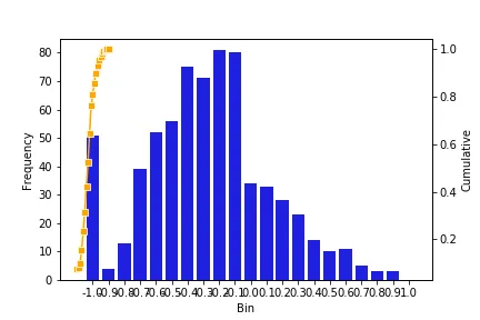
我希望生成一个包含直方图和折线图的单个图表。这两个图表有相同的 x 轴但不同的 y 轴。通过搜索 Stackoverflow,我得到了下面的方法:
- 问题在于折线图没有延伸到 x 轴的末尾。如果注释掉柱状图,则会得到预期的折线图。
- 另一个问题是 plt.xticks(rotation=60) 没有旋转 x 轴上的数字。我不确定制作这两个图表时出了什么问题,也不知道如何解决这个问题。提前感谢您的帮助。
import pandas as pd
import matplotlib.pyplot as plt
import seaborn as sns
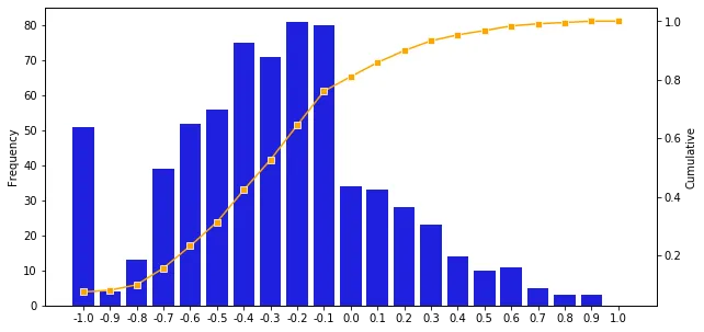
myDict = {'Bin': {0: -1.0,
1: -0.9,
2: -0.8,
3: -0.7,
4: -0.6,
5: -0.5,
6: -0.4,
7: -0.3,
8: -0.2,
9: -0.1,
10: 0.0,
11: 0.1,
12: 0.2,
13: 0.3,
14: 0.4,
15: 0.5,
16: 0.6,
17: 0.7,
18: 0.8,
19: 0.9,
20: 1.0},
'Frequency': {0: 51,
1: 4,
2: 13,
3: 39,
4: 52,
5: 56,
6: 75,
7: 71,
8: 81,
9: 80,
10: 34,
11: 33,
12: 28,
13: 23,
14: 14,
15: 10,
16: 11,
17: 5,
18: 3,
19: 3,
20: 0},
'Cumulative': {0: 0.074344023,
1: 0.080174927,
2: 0.09912536400000001,
3: 0.155976676,
4: 0.231778426,
5: 0.313411079,
6: 0.422740525,
7: 0.526239067,
8: 0.644314869,
9: 0.760932945,
10: 0.810495627,
11: 0.858600583,
12: 0.89941691,
13: 0.932944606,
14: 0.95335277,
15: 0.967930029,
16: 0.983965015,
17: 0.991253644,
18: 0.9956268220000001,
19: 1.0,
20: 1.0}}
myDF = pd.DataFrame(myDataDict)
fig=plt.figure()
ax1 = fig.add_subplot(111)
ax2 = ax1.twinx()
sns.barplot(x='Bin',y='Frequency',data=data_up,color='blue',ax=ax1)
sns.lineplot(x='Bin',y='Cumulative',data=data_up,marker='s',color='orange',ax=ax2)
plt.xticks(rotation=60)
plt.show()
plt.close()