Python同一图中并排箱线图

12

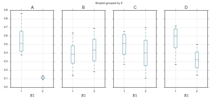
我正在尝试在Python 2.7中为下面的Pandas数据帧中列E中的每个分类值生成一个箱线图。

          A         B         C         D  E
0  0.647366  0.317832  0.875353  0.993592  1
1  0.504790  0.041806  0.113889  0.445370  2
2  0.769335  0.120647  0.749565  0.935732  3
3  0.215003  0.497402  0.795033  0.246890  1
4  0.841577  0.211128  0.248779  0.250432  1
5  0.045797  0.710889  0.257784  0.207661  4
6  0.229536  0.094308  0.464018  0.402725  3
7  0.067887  0.591637  0.949509  0.858394  2
8  0.827660  0.348025  0.507488  0.343006  3
9  0.559795  0.820231  0.461300  0.921024  1

我愿意使用Matplotlib或任何其他绘图库来完成这个任务。目前,以上代码可以在一个图中绘制所有类别的数据。以下是生成上述数据并绘制图表的代码:

import numpy as np
import pandas as pd
import matplotlib.pyplot as plt
fig, ax = plt.subplots()

# Data
df = pd.DataFrame(np.random.rand(10,4),columns=list('ABCD'))
df['E'] = [1,2,3,1,1,4,3,2,3,1]

# Boxplot
bp = ax.boxplot(df.iloc[:,:-1].values, widths=0.2)
plt.show()

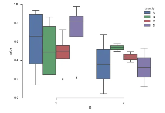
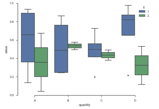
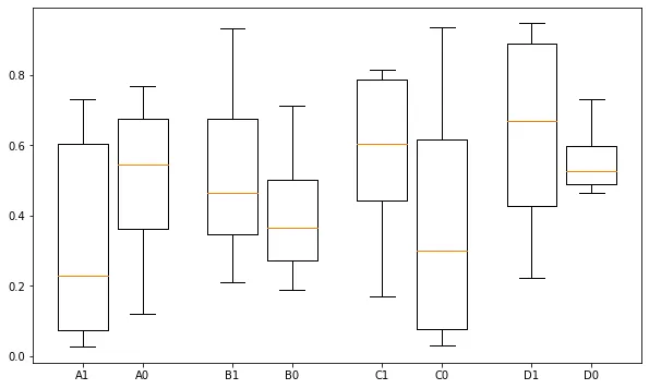
在这个例子中,类别是1、2、3、4。我想在同一图上侧边放置分开的箱线图,只显示类别1和2,并在图例中显示类别名称。
有什么方法可以做到这一点吗?
额外信息:
输出应该类似于here中的第三幅图 - 将“Yes”,“No”替换为“1”,“2”。

这个例子不起作用,因为matplotlib按列绘制数据,所以会有4个箱线图,标记为A、B、C和D。 - Paul H
是的,没错。我想要为第一类别生成4个箱线图,并为第二类别生成4个箱线图。我在问题原帖中添加了一个链接,展示了其他地方类似的绘图方式。我正在寻找类似的绘图方式。 - edesz
2个回答

18

从这里开始:

import numpy
import pandas
from matplotlib import pyplot
import seaborn
seaborn.set(style="ticks")

# Data
df = pandas.DataFrame(numpy.random.rand(10,4), columns=list('ABCD'))
df['E'] = [1, 2, 3, 1, 1, 4, 3, 2, 3, 1]

你有几个选项。如果使用单独的轴可以接受,

fig, axes = pyplot.subplots(ncols=4, figsize=(12, 5), sharey=True)
df.query("E in [1, 2]").boxplot(by='E', return_type='axes', ax=axes)

enter image description here

如果你只需要一个轴,我认为seaborn会更容易一些。你只需要整理好你的数据即可。

ax = (
    df.set_index('E', append=True)  # set E as part of the index
      .stack()                      # pull A - D into rows 
      .to_frame()                   # convert to a dataframe
      .reset_index()                # make the index into reg. columns
      .rename(columns={'level_2': 'quantity', 0: 'value'})  # rename columns
      .drop('level_0', axis='columns')   # drop junk columns
      .pipe((seaborn.boxplot, 'data'), x='E', y='value', hue='quantity', order=[1, 2])  
)
seaborn.despine(trim=True)

在此输入图片描述

Seaborn很酷的一点是稍微调整一下参数就可以大大改善图表布局。如果我们将huex变量互换,我们会得到:

ax = (
    df.set_index('E', append=True)  # set E as part of the index
      .stack()                      # pull A - D into rows 
      .to_frame()                   # convert to a dataframe
      .reset_index()                # make the index into reg. columns
      .rename(columns={'level_2': 'quantity', 0: 'value'})  # rename columns
      .drop('level_0', axis='columns')   # drop junk columns
      .pipe((seaborn.boxplot, 'data'), x='quantity', y='value', hue='E', hue_order=[1, 2])  
)
seaborn.despine(trim=True)

enter image description here

如果你感到好奇,最终的数据框大致如下:

    E quantity     value
0   1        A  0.935433
1   1        B  0.862290
2   1        C  0.197243
3   1        D  0.977969
4   2        A  0.675037
5   2        B  0.494440
6   2        C  0.492762
7   2        D  0.531296
8   3        A  0.119273
9   3        B  0.303639
10  3        C  0.911700
11  3        D  0.807861

当我尝试运行df = df.set_index('E', append=True).stack().to_frame().rename(columns={'level_2': 'quantity', 0: 'value'}).drop('level_0', axis='columns')时,出现了错误ValueError: labels ['level_0'] not contained in axis。在绘制图表之前,我更愿意先查看数据框架。是否可以先生成Pandas DF再生成箱线图?此外,在seaborn中是否可以自定义事物,如须大小、帽子大小、异常值大小/颜色等? - edesz
1
是的。只需不将其导入 seaborn.boxplot 并单独调用即可。 - Paul H
谢谢,那个有用。在 seaborn 中是否可能自定义事物,例如须的大小、盖帽的大小、异常值的大小/颜色?例如,在 matplotlib 中,我会执行 bp = ax.boxplot() 然后对于每个须,我会执行 for whisker in bp['whiskers']: whisker.set(lw=0.5,linestyle='-')。当我尝试在 bp = sns.boxplot() 中执行此操作时,我得到 TypeError: 'Axes' object has no attribute '__getitem__'。这些自定义可以做到吗? - edesz
1
seaborn.boxplots 将所有的附加参数直接传递给 pyplot.boxplot,其文档在此处:http://matplotlib.org/api/pyplot_api.html#matplotlib.pyplot.boxplot。如果你想深入了解自定义箱线图的细节,那就需要提出一个单独的问题。 - Paul H
很棒的答案。这回答了我的问题并提供了一种快速可视化数据框的替代方法。 - edesz
关于箱线图的一个方面的定制,我已经发布了一个单独的问题:https://dev59.com/y5ffa4cB1Zd3GeqP1gP5。如果您能在那里看一下,那就太好了。对于这个问题,这不是必要的。再次感谢。 - edesz

5

@Paul_H 的回答中还有一个补充。

在单个 matplotlib.axes.Axes 上放置并列的箱线图,没有使用 seaborn 库:

import pandas as pd
import numpy as np
import matplotlib.pyplot as plt


df = pd.DataFrame(np.random.rand(10,4), columns=list('ABCD'))
df['E'] = [1, 2, 1, 1, 1, 2, 1, 2, 2, 1]

mask_e = df['E'] == 1

# prepare data
data_to_plot = [df[mask_e]['A'], df[~mask_e]['A'],
                df[mask_e]['B'], df[~mask_e]['B'],
                df[mask_e]['C'], df[~mask_e]['C'],
                df[mask_e]['D'], df[~mask_e]['D']]

# Positions defaults to range(1, N+1) where N is the number of boxplot to be drawn.
# we will move them a little, to visually group them
plt.figure(figsize=(10, 6))
box = plt.boxplot(data_to_plot,
                  positions=[1, 1.6, 2.5, 3.1, 4, 4.6, 5.5, 6.1],
                  labels=['A1','A0','B1','B0','C1','C0','D1','D0'])

result


网页内容由stack overflow 提供, 点击上面的
可以查看英文原文,
原文链接