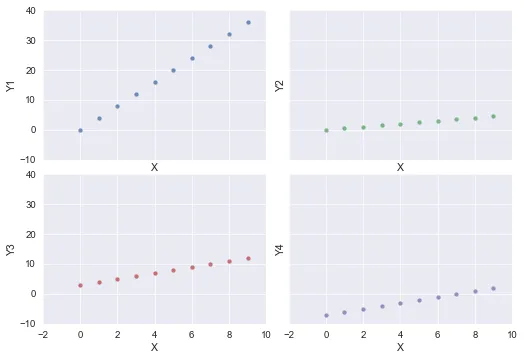
我第一次使用seaborn,尝试使用matplotlib子图在不同的图表上绘制pandas数据框中的不同列。下面的简单代码生成了预期的图形,但是最后一个图没有适当的y范围(它似乎与数据框中的所有值的完整范围相关联)。 有人知道为什么会发生这种情况以及如何防止它吗?谢谢。
import matplotlib.pyplot as plt
import numpy as np
import pandas as pds
import seaborn as sns

X = np.arange(0,10)
df = pds.DataFrame({'X': X, 'Y1': 4*X, 'Y2': X/2., 'Y3': X+3, 'Y4': X-7})

fig, axes = plt.subplots(ncols=2, nrows=2)
ax1, ax2, ax3, ax4 = axes.ravel()
sns.set(style="ticks")
sns.despine(fig=fig)

sns.regplot(x='X', y='Y1', data=df, fit_reg=False, ax=ax1)
sns.regplot(x='X', y='Y2', data=df, fit_reg=False, ax=ax2)
sns.regplot(x='X', y='Y3', data=df, fit_reg=False, ax=ax3)
sns.regplot(x='X', y='Y4', data=df, fit_reg=False, ax=ax4)

plt.show()
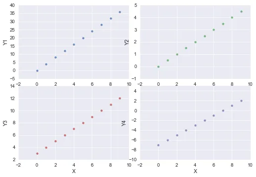
更新:我使用以下代码进行了修改:
fig, axes = plt.subplots(ncols=2, nrows=3)
ax1, ax2, ax3, ax4, ax5, ax6 = axes.ravel()
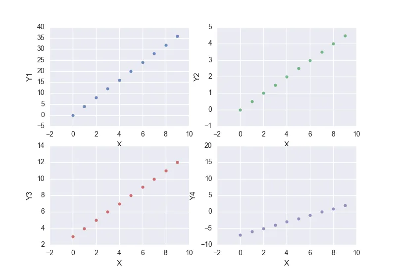
如果我在除了最后一个轴以外的任何轴上绘制数据,我就能得到我想要的结果:
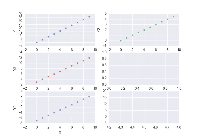 当然,我不想要空白框架。所有的图表都以类似的视觉效果呈现数据。当数据绘制在最后一个轴上时,它会获得一个范围太宽的 y 轴,就像第一个示例中一样。只有最后一个轴似乎有这个问题。有什么线索吗?