我正在尝试使用ggplot2绘制这个逻辑回归图。
df <- structure(list(y = c(2L, 7L, 776L, 19L, 12L, 26L, 7L, 12L, 8L,
24L, 20L, 16L, 12L, 10L, 23L, 20L, 16L, 12L, 18L, 22L, 23L, 22L,
13L, 7L, 20L, 12L, 13L, 11L, 11L, 14L, 10L, 8L, 10L, 11L, 5L,
5L, 1L, 2L, 1L, 1L, 0L, 0L, 0L), n = c(3L, 7L, 789L, 20L, 14L,
27L, 7L, 13L, 9L, 29L, 22L, 17L, 14L, 11L, 30L, 21L, 19L, 14L,
22L, 29L, 28L, 28L, 19L, 10L, 27L, 22L, 18L, 18L, 14L, 23L, 18L,
12L, 19L, 15L, 13L, 9L, 7L, 3L, 1L, 1L, 1L, 1L, 1L), x = c(18L,
19L, 20L, 21L, 22L, 23L, 24L, 25L, 26L, 27L, 28L, 29L, 30L, 31L,
32L, 33L, 34L, 35L, 36L, 37L, 38L, 39L, 40L, 41L, 42L, 43L, 44L,
45L, 46L, 47L, 48L, 49L, 50L, 51L, 52L, 53L, 54L, 55L, 56L, 59L,
62L, 63L, 66L)), .Names = c("y", "n", "x"), class = "data.frame", row.names = c(NA,
-43L))
mod.fit <- glm(formula = y/n ~ x, data = df, weight=n, family = binomial(link = logit),
na.action = na.exclude, control = list(epsilon = 0.0001, maxit = 50, trace = T))
summary(mod.fit)
Pi <- c(0.25, 0.5, 0.75)
LD <- (log(Pi /(1-Pi))-mod.fit$coefficients[1])/mod.fit$coefficients[2]
LD.summary <- data.frame(Pi , LD)
LD.summary
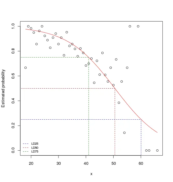
plot(df$x, df$y/df$n, xlab = "x", ylab = "Estimated probability")
lin.pred <- predict(mod.fit)
pi.hat <- exp(lin.pred)/(1 + exp(lin.pred))
lines(df$x, pi.hat, lty = 1, col = "red")
segments(x0 = LD.summary$LD, y0 = -0.1, x1 = LD.summary$LD, y1 = LD.summary$Pi,
lty=2, col=c("darkblue","darkred","darkgreen"))
segments(x0 = 15, y0 = LD.summary$Pi, x1 = LD.summary$LD, y1 = LD.summary$Pi,
lty=2, col=c("darkblue","darkred","darkgreen"))
legend("bottomleft", legend=c("LD25", "LD50", "LD75"), lty=2, col=c("darkblue","darkred","darkgreen"), bty="n", cex=0.75)
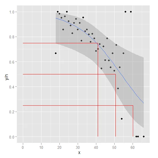
这是我使用 ggplot2 的尝试。
library(ggplot2)

p <- ggplot(data = df, aes(x = x, y = y/n)) +
            geom_point() +
            stat_smooth(method = "glm", family = "binomial")

p <- p + geom_segment(aes(
                            x = LD.summary$LD
                          , y = 0
                          , xend = LD.summary$LD
                          , yend = LD.summary$Pi
                         )
                         , colour="red"
                       )

p <- p + geom_segment(aes(
                            x = 0
                          , y = LD.summary$Pi
                          , xend = LD.summary$LD
                          , yend = LD.summary$Pi
                         )
                         , colour="red"
                       )

print(p)
问题
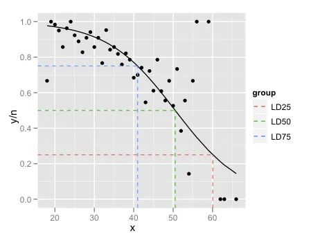
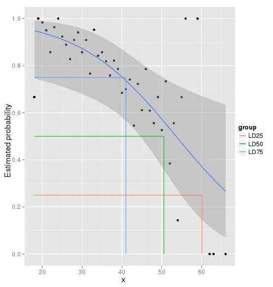
glm和stat_smooth的预测值看起来不同。这两种方法会产生不同的结果,还是我漏了什么。- 我的ggplot2图形与基本R图形不完全相同。
- 如何在ggplot2中使用不同颜色的线段?
- 如何在ggplot2中添加图例?
非常感谢您的帮助和时间。谢谢
Pi <- c(0.25, 0.5, 0.75)中,为什么将变量称为“Pi”?“Pi”是什么的缩写?同样的问题也适用于“LD”。 - Erdogan CEVHER