逻辑回归 + ggplot2直方图

6

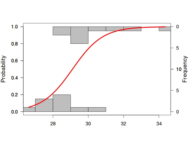
我有一些二进制数据,希望能够在同一张图上绘制逻辑回归线和相对频率为0和1的直方图。

我找到了一个非常好的实现方式,使用popbio包,这里是shizuka lab的页面:shizuka lab's page

以下是一个使用library(popbio)运行的最小化工作示例(由shizuka lab提供):

bodysize=rnorm(20,30,2) # generates 20 values, with mean of 30 & s.d.=2
bodysize=sort(bodysize) # sorts these values in ascending order.
survive=c(0,0,0,0,0,1,0,1,0,0,1,1,0,1,1,1,0,1,1,1) # assign 'survival' to these 20 individuals non-randomly... most mortality occurs at smaller body size
dat=as.data.frame(cbind(bodysize,survive))

#and now the plot
library(popbio)
logi.hist.plot(bodysize,survive,boxp=FALSE,type="hist",col="gray")

这将会产生:

在此输入图片描述

现在,能否使用ggplot2来实现这个效果?


ggplot和双y轴在哲学上是“困难的”,但可能有类似的解决方案。 - Heroka
@Heroka和我都同意这个理念 - 通常我尽量不使用它们。不过,在这种情况下,我可以理解为什么要使用它们 - 它能够让你真正感受到数据的本质,而使用geom_smooth()+geom_point()只会显示一个点,无法清楚地了解到整体数据的趋势。我试过使用geom_smooth()+geom_point(position='jitter'),但是我的数据量很大,导致jitter效果非常难以控制。 - PaoloCrosetto
1个回答

4

以下是一些想法

ggplot(dat, aes(x = bodysize, y = survive)) + 
  geom_dotplot(
    aes(fill = factor(survive)), method = "histodot", binpositions = "all", 
    stackgroups = TRUE, stackdir = "centerwhole", binwidth = 1
  ) +
  geom_smooth(method = "glm", family = "binomial")

ggplot(dat, aes(x = bodysize, y = survive)) + 
  geom_hex(bins = 10) +
  geom_smooth(method = "glm", family = "binomial")

ggplot(dat, aes(x = bodysize, y = survive)) + 
  geom_bin2d(bins = 10) +
  geom_smooth(method = "glm", family = "binomial")

虽然有很多可能性,但还是没有达到目标。我的意思是,它们都很好,但不像popbio示例那样易读。 - PaoloCrosetto
一个更详细的解决方案是计算直方图。然后计算直方图条形的坐标。然后在 geom_rect() 中使用这些坐标。 - Thierry
geom_smooth() now takes family as a list of method.args: geom_smooth(method = "glm", method.args = list(family = "binomial")) - bdetweiler

网页内容由stack overflow 提供, 点击上面的
可以查看英文原文,
原文链接