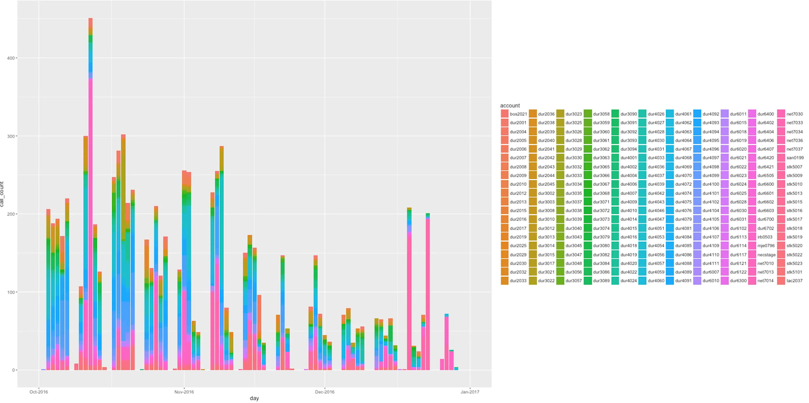
我对使用R得到的结果非常满意。我的大部分堆叠直方图都看起来很好,例如:
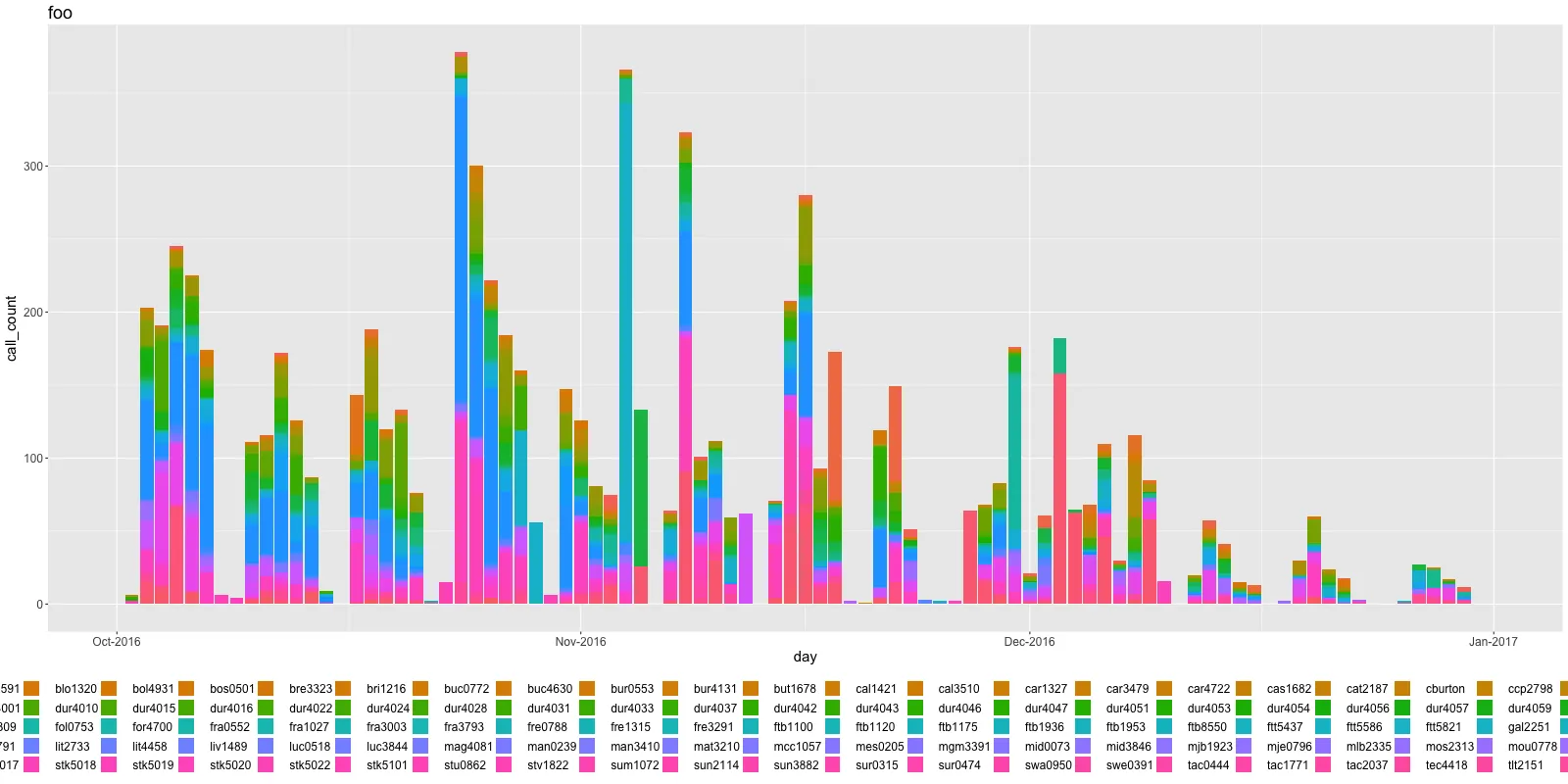
并且
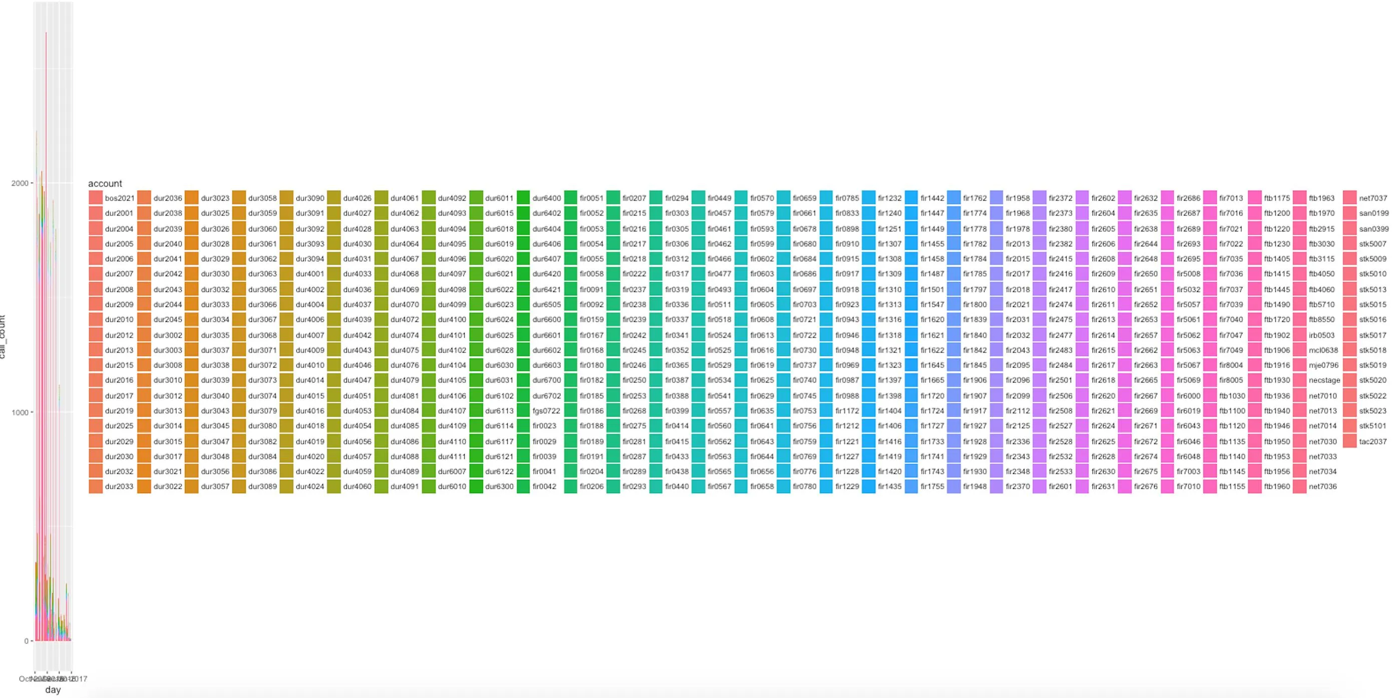
我该如何修复这个问题?
这是我的plot.r文件,我通过命令行调用它,像这样:
RScript plot.r foo.dat foo.png 1600 800
foo.dat
account,operation,call_count,day
cal3510,foo-method,1,2016-10-01
cra4617,foo-method,1,2016-10-03
cus4404,foo-method,1,2016-10-03
hin4510,foo-method,1,2016-10-03
mas4484,foo-method,1,2016-10-04
...
foo.dat的全部内容:http://pastebin.com/xnJtJSrU
plot.r
library(ggplot2)
library(scales)

args<-commandArgs(TRUE)

filename<-args[1]
png_filename<-args[2]

wide<-as.numeric(args[3])
high<-as.numeric(args[4])

print(wide)
print(high)

print(filename)
print(png_filename)

dat = read.csv(filename)

dat$account = as.character(dat$account)
dat$operation = as.character(dat$operation)
dat$call_count = as.integer(dat$call_count)
dat$day = as.Date(dat$day)

png(png_filename,width=wide,height=high)

p <- ggplot(dat, aes(x=day, y=call_count, fill=account))
p <- p + geom_histogram(stat="identity")
p <- p + scale_x_date(labels=date_format("%b-%Y"), limits=as.Date(c('2016-10-01','2017-01-01')))

print(p)

dev.off()
theme(legend.position="bottom")。 - Pierre Lguides(fill=guide_legend(nrow=2, byrow=TRUE))。 - Pierre L