使用'ggplot2'绘制具有对数网格的图形

12

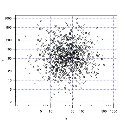
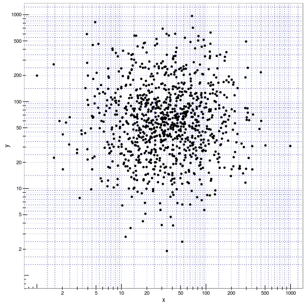
我正在尝试使用ggplot2创建一个像下面这张图片一样具有对数间隔网格的绘图。 我得到了等距离的网格,但不是对数间隔的。 我知道我缺少一些参数,但我现在似乎无法获得它。 我已经看到了许多关于这个主题的问题,如使用ggplot2创建对数正常刻度线(动态而非手动),但没有解决我正在寻找的问题。

set.seed(5)
x <- rlnorm(1000, meanlog=3.5, sdlog=1)
y <- rlnorm(1000, meanlog=4.0, sdlog=1)
d <- data.frame(x, y)

plot(x, y, log="xy", las=1)
grid(nx=NULL, ny=NULL, col= "blue", lty="dotted", equilogs=FALSE)
library(magicaxis)
magaxis(side=1:2, ratio=0.5, unlog=FALSE, labels=FALSE)

在此输入图像描述

library(ggplot2)
library(MASS)
library(scales)
a <- ggplot(d, aes(x=x, y=y)) + geom_point() +
     scale_x_log10(limits = c(1, NA), 
                   labels = trans_format("log10", math_format(10^.x)),
                   breaks=trans_breaks("log10", function(x) 10^x, n=4)) +
     scale_y_log10(limits = c(1, NA),
                   labels = trans_format("log10", math_format(10^.x)),
                   breaks=trans_breaks("log10", function(x) 10^x, n=4)) +
     theme_bw() + theme(panel.grid.minor = element_line(color="blue", linetype="dotted"), panel.grid.major = element_line(color="blue", linetype="dotted"))
a + annotation_logticks(base = 10)
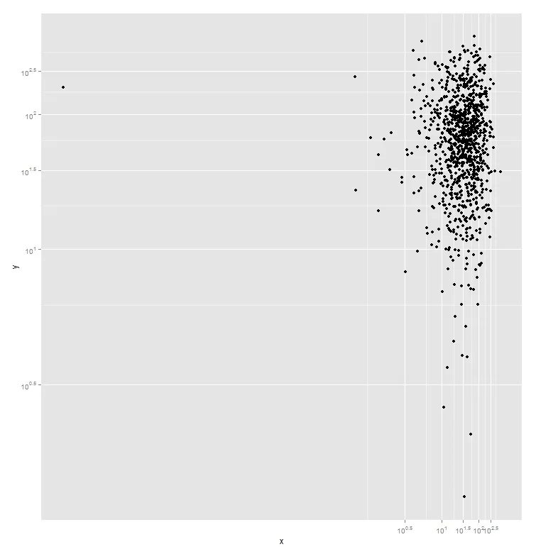
这里输入图片描述

4个回答

19

在Gabor的回答基础上,定义刻度不一定只能在图的精确范围内。相反,您可以为大范围值定义断点,这将覆盖您预期看到的几乎所有内容,并使用它们来为任何绘图创建漂亮的网格线。虽然可能不是最优雅的解决方案,但比每次手动计算范围更容易且更具普适性。

breaks <- 10^(-10:10)
minor_breaks <- rep(1:9, 21)*(10^rep(-10:10, each=9))

d %>% 
    ggplot(aes(x, y)) +
        geom_point() +
        scale_x_log10(breaks = breaks, minor_breaks = minor_breaks) +
        scale_y_log10(breaks = breaks, minor_breaks = minor_breaks) +
        annotation_logticks() +
        coord_equal() +
        theme_bw()

图表链接


d %>% ggplot(aes(x, y)) 中的错误:找不到函数“%>%”。 - Mike T
1
我习惯使用tidyverse(其中ggplot是一部分),因此我使用了magrittr的管道运算符%>%。但这对问题来说完全不必要。如果您不想使用管道,可以使用ggplot(d, aes(x, y)) - Ian Kent

5

您是否正在寻找像这样的减少间距网格?

ggplot(d, aes(x=x, y=y)) + geom_point() + 
  coord_trans(y="log10", x="log10") +
  scale_y_continuous(trans = log10_trans(),
                     breaks = trans_breaks("log10", function(x) 10^x),
                     labels = trans_format("log10", math_format(10^.x))) +
  scale_x_continuous(trans = log10_trans(),
                     breaks = trans_breaks("log10", function(x) 10^x),
                     labels = trans_format("log10", math_format(10^.x)))

enter image description here


3

对于使用ggplot2的对数间隔网格,Samehmagd提供的答案因其简单性而闪耀,不需要手动设置,而且它回答了问题。

在我自己的数据上使用它时,我发现了一个似乎是bug的东西。至少在我的手中,当要绘制的值小于1(因此应用log10时生成负值)时,这种策略会失败。

这是由Samehmagd提供的示例,加上我末尾的贡献:

library(ggplot2)
library(scales)

set.seed(5)
x <- rlnorm(1000, meanlog=3.5, sdlog=1)
y <- rlnorm(1000, meanlog=4.0, sdlog=1)
d <- data.frame(x, y)

# peek at d
head(d)
#            x         y
# 1  14.284064  12.74253
# 2 132.205740 189.53295
# 3   9.435773  35.44751
# 4  35.521664  54.97449
# 5 183.358064  61.84004
# 6  18.121372  36.24753

# Plot successfully (this figure is identical to Samehmagd's)
ggplot(d, aes(x=x, y=y)) + geom_point() + coord_trans(y="log10", x="log10") + scale_y_continuous(trans=log10_trans(), breaks=trans_breaks("log10", function(x) 10^x), labels=trans_format("log10", math_format(10^.x))) + scale_x_continuous(trans=log10_trans(), breaks=trans_breaks("log10", function(x) 10^x), labels=trans_format("log10", math_format(10^.x)))

# Now, here is when it breaks
f <- 1/d

# peek at f
head(f)
#             x           y
# 1 0.070008087 0.078477335
# 2 0.007563968 0.005276127
# 3 0.105979655 0.028210728
# 4 0.028151834 0.018190255
# 5 0.005453810 0.016170753
# 6 0.055183459 0.027588083

# Get the plotting to fail just by using f instead of d, no other change.
ggplot(f, aes(x=x, y=y)) + geom_point() + coord_trans(y="log10", x="log10") + scale_y_continuous(trans=log10_trans(), breaks=trans_breaks("log10", function(x) 10^x), labels=trans_format("log10", math_format(10^.x))) + scale_x_continuous(trans=log10_trans(), breaks=trans_breaks("log10", function(x) 10^x), labels=trans_format("log10", math_format(10^.x)))
Error in if (zero_range(range)) { : missing value where TRUE/FALSE needed
In addition: Warning message:
In trans$transform(out$range) : NaNs produced

无论这个失败是一个错误还是一个功能,记录它都是非常值得的。

2
您可以手动定义断点。
> ticks <- 2:10
> ooms <- 10^(0:3)
> breaks <- as.vector(ticks %o% ooms)
> breaks
 [1]     2     3     4     5     6     7     8     9    10
[10]    20    30    40    50    60    70    80    90   100
[19]   200   300   400   500   600   700   800   900  1000
[28]  2000  3000  4000  5000  6000  7000  8000  9000 10000

此代码段定义了断点,隐藏了其中一些,并生成了这个图表。
library(ggplot2)

set.seed(5)
x <- rlnorm(1000, meanlog=3.5, sdlog=1)
y <- rlnorm(1000, meanlog=4.0, sdlog=1)
d <- data.frame(x, y)

ticks <- 2:10
# define the OOMs (orders of magnitudes)
ooms <- 10^(0:3)
breaks <- as.vector(ticks %o% ooms)

# select the labels to show
show.labels <- c(T, F, F, T, F, F, F, F, T)
labels <- as.character(breaks * show.labels)
labels <- gsub("^0$", "", labels)

p <- ggplot(d, aes(x=x, y=y)) + geom_point() +
  scale_x_log10(limits = c(1, NA), labels = labels, breaks = breaks) +
  scale_y_log10(limits = c(1, NA), labels = labels, breaks = breaks) +
  theme_bw() + theme(panel.grid.minor = element_line(color="blue", linetype="dotted"), panel.grid.major = element_line(color="blue", linetype="dotted")) +
  annotation_logticks(base = 10)
p

Scatterplot with logaritmic axes and custom ticks


网页内容由stack overflow 提供, 点击上面的
可以查看英文原文,
原文链接