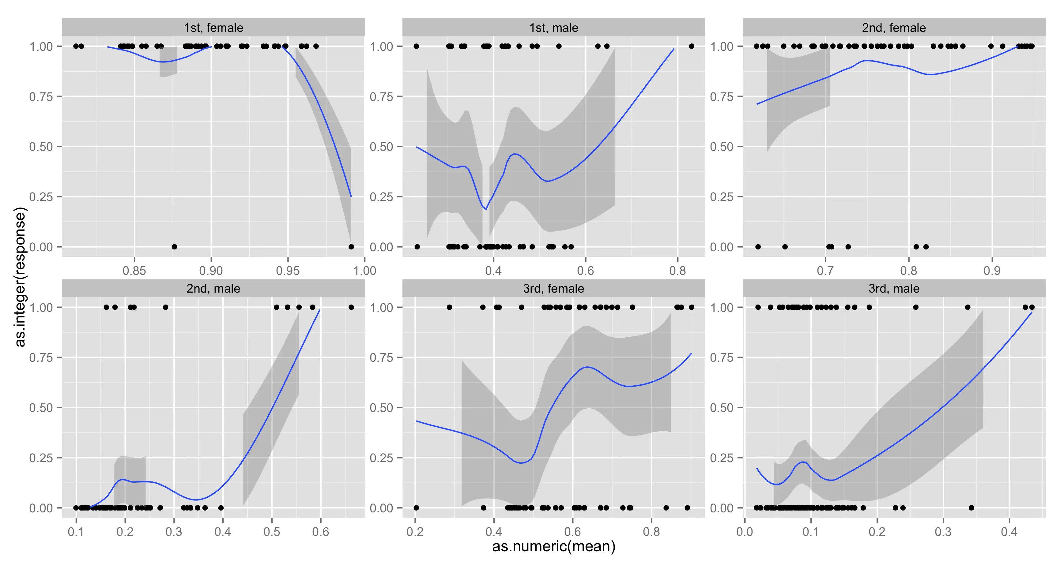
我试图绘制二项选择glm模型的预测结果,将其与泰坦尼克号数据中的实际概率进行比较并显示在分类和性别方面的差异。我使用分面展示,但我有两个问题无法解决。第一个是我想限制loess曲线在0到1之间,但如果我在图的末尾添加选项
ylim(c(0,1)),则围绕loess曲线的带状物会被切断,如果其一侧处于界限之外。第二件事是我想从每个细分中的最小x值(glm的预测概率)到该细分内的最大x值,以及y = 1绘制一条线,以显示glm预测的概率。
#info on this data http://biostat.mc.vanderbilt.edu/wiki/pub/Main/DataSets/titanic3info.txt
load(url('http://biostat.mc.vanderbilt.edu/wiki/pub/Main/DataSets/titanic3.sav'))
titanic <- titanic3[ ,-c(3,8:14)]; rm(titanic3)
titanic <- na.omit(titanic) #probably missing completely at random
titanic$age <- as.numeric(titanic$age)
titanic$sibsp <- as.integer(titanic$sibsp)
titanic$survived <- as.integer(titanic$survived)

training.df <- titanic[sample(nrow(titanic), nrow(titanic) / 2), ]
validation.df <- titanic[!(row.names(titanic) %in% row.names(training.df)), ]


glm.fit <- glm(survived ~ sex + sibsp + age + I(age^2) + factor(pclass) + sibsp:sex,
               family = binomial(link = "probit"), data = training.df)

glm.predict <- predict(glm.fit, newdata = validation.df, se.fit = TRUE, type = "response")

plot.data <- data.frame(mean = glm.predict$fit, response = validation.df$survived,
                        class = validation.df$pclass, sex = validation.df$sex)

require(ggplot2)
ggplot(data = plot.data, aes(x = as.numeric(mean), y = as.integer(response))) + geom_point() +
       stat_smooth(method = "loess", formula = y ~ x) +
       facet_wrap( ~ class + sex, scale = "free") + ylim(c(0,1)) +
       xlab("Predicted Probability of Survival") + ylab("Empirical Survival Rate")
mean替换x,那就可以了。非常感谢。 - Zach