使用ggplot2中的图形GLM,其中x变量是分类变量

4
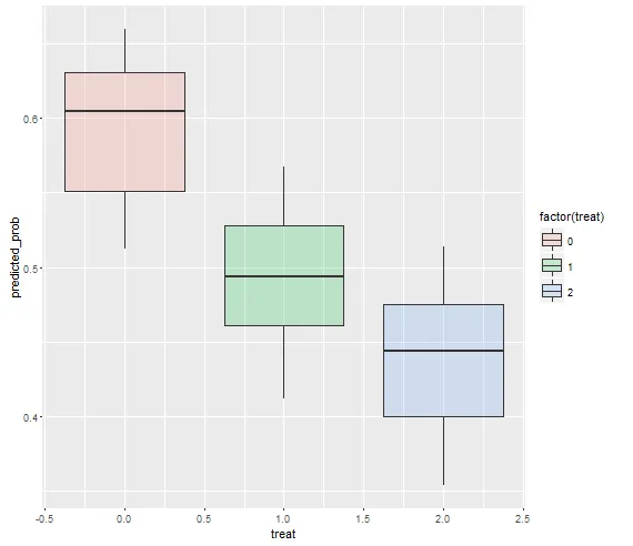
我需要在ggplot2中绘制逻辑回归的预测概率图。本质上,我正在尝试在同一图表中按每个处理条件绘制glm。然而,我对如何做到这一点感到非常困惑,因为我的变量treat(即我感兴趣的x)是分类的。这意味着当我尝试使用ggplot绘制治疗效果时,我只会得到0、1和2的一堆点,但没有线条。
我的问题是...在这种情况下,我该如何绘制逻辑回归预测线?谢谢!
set.seed(96)
df <- data.frame(
  vote = sample(0:1, 200, replace = T),
  treat = sample(0:3, 200, replace = T))

glm_output <- glm(vote ~ as.factor(treat), data = df, family = binomial(link = "logit"))

predicted_vote <- predict(glm_output, newdata = df, type = "link", interval = "confidence", se = TRUE)
df <- cbind(df, data.frame(predicted_vote))
1个回答

4

由于自变量treat是分类变量,因此最好使用箱线图,如下所示:

ggplot(df, aes(x = treat, y = predicted_prob)) +
  geom_boxplot(aes(fill = factor(treat)), alpha = .2)

enter image description here

如果你想查看在其他解释变量的不同值下,glm 的预测概率,可以尝试以下方法:

ggplot(df, aes(x = treat, y = predicted_prob)) +
  geom_boxplot(aes(fill = factor(treat)), alpha = .2) + facet_wrap(~gender)

enter image description here

# create age groups 
df$age_group <- cut(df$age, breaks=seq(0,100,20))

ggplot(df, aes(x = treat, y = predicted_prob)) +
  geom_boxplot(aes(fill = factor(treat)), alpha = .2) + facet_grid(age_group~gender)

enter image description here


网页内容由stack overflow 提供, 点击上面的
可以查看英文原文,
原文链接