ggplot2:如何通过多个变量对图形进行着色

10

我很确定我在某个地方看到过这个问题的解决方案,但是由于我一直找不到它,所以这是我的问题。

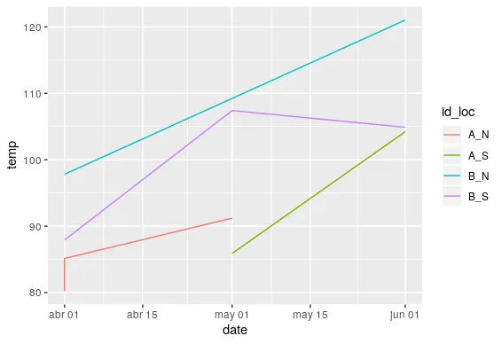
我有一些由多个变量识别的时间序列数据,我希望能够使用ggplot2中的多个变量来绘制图形并区分颜色。

示例数据:

date <- c("2016-04-01 UTC", "2016-05-01 UTC", "2016-06-01 UTC", "2016-04-01 UTC",
          "2016-05-01 UTC", "2016-06-01 UTC", "2016-04-01 UTC", "2016-05-01 UTC",
          "2016-06-01 UTC", "2016-04-01 UTC")
temp <- c(80.24018,  85.88911, 104.23125,  85.13571,  91.21129, 104.88333,  97.81116,
          107.40484, 121.03958,  87.91830)
id <- c("A","A","A","A","A","B","B","B","B","B")
location <- c("N","S","S","N","N","S","N","S","N","S")

df <- data.frame(date,temp,id,location)

我的尝试绘制图表
library(ggplot2)

ggplot(df) + 
  geom_line(aes(x=date,y=temp,colour=factor(location), group=interaction(location,id)))

使用这段代码只能按位置进行着色。我希望行可以根据位置和ID进行着色。

1
ggplot(df, aes(as.Date(date), temp, color = id, linetype = location)) + geom_path()?或者ggplot(df, aes(as.Date(date), temp, color = id:location)) + geom_line(),但是后者更加令人困惑。 - alistaire
3个回答

20

两个选项:

library(ggplot2)

df <- data.frame(date = c("2016-04-01 UTC", "2016-05-01 UTC", "2016-06-01 UTC", "2016-04-01 UTC", "2016-05-01 UTC", "2016-06-01 UTC", "2016-04-01 UTC", "2016-05-01 UTC", "2016-06-01 UTC", "2016-04-01 UTC"),
                 temp = c(80.24018,  85.88911, 104.23125,  85.13571,  91.21129, 104.88333,  97.81116, 107.40484, 121.03958,  87.91830),
                 id = c("A","A","A","A","A","B","B","B","B","B"),
                 location = c("N","S","S","N","N","S","N","S","N","S"))

df$date <- as.Date(df$date)    # parse dates to get a nicer x-axis

id 映射到颜色,将 location 映射到线型:

ggplot(df, aes(date, temp, color = id, linetype = location)) + geom_path()

...或将所有互动绘制为不同的颜色:

ggplot(df, aes(date, temp, color = id:location)) + geom_path()


第二种方法似乎不再起作用了。但是David Pritchard的解决方案似乎可以解决这个问题。 - hmhensen

5
冒号语法对我也不起作用,但是这个可以: ggplot(df, aes(date, temp, color = interaction(id, location, sep=':'))) + geom_path()

3
我想提供另一种方法。我不知道为什么,但color=id:location对我来说无效。我通过使用tidyr::unite解决了这个问题。
我是这样做的:
library(ggplot2)

df <- data.frame(date = c("2016-04-01 UTC", "2016-05-01 UTC", "2016-06-01 UTC", "2016-04-01 UTC", "2016-05-01 UTC", "2016-06-01 UTC", "2016-04-01 UTC", "2016-05-01 UTC", "2016-06-01 UTC", "2016-04-01 UTC"),
                 temp = c(80.24018,  85.88911, 104.23125,  85.13571,  91.21129, 104.88333,  97.81116, 107.40484, 121.03958,  87.91830),
                 id = c("A","A","A","A","A","B","B","B","B","B"),
                 location = c("N","S","S","N","N","S","N","S","N","S"))

df$date <- as.Date(df$date) 

df <- tidyr::unite(df,"id_loc",id,location,remove = F)
ggplot(df,aes(date, temp, color = id_loc)) + geom_path()

生成的绘图


网页内容由stack overflow 提供, 点击上面的
可以查看英文原文,
原文链接