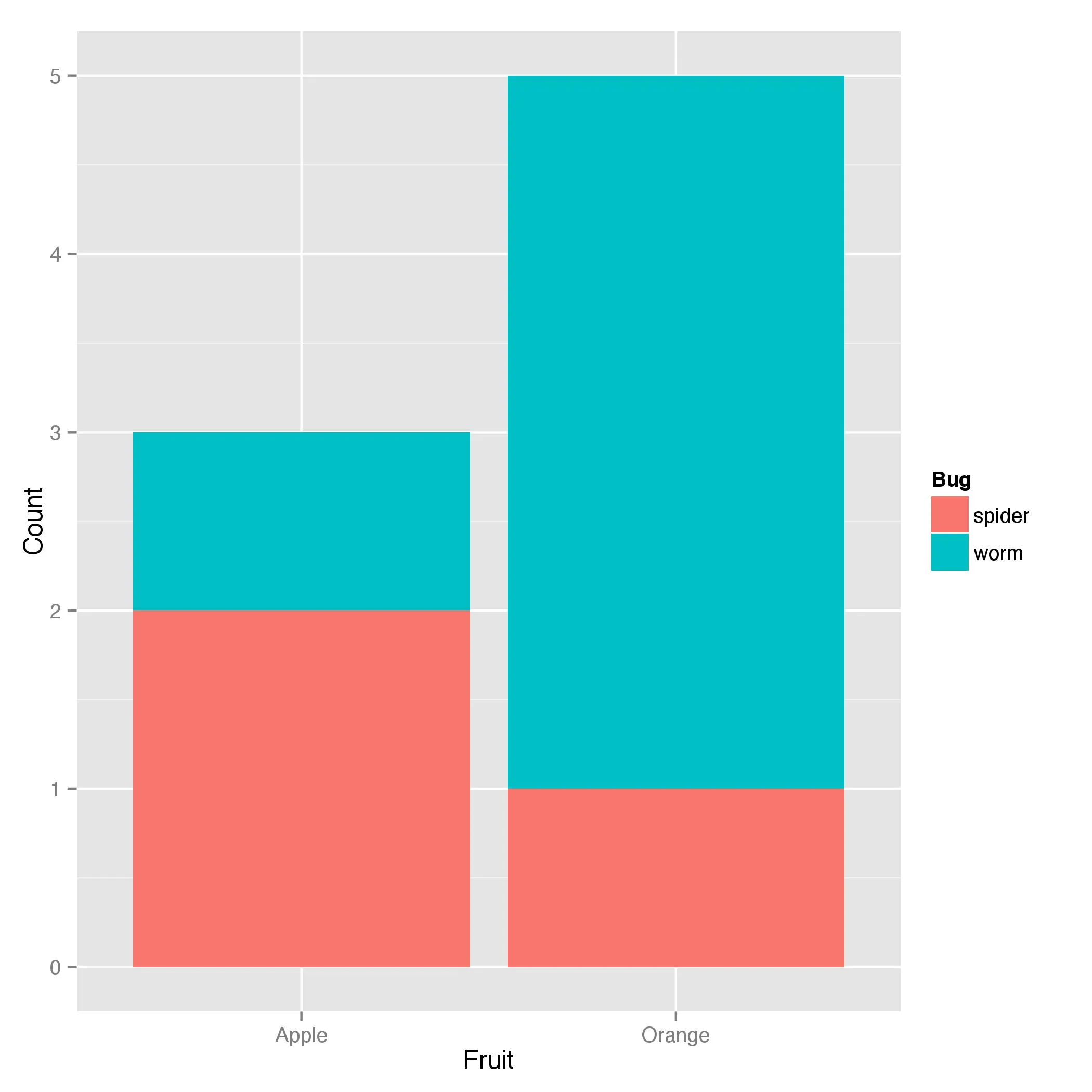
使用ggplot2绘制具有两个分类变量的条形图

14

假设我有以下数据:

Fruit <- c(rep("Apple",3),rep("Orange",5))
Bug <- c("worm","spider","spider","worm","worm","worm","worm","spider")

df <- data.frame(Fruit,Bug)
df

   Fruit    Bug
1  Apple   worm
2  Apple spider
3  Apple spider
4 Orange   worm
5 Orange   worm
6 Orange   worm
7 Orange   worm
8 Orange spider
我想使用ggplot创建一个条形图,其中x轴为水果类型,填充颜色为虫害类型。我希望条形图显示苹果和橙子中虫害计数的数量。因此,条形图应该像这样:

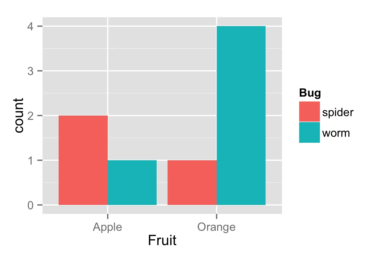
苹果(红色虫子,y=1;蓝色蜘蛛,y=2)BREAK 橙子(红色虫子,y=4;蓝色蜘蛛,y=1)

希望这样描述清晰明了。谢谢!

你看过这里的例子吗?http://docs.ggplot2.org/0.9.3.1/geom_bar.html - konvas
2个回答

35
Fruit <- c(rep("Apple",3),rep("Orange",5))
Bug <- c("worm","spider","spider","worm","worm","worm","worm","spider")

df <- data.frame(Fruit,Bug)

ggplot(df, aes(Fruit, ..count..)) + geom_bar(aes(fill = Bug), position = "dodge")

在此输入图片描述


9

使用双向表格非常容易实现:

dat <- data.frame(table(df$Fruit,df$Bug))
names(dat) <- c("Fruit","Bug","Count")

ggplot(data=dat, aes(x=Fruit, y=Count, fill=Bug)) + geom_bar(stat="identity")

enter image description here


1
此外,ggplot2 实际上有一个选项可以直接使用 ..count....density.. 绘制计数/密度图,而不必使用双向表格。 - tkmckenzie
1
Count 的值在哪里? - SabreWolfy
@SabreWolfy 我是通过对数据进行表格化处理 data.frame(table(df$Fruit,df$Bug)) 来生成的,你也可以使用内置函数,就像 @tkmckenzie 所说的那样。 - bjoseph

网页内容由stack overflow 提供, 点击上面的
可以查看英文原文,
原文链接