如何在ggplot2中绘制logit和probit图形

11

这几乎可以肯定是一个新手问题。

对于下面的数据集,我一直在尝试使用ggplot2绘制logit和probit曲线,但没有成功。

Ft Temp TD

    1  66 0
    6  72 0
    11 70 1
    16 75 0
    21 75 1
    2   70 1
    7   73 0
    12 78 0
    17 70 0
    22 76 0
    3   69 0
    8   70 0
    13 67 0
    18 81 0
    23 58 1
    4   68 0
    9   57 1
    14 53 1
    19 76 0
    5   67 0
    10 63 1
    15 67 0
    20 79 0

我一直在天真地使用的代码是:
    library(ggplot2)
    TD<-mydata$TD
    Temp<-mydata$Temp
    g<-    qplot(Temp,TD)+geom_point()+stat_smooth(method="glm",family="binomial",formula=y~x,col="red")
    g1<-g+labs(x="Temperature",y="Thermal Distress")
    g1
    g2<-g1+stat_smooth(method="glm",family="binomial",link="probit",formula=y~x,add=T)
    g2

请告诉我如何改进我的代码,以便将这两个曲线绘制在同一图表上?

谢谢

2个回答

24

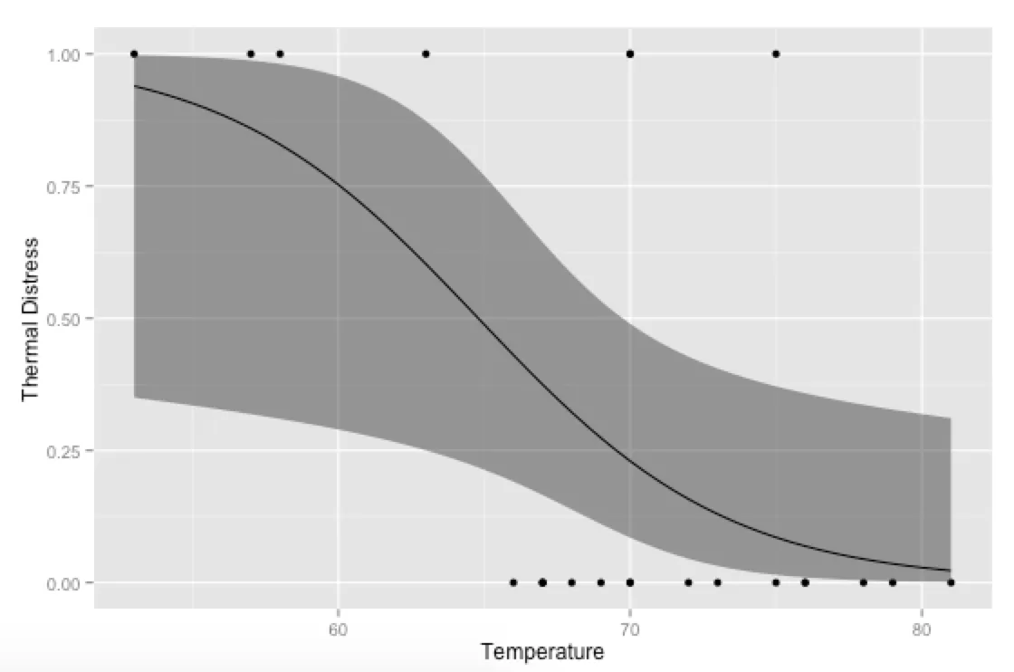
另一种方法是生成自己的预测值,并使用ggplot绘制它们 - 这样你可以更好地控制最终的绘图(而不是依赖于stat_smooth进行计算;如果你使用多个协变量并需要在绘图时将某些常数保持在它们的均值或模式处,这尤其有用)。

library(ggplot2)

# Generate data
mydata <- data.frame(Ft = c(1, 6, 11, 16, 21, 2, 7, 12, 17, 22, 3, 8, 
                            13, 18, 23, 4, 9, 14, 19, 5, 10, 15, 20),
                     Temp = c(66, 72, 70, 75, 75, 70, 73, 78, 70, 76, 69, 70, 
                              67, 81, 58, 68, 57, 53, 76, 67, 63, 67, 79),
                     TD = c(0, 0, 1, 0, 1, 1, 0, 0, 0, 0, 0, 0, 
                            0, 0, 1, 0, 1, 1, 0, 0, 1, 0, 0))

# Run logistic regression model
model <- glm(TD ~ Temp, data=mydata, family=binomial(link="logit"))

# Create a temporary data frame of hypothetical values
temp.data <- data.frame(Temp = seq(53, 81, 0.5))

# Predict the fitted values given the model and hypothetical data
predicted.data <- as.data.frame(predict(model, newdata = temp.data, 
                                        type="link", se=TRUE))

# Combine the hypothetical data and predicted values
new.data <- cbind(temp.data, predicted.data)

# Calculate confidence intervals
std <- qnorm(0.95 / 2 + 0.5)
new.data$ymin <- model$family$linkinv(new.data$fit - std * new.data$se)
new.data$ymax <- model$family$linkinv(new.data$fit + std * new.data$se)
new.data$fit <- model$family$linkinv(new.data$fit)  # Rescale to 0-1

# Plot everything
p <- ggplot(mydata, aes(x=Temp, y=TD)) 
p + geom_point() + 
  geom_ribbon(data=new.data, aes(y=fit, ymin=ymin, ymax=ymax), alpha=0.5) + 
  geom_line(data=new.data, aes(y=fit)) + 
  labs(x="Temperature", y="Thermal Distress") 

更好的单行

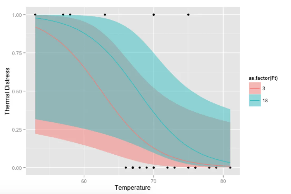
额外福利,只是为了好玩:如果您使用自己的预测函数,可以在协变量方面发疯,例如显示模型在不同水平的Ft下的拟合情况:

# Alternative, if you want to go crazy
# Run logistic regression model with two covariates
model <- glm(TD ~ Temp + Ft, data=mydata, family=binomial(link="logit"))

# Create a temporary data frame of hypothetical values
temp.data <- data.frame(Temp = rep(seq(53, 81, 0.5), 2),
                        Ft = c(rep(3, 57), rep(18, 57)))

# Predict the fitted values given the model and hypothetical data
predicted.data <- as.data.frame(predict(model, newdata = temp.data, 
                                        type="link", se=TRUE))

# Combine the hypothetical data and predicted values
new.data <- cbind(temp.data, predicted.data)

# Calculate confidence intervals
std <- qnorm(0.95 / 2 + 0.5)
new.data$ymin <- model$family$linkinv(new.data$fit - std * new.data$se)
new.data$ymax <- model$family$linkinv(new.data$fit + std * new.data$se)
new.data$fit <- model$family$linkinv(new.data$fit)  # Rescale to 0-1

# Plot everything
p <- ggplot(mydata, aes(x=Temp, y=TD)) 
p + geom_point() + 
  geom_ribbon(data=new.data, aes(y=fit, ymin=ymin, ymax=ymax, 
                                       fill=as.factor(Ft)), alpha=0.5) + 
  geom_line(data=new.data, aes(y=fit, colour=as.factor(Ft))) + 
  labs(x="Temperature", y="Thermal Distress") 

更好的多行


6
这很优雅,但是通过构建自己的(基于正态分布的)置信区间而不是使用
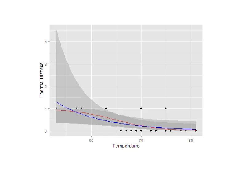
glm,你得到的置信区间超出了(0,1)的范围,这可能不是OP想要的... - Ben Bolker
好的,我按照 Hadley 在 ggplot 中的方法进行了答案重构,使用链接函数进行预测,然后转换为响应比例。现在一切都很顺利。 - Andrew
此外,使用dplyr可以大大简化所有数据框的创建过程,但是为了回答这个问题,我仍然坚持使用基本的R语言。 - Andrew
我真正想要做的事情是,在绘图时保留y轴的二元标签(是/否或真/假),而不是得到0到1的渐变。这样,我可以展示一个类似于逻辑二项回归的图表。但是,如果我尝试使用因子,我会得到一个非常漂亮的图表,但是失去了绘制回归线的能力。 - Joshua Eric Turcotte
您可以使用 scale_y_continuous() 来定义 y 轴上的断点和标签,例如:scale_y_continuous(breaks=c(0, 1), labels=c("否", "是")) - Andrew
predict中使用参数 type="response"是否有更简单的方法来获取conf.int(而不是调用model$family$linkinv)? - Marc in the box

3

您在stat_smooth中使用的这两个函数重叠了。这就是为什么您认为不能在同一张图上看到这两个函数的原因。运行下面的代码将使其清晰,第二条线的颜色为蓝色。

library(ggplot2)
TD<-mydata$TD
Temp<-mydata$Temp
g <- qplot(Temp,TD)+geom_point()+stat_smooth(method="glm",family="binomial",formula=y~x,col="red")
g1<-g+labs(x="Temperature",y="Thermal Distress")
g1
g2<-g1+stat_smooth(method="glm",family="binomial",link="probit",formula=y~x,add=T,col='blue')
g2

如果您在第二个stat_smooth上运行不同的族群,例如泊松分布glm:
library(ggplot2)
TD<-mydata$TD
Temp<-mydata$Temp
g <- qplot(Temp,TD)+geom_point()+stat_smooth(method="glm",family="binomial",formula=y~x,col="red")
g1<-g+labs(x="Temperature",y="Thermal Distress")
g1
g2<-g1+stat_smooth(method="glm",family="poisson",link="log",formula=y~x,add=T,col='blue')
g2

然后您可以看到确实绘制了两条线:

enter image description here


从风格上讲,我更喜欢使用 ggplot(mydata,aes(Temp,TD))+geom_point()+ ...,为了使它更清晰,可以在相应的图形中添加 fill='red'fill='blue' 来着色... PS:将logit二项式与log-Poisson进行比较并没有太多意义... 我认为你真正想要的是 link="logit" 而不是 link="log"... - Ben Bolker
@BenBolker 谢谢Ben。我的意思是要展示他的代码是有效的,而且他绘制的两条线重叠在一起。最简单的方法是将第二个glm模型更改为不同的内容,以使其清晰明了。我并不想以任何方式比较这两个模型。我也不想将logit二项式与log-Poisson进行比较。此外,是的,在风格上有10000种方法可以使我的图形更好,但我只想快速地表达我的观点。谢谢。 - LyzandeR

网页内容由stack overflow 提供, 点击上面的
可以查看英文原文,
原文链接