我想在ggplot柱状图(或类似的绘图)的每个y轴标签中写入多个信息。问题是如何使所有内容都对齐。最好通过一个示例来解释我所需要的东西:
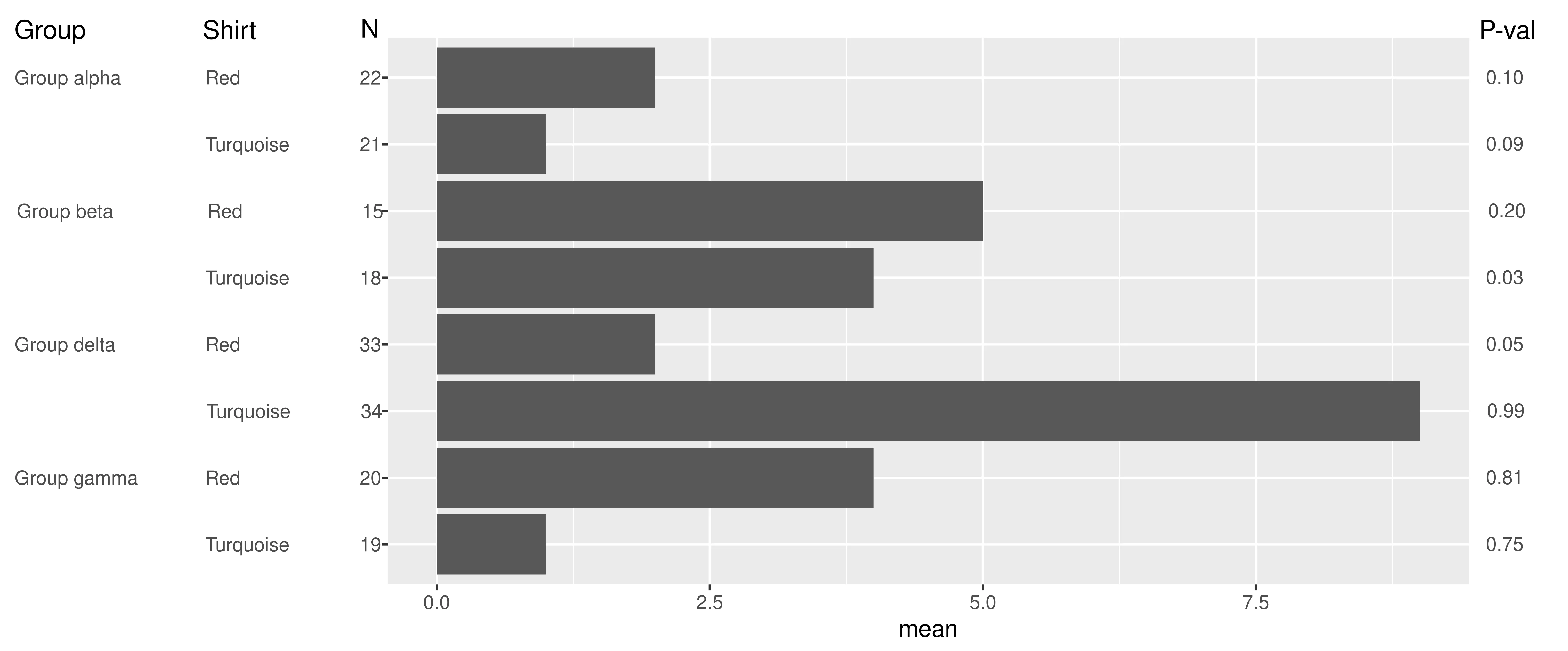 。
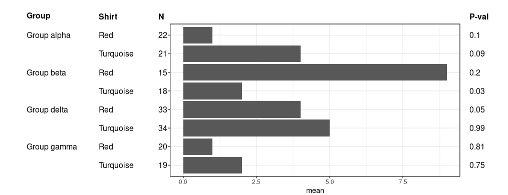
我的主要问题是图形左侧的格式。
到目前为止,我尝试过使用等宽字体编写标签。这基本上可行,但出于美观考虑,我想避免使用等宽字体。
我还尝试过制作几个ggplot,其中的想法是在两个初始图中除了y轴标签之外删除其他所有内容(因此这些“图”将仅是y轴标签)。然后使用
。
我的主要问题是图形左侧的格式。
到目前为止,我尝试过使用等宽字体编写标签。这基本上可行,但出于美观考虑,我想避免使用等宽字体。
我还尝试过制作几个ggplot,其中的想法是在两个初始图中除了y轴标签之外删除其他所有内容(因此这些“图”将仅是y轴标签)。然后使用
我还尝试过使用
。
我的主要问题是图形左侧的格式。
到目前为止,我尝试过使用等宽字体编写标签。这基本上可行,但出于美观考虑,我想避免使用等宽字体。
我还尝试过制作几个ggplot,其中的想法是在两个初始图中除了y轴标签之外删除其他所有内容(因此这些“图”将仅是y轴标签)。然后使用grid.align将图形对齐。我在这里遇到的问题是似乎没有办法删除ggplot的图部分(或者有吗?)。这也需要一些微调,因为在“空”图之一中删除x轴标签将导致标签向下移动(因为x轴标签/标题不再占用空间)。我还尝试过使用
geom_text的方法,并使用hjust参数设置适当的距离。但是,由于某种原因,不同大小标签的间距似乎不相等(例如,“红色”和“青绿色”标签的距离在相同的hjust下不同)。由于实际数据具有许多更大的标签大小变化,这种变化使表格看起来非常杂乱......
我对标题不太担心,因为它们很容易手动添加到图中。右侧的值也不是太大的问题,因为它们具有固定的宽度,我可以使用geom_text来设置它们。所以我的主要问题是y轴(左侧)标签。
这是一个示例数据集:
dt = data.frame(shirt = c('Red','Turquoise','Red','Turquoise','Red','Turquoise','Red','Turquoise'),
            group = c('Group alpha','Group alpha','Group beta','Group beta','Group delta','Group delta','Group gamma','Group gamma'),
            n = c(22,21,15,18,33,34,20,19),
            mean = c(1,   4,  9,  2,  4,  5 , 1, 2),
            p = c(0.1, 0.09, 0.2, 0.03, 0.05, 0.99, 0.81, 0.75))

dput(),只有在您没有提供创建数据框的代码时才需要它。 - Gregor Thomas