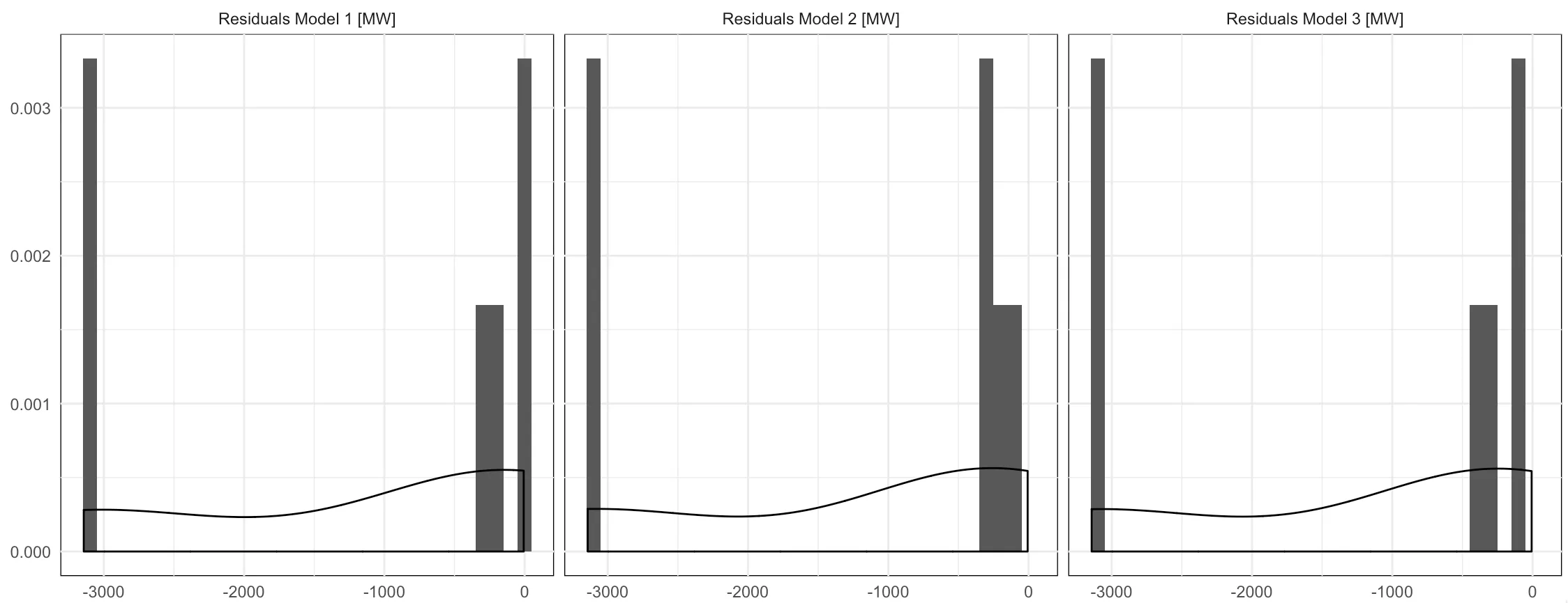
我希望将3个ggplot直方图合并在一起。为此,我使用gridExtra包。因为所有图都在一行中,所以我想从右边开始数的2个图中删除y轴标题和刻度。
我写了与往常一样的代码,但它没有起作用。你们知道可能出了什么问题吗?我的代码:
我写了与往常一样的代码,但它没有起作用。你们知道可能出了什么问题吗?我的代码:
plot1 <- ggplot(testing, aes(x=residualtotal))+
  geom_histogram(aes(y = ..density..), binwidth = 100) +
  geom_density(aes(y = ..density..*(2)))+
  xlab("Residuals Model 1 [MW]")+
  theme(panel.background=element_rect(fill = "white") )+
  theme_minimal()
plot2 <- ggplot(testing, aes(x=residualtotal1))+
  geom_histogram(aes(y = ..density..), binwidth = 100) +
  geom_density(aes(y = ..density..*(2)))+
  xlab("Residuals Model 2 [MW]")+
  theme(axis.text.y = element_blank(), axis.title.y = element_blank(), axis.ticks.y = element_blank(), panel.background=element_rect(fill = "white") )+
  theme_minimal()
plot3 <- ggplot(testing, aes(x=residualtotal2))+
  geom_histogram(aes(y = ..density..), binwidth = 100) +
  geom_density(aes(y = ..density..*(2)))+
  xlab("Residuals Model 3 [MW]")+
  theme(axis.text.y = element_blank(), axis.title.y = element_blank(), axis.ticks.y = element_blank(), panel.background=element_rect(fill = "white") )+
  theme_minimal()
grid.arrange(plot1, plot2, plot3, ncol = 3, nrow=1)
我的数据集样例。
    Load residualtotal1 prognosis2 residualtotal2 residualtotal
89  20524      -347.6772   20888.75      -364.7539    -287.82698
99  13780      -133.8496   13889.52      -109.5207      -6.60009
100 13598      -155.9950   13728.77      -130.7729     -27.18835
103 13984      -348.4080   14310.12      -326.1226    -213.68816
129 14237     -3141.5591   17375.82     -3138.8188   -3077.32236
130 14883     -3142.0134   18026.02     -3143.0183   -3090.52193
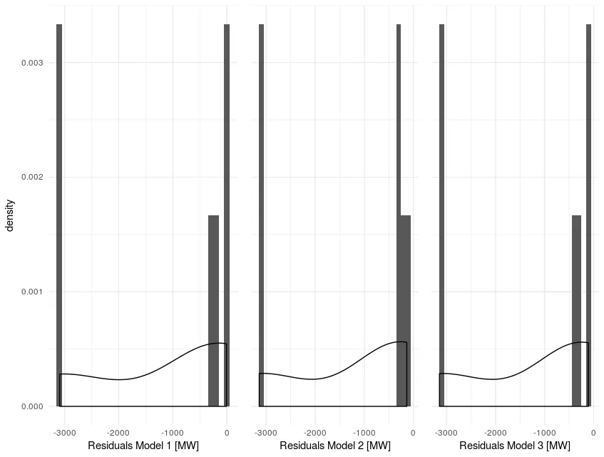
theme语句放在theme_minimal()之后,否则theme_minimal会覆盖它。 - eipi10my_plot = list(geom_density(aes(y = ..density..*(2))), theme_minimal(), theme(axis.text.y = element_blank(), axis.title.y = element_blank(), axis.ticks.y = element_blank(), panel.background=element_rect(fill = "white"))。然后只需在您的ggplot调用中包含+ my_plot即可。 - eipi10