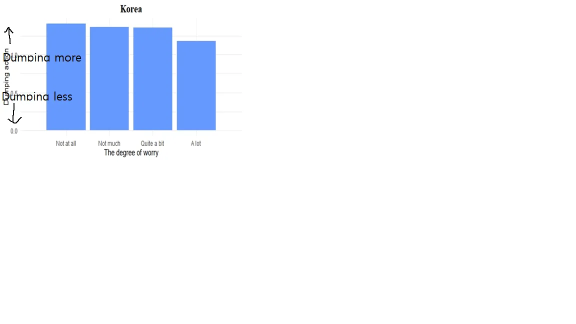
有人知道如何水平更改y轴并添加箭头吗?
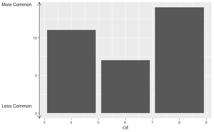
我想制作这样的图表。
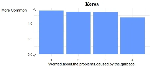
以下是我用于制作此图表的代码。
ggplot(plot, aes(x=Worried.about.the.problems.caused.by.the.garbage., y=mean))
+ geom_bar(stat = "identity", position ="dodge", fill='#6699FF') + theme_minimal()+ ggtitle("Korea") + theme(plot.title = element_text(family = "serif", face = "bold", hjust = 0.5, size = 15, color = "black"))