我需要使用sec.axis创建一个双y轴图,但是无法使两个轴都正确缩放。
我一直在按照这个线程中的说明进行操作:ggplot with 2 y axes on each side and different scales
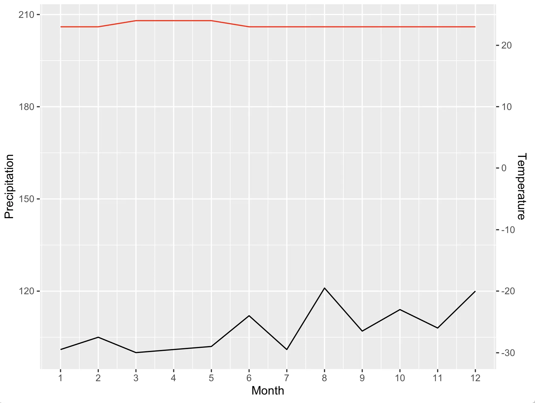
但是每次我将ylim.prim中的下限更改为0以外的任何值时,整个图表就会出现问题。出于可视化的原因,我需要为两个轴设置非常具体的y限制。此外,当我将geom_col更改为geom_line时,它也会破坏辅助轴的限制。
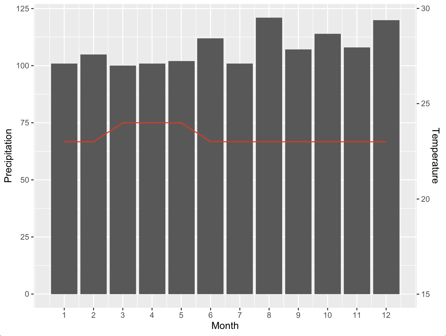
climate <- tibble(
  Month = 1:12,
  Temp = c(23,23,24,24,24,23,23,23,23,23,23,23),
  Precip = c(101,105,100,101,102, 112, 101, 121, 107, 114, 108, 120)
  )

ylim.prim <- c(0, 125)   # in this example, precipitation
ylim.sec <- c(15, 30)    # in this example, temperature

b <- diff(ylim.prim)/diff(ylim.sec)
a <- b*(ylim.prim[1] - ylim.sec[1])

ggplot(climate, aes(Month, Precip)) +
  geom_col() +
  geom_line(aes(y = a + Temp*b), color = "red") +
  scale_y_continuous("Precipitation", sec.axis = sec_axis(~ (. - a)/b, name = "Temperature"),) +
  scale_x_continuous("Month", breaks = 1:12)
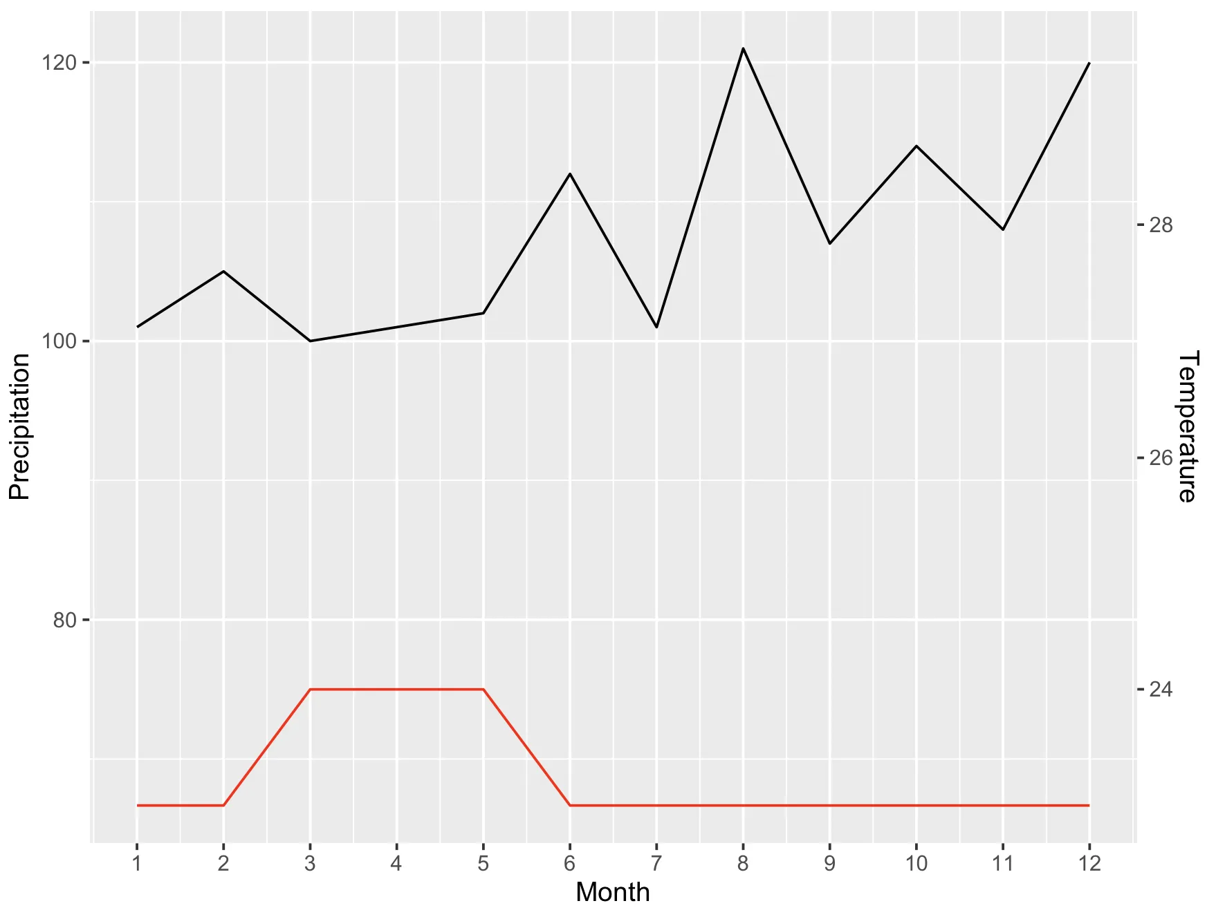
ylim.prim <- c(0, 125)   # in this example, precipitation
ylim.sec <- c(15, 30)    # in this example, temperature

b <- diff(ylim.prim)/diff(ylim.sec)
a <- b*(ylim.prim[1] - ylim.sec[1])

ggplot(climate, aes(Month, Precip)) +
  geom_line() +
  geom_line(aes(y = a + Temp*b), color = "red") +
  scale_y_continuous("Precipitation", sec.axis = sec_axis(~ (. - a)/b, name = "Temperature"),) +
  scale_x_continuous("Month", breaks = 1:12)
ylim.prim <- c(95, 125)   # in this example, precipitation
ylim.sec <- c(15, 30)    # in this example, temperature

b <- diff(ylim.prim)/diff(ylim.sec)
a <- b*(ylim.prim[1] - ylim.sec[1])

ggplot(climate, aes(Month, Precip)) +
  geom_line() +
  geom_line(aes(y = a + Temp*b), color = "red") +
  scale_y_continuous("Precipitation", sec.axis = sec_axis(~ (. - a)/b, name = "Temperature"),) +
  scale_x_continuous("Month", breaks = 1:12)
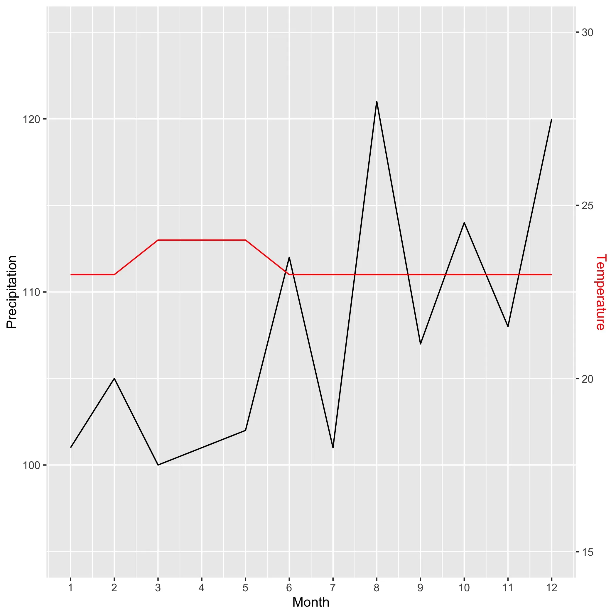
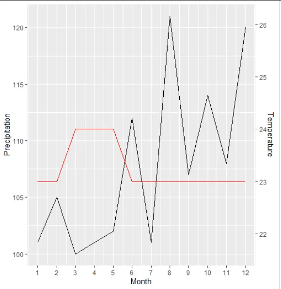
a的方程式应该是ylim.prim[1] - b*ylim.sec[1]。如果我使用这个方程式代替你的定义,两个比例尺之间的重新映射似乎可以正常工作,并且两个轴的限制与你的定义相匹配。 - aosmith