我将尝试绘制一组图表,并在其上叠加一个显示它们之间百分比差异的图表。
我的绘图代码如下:
结果看起来像这样: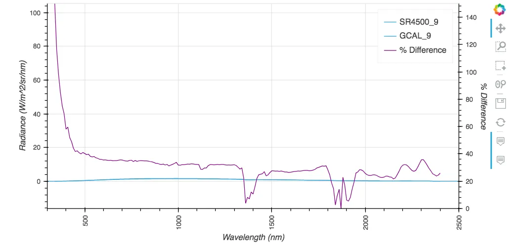 实际上,平坦的蓝色图应该长这样:
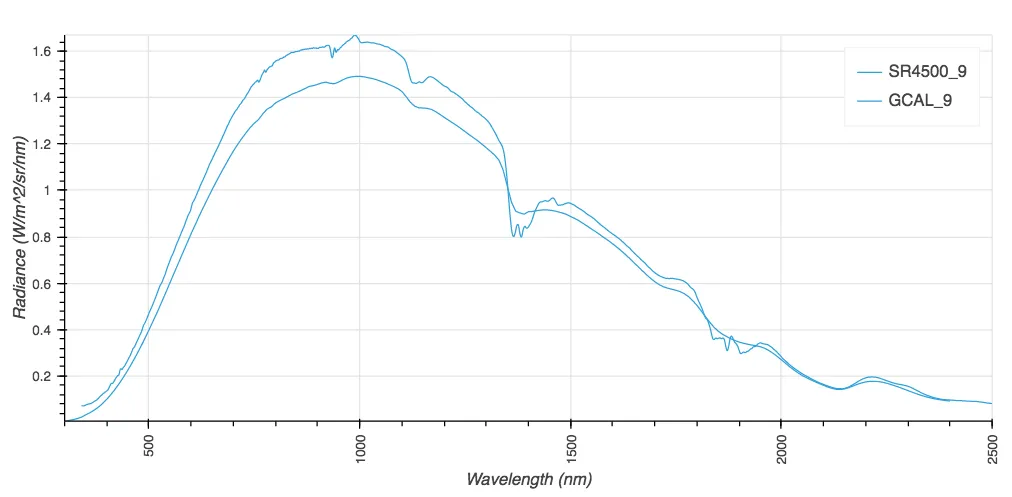
 我需要在两个刻度上绘制两个图。我似乎可以添加一个刻度,但无法将任何绘图附加到刻度上。
我的绘图代码如下:
%%output size = 200
%%opts Curve[height=200, width=400,show_grid=True,tools=['hover','box_select'], xrotation=90]
%%opts Curve(line_width=1)


from bokeh.models import Range1d, LinearAxis

new_df = new_df.astype('float')
percent_diff_df = percent_diff_df.astype('float')

def twinx(plot, element):
    # Setting the second y axis range name and range
    start, end = (element.range(1))
    label = element.dimensions()[1].pprint_label
    plot.state.extra_y_ranges = {"foo": Range1d(start=0, end=150)}
    # Adding the second axis to the plot.
    linaxis = LinearAxis(axis_label='% Difference', y_range_name='foo')
    plot.state.add_layout(linaxis, 'right')

wavelength = hv.Dimension('wavelength', label = 'Wavelength', unit = 'nm')
radiance = hv.Dimension('radiance', label = 'Radiance', unit = 'W/m^2/sr/nm')
curve = hv.Curve((new_df['Wave'], new_df['Level_9']), wavelength, radiance,label = 'Level_9', group = 'Requirements')*\
    hv.Curve((new_df['gcal_wave'],new_df['gcal_9']),wavelength, radiance,label = 'GCAL_9', group = 'Requirements')
curve2 = hv.Curve((percent_diff_df['pdiff_wave'],percent_diff_df['pdiff_9']), label = '% Difference', group = 'Percentage Difference').opts(plot=dict(finalize_hooks=[twinx]), style=dict(color='purple'))
curve * curve2
结果看起来像这样:
实际上,平坦的蓝色图应该长这样:
我需要在两个刻度上绘制两个图。我似乎可以添加一个刻度,但无法将任何绘图附加到刻度上。