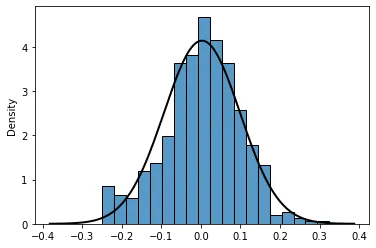
distplot的源代码关于fit=参数与这里其他答案已经提到的非常相似;初始化一些支持数组,使用给定数据的均值/标准差计算PDF值,并在直方图上面叠加线性图。我们可以直接将代码的相关部分“转录”为自定义函数,并用它来绘制高斯拟合(不一定是正态分布;也可以是任何连续分布)。
一个示例实现如下所示。
import numpy as np
import matplotlib.pyplot as plt
import seaborn as sns
from scipy import stats
def add_fit_to_histplot(a, fit=stats.norm, ax=None):
if ax is None:
ax = plt.gca()
bw = len(a)**(-1/5) * a.std(ddof=1)
x = np.linspace(a.min()-bw*3, a.max()+bw*3, 200)
params = fit.fit(a)
y = fit.pdf(x, *params)
ax.plot(x, y, color='#282828')
return ax
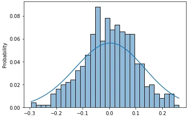
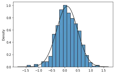
x = np.random.default_rng(0).normal(1, 4, size=500) * 0.1
sns.histplot(x, stat='density')
add_fit_to_histplot(x, fit=stats.norm);
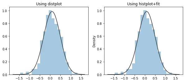
如果你不喜欢黑色边缘颜色或者整体的颜色,我们可以改变条形图的颜色、边缘颜色和透明度参数,使得
histplot()的输出与已弃用的
distplot()的默认样式输出相同。
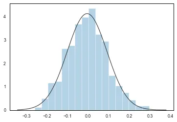
import numpy as np
x = np.random.default_rng(0).normal(1, 4, size=500) * 0.1
fig, (ax1, ax2) = plt.subplots(1, 2, figsize=(10,4))
sns.distplot(x, kde=False, fit=stats.norm, ax=ax1)
ax1.set_title('Using distplot')
sns.histplot(x, stat='density', color='#1f77b4', alpha=0.4, edgecolor='none', ax=ax2)
add_fit_to_histplot(x, fit=stats.norm, ax=ax2)
ax2.set_title('Using histplot+fit');
这个答案与现有的答案(
1,
2)不同,因为它在直方图上拟合了一个高斯分布(或任何其他连续分布,如伽玛分布),其中存在数据(这也是在
distplot()中绘制拟合的方式)。目标是尽可能地复制
distplot()的拟合功能。
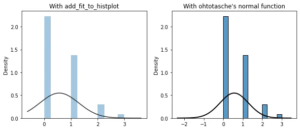
例如,假设您有遵循泊松分布的数据,绘制其直方图并对其进行高斯拟合。使用
add_fit_to_histplot(),由于支持与数据端点相关联(并使用Scott的规则进行带宽计算),所得到的高斯拟合图仅在直方图上存在相应的数据时绘制,这也是使用
distplot()绘制的方式(下面的左子图)。另一方面,
ohtotasche的
normal()函数即使没有相应的数据也会绘制,即正态概率密度函数的左尾部分完全绘制出来(下面的右子图)。
data = np.random.default_rng(0).poisson(0.5, size=500)
fig, (a1, a2) = plt.subplots(1, 2, facecolor='white', figsize=(10,4))
sns.histplot(data, stat='density', color='#1f77b4', alpha=0.4, edgecolor='none', ax=a1)
add_fit_to_histplot(data, fit=stats.norm, ax=a1)
a1.set_title("With add_fit_to_histplot")
sns.histplot(x=data, stat="density", ax=a2)
normal(data.mean(), data.std())
a2.set_title("With ohtotasche's normal function")