如何在R中对数据点运行高通或低通滤波器?

45
我是一名R初学者,尝试寻找以下内容的信息但未能找到:

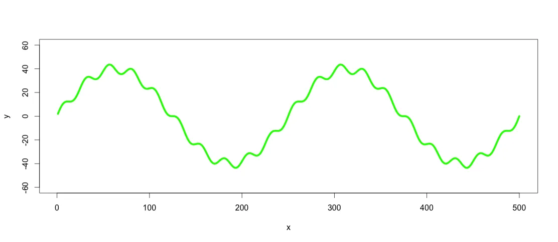
图片中的绿色图形由红色和黄色图形组成。但假设我只有类似绿色图形的数据点,如何使用低通滤波器/高通滤波器提取低/高频率(即大约是红色/黄色图形)?
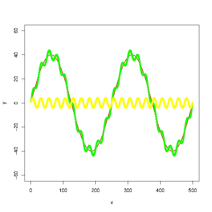
low frequency sinus curve with high frequency sinus curve modulated onto

更新:该图表是使用

number_of_cycles = 2
max_y = 40

x = 1:500
a = number_of_cycles * 2*pi/length(x)

y = max_y * sin(x*a)
noise1 = max_y * 1/10 * sin(x*a*10)

plot(x, y, type="l", col="red", ylim=range(-1.5*max_y,1.5*max_y,5))
points(x, y + noise1, col="green", pch=20)
points(x, noise1, col="yellow", pch=20)

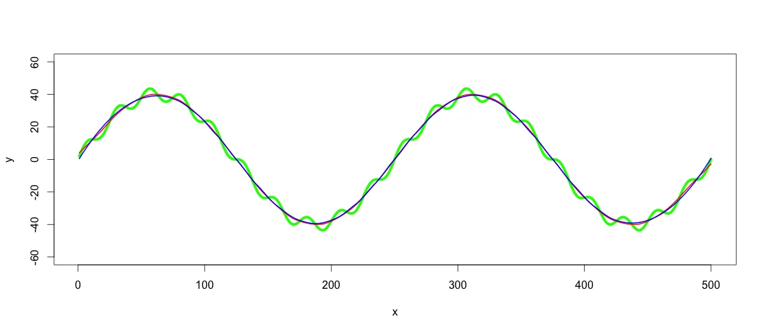
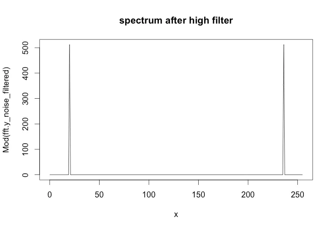
更新2:使用signal包中的Butterworth滤波器建议我得到以下结果:
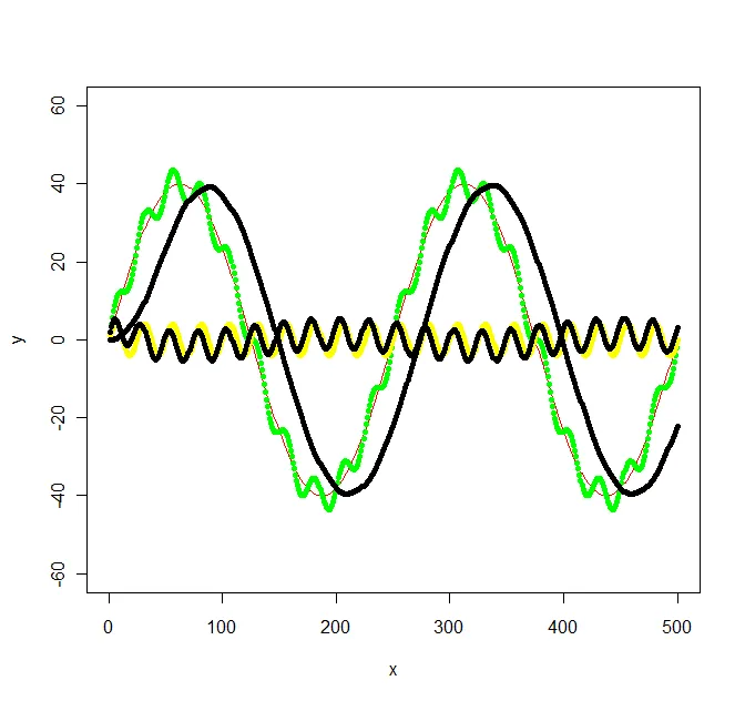
Original picture with filtered graphs added

library(signal)

bf <- butter(2, 1/50, type="low")
b <- filter(bf, y+noise1)
points(x, b, col="black", pch=20)

bf <- butter(2, 1/25, type="high")
b <- filter(bf, y+noise1)
points(x, b, col="black", pch=20)

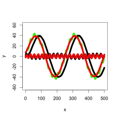
计算有些费力,signal.pdf几乎没有提供关于W应该取什么值的提示,但是原始Octave文档至少提到了弧度,这让我有了头绪。我原始图表中的值没有考虑任何特定频率,因此我最终得到了以下不太简单的频率:f_low = 1/500 * 2 = 1/250f_high = 1/500 * 2*10 = 1/25和采样频率f_s = 500/500 = 1。然后我选择了一个介于低频和高频之间的f_c作为低通/高通滤波器的截止频率(分别为1/100和1/50)。

1
如果您提供一个可重现的例子(例如用于图形的数据/代码),人们将更容易地帮助您。展示您目前为止尝试过的内容会有所帮助。 - Joris Meys
2
另外补充一点:signal软件包包含各种滤波器,可在以下链接中找到:http://cran.r-project.org/web/packages/signal/signal.pdf - Joris Meys
FYI,这是在Cross Validated的一篇回答中提到的! - Nick Stauner
非常好的追踪和编辑问题。我发现你的编辑中的答案很有用。+1 - Mikko
2
我认为你错过了傅里叶分析的整个领域。一个正确应用的分析应该能够提取出只有两个正弦信号的事实。 - IRTFM
显示剩余2条评论
8个回答

33

我最近遇到了类似的问题,在这里没有找到特别有用的答案。下面是另一种方法。

让我们从定义问题中的示例数据开始:

number_of_cycles = 2
max_y = 40

x = 1:500
a = number_of_cycles * 2*pi/length(x)

y = max_y * sin(x*a)
noise1 = max_y * 1/10 * sin(x*a*10)
y <- y + noise1

plot(x, y, type="l", ylim=range(-1.5*max_y,1.5*max_y,5), lwd = 5, col = "green")

输入图像描述

绿线是我们想要进行低通和高通滤波的数据集。

顺便提一下:在这种情况下,可以使用三次样条函数(spline(x,y,n=length(x)))来表示该线,但是在实际数据中很少出现这种情况,因此假设无法将数据集表示为函数。

我发现最简单的平滑数据的方法是使用适当的span/spar参数使用loesssmooth.spline。据统计学家称,loess/smooth.spline在这里可能不是正确的方法,因为它并没有真正展示数据的定义模型。另一种选择是使用广义相加模型(包mgcv中的gam()函数)。我选择使用loess或smoothed spline的理由是它更简单,而且并没有什么区别,因为我们关心的是可见的结果模式。现实世界的数据集比这个例子更复杂,因此对几个类似的数据集进行滤波并找到一个定义的函数可能会很困难。如果可见的拟合效果很好,为什么要用R2和p值来增加复杂性呢?对于我来说,这种应用是视觉化的,因此loess/smoothed splines是适当的方法。这两种方法都假设多项式关系,不同之处在于loess更灵活,也使用高阶多项式,而三次样条始终是三次(x^2)。该使用哪种取决于数据集中的趋势。也就是说,下一步是通过使用loess()smooth.spline()在数据集上应用低通滤波器。

lowpass.spline <- smooth.spline(x,y, spar = 0.6) ## Control spar for amount of smoothing
lowpass.loess <- loess(y ~ x, data = data.frame(x = x, y = y), span = 0.3) ## control span to define the amount of smoothing

lines(predict(lowpass.spline, x), col = "red", lwd = 2)
lines(predict(lowpass.loess, x), col = "blue", lwd = 2)

enter image description here

红色线是平滑样条过滤器,蓝色线是loess过滤器。正如您所看到的结果略有不同。我想使用GAM的一个参数是找到最佳拟合,如果趋势确实在数据集中非常清晰且一致,但对于此应用程序,这两个拟合对我来说都足够好。

在找到合适的低通滤波器之后,高通滤波就像从y中减去低通滤波值一样简单:

highpass <- y - predict(lowpass.loess, x)
lines(x, highpass, lwd =  2)

这个答案来的有点晚,但我希望它能对其他遇到类似问题的人有所帮助。

谢谢,非常好的答案。我会记住这个,下次遇到这种问题时再用。 - hlovdal

18

使用filtfilt函数(signal包)代替filter函数,以消除信号偏移。

library(signal)
bf <- butter(2, 1/50, type="low")
b1 <- filtfilt(bf, y+noise1)
points(x, b1, col="red", pch=20)

红色线显示了 filtfilt 的结果


1
请小心使用此函数,因为在其文档中有这样的描述:“...所以这个函数还需要一些工作 - 并且处于Octave代码2000年版本的状态。” - André Costa

8

一种方法是使用在 R 中实现的快速傅里叶变换,称为 fft。以下是一个高通滤波器的示例。从上面的图中可以看到,这个示例的思路是从绿色序列(真实数据)中获取黄色序列。

# I've changed the data a bit so it's easier to see in the plots
par(mfrow = c(1, 1))
number_of_cycles = 2
max_y = 40
N <- 256

x = 0:(N-1)
a = number_of_cycles * 2 * pi/length(x)

y = max_y * sin(x*a)
noise1 = max_y * 1/10 * sin(x*a*10)
plot(x, y, type="l", col="red", ylim=range(-1.5*max_y,1.5*max_y,5))
points(x, y + noise1, col="green", pch=20)
points(x, noise1, col="yellow", pch=20)

### Apply the fft to the noisy data
y_noise = y + noise1
fft.y_noise = fft(y_noise)


# Plot the series and spectrum
par(mfrow = c(1, 2))
plot(x, y_noise, type='l', main='original serie', col='green4')
plot(Mod(fft.y_noise), type='l', main='Raw serie - fft spectrum')

y-noise and fft spectrum

### The following code removes the first spike in the spectrum
### This would be the high pass filter
inx_filter = 15
FDfilter = rep(1, N)
FDfilter[1:inx_filter] = 0
FDfilter[(N-inx_filter):N] = 0
fft.y_noise_filtered = FDfilter * fft.y_noise

enter image description here

par(mfrow = c(2, 1))
plot(x, noise1, type='l', main='original noise')
plot(x, y=Re( fft( fft.y_noise_filtered, inverse=TRUE) / N ) , type='l', 
     main = 'filtered noise')

enter image description here


7

根据OP的要求:

signal软件包包含各种信号处理滤波器。其中大部分与Matlab/Octave中的信号处理函数相似/兼容。


3

我曾经也为理解butter函数中的W参数如何映射到滤波器截止频率而苦苦思索,部分原因是因为filter和filtfilt的文档在发布时是错误的(它表明当信号采样率Fs = 100时,W = .1会导致10 Hz lp滤波器,但实际上只是一个5 Hz lp滤波器 - 当使用filtfilt时,一半幅值截止频率为5 Hz,但当你只使用一次滤波器函数时,使用filter函数,一半功率截止频率为5 Hz)。下面是我编写的一些演示代码,帮助我确认所有这些是如何工作的,并且您可以使用这些代码来检查滤波器是否按照您的要求进行操作。

#Example usage of butter, filter, and filtfilt functions
#adapted from https://rdrr.io/cran/signal/man/filtfilt.html

library(signal)

Fs <- 100; #sampling rate

bf <- butter(3, 0.1);       
#when apply twice with filtfilt, 
#results in a 0 phase shift 
#5 Hz half-amplitude cut-off LP filter
#
#W * (Fs/2) == half-amplitude cut-off when combined with filtfilt
#
#when apply only one time, using the filter function (non-zero phase shift),
#W * (Fs/2) == half-power cut-off


t <- seq(0, .99, len = 100)   # 1 second sample

#generate a 5 Hz sine wave
x <- sin(2*pi*t*5)

#filter it with filtfilt
y <- filtfilt(bf, x)

#filter it with filter
z <- filter(bf, x)

#plot original and filtered signals
plot(t, x, type='l')
lines(t, y, col="red")
lines(t,z,col="blue")

#estimate signal attenuation (proportional reduction in signal amplitude)
1 - mean(abs(range(y[t > .2 & t < .8]))) #~50% attenuation at 5 Hz using filtfilt

1 - mean(abs(range(z[t > .2 & t < .8]))) #~30% attenuation at 5 Hz using filter

#demonstration that half-amplitude cut-off is 6 Hz when apply filter only once
x6hz <- sin(2*pi*t*6)

z6hz <- filter(bf, x6hz)

1 - mean(abs(range(z6hz[t > .2 & t < .8]))) #~50% attenuation at 6 Hz using filter


#plot the filter attenuation profile (for when apply one time, as with "filter" function):

hf <- freqz(bf, Fs = Fs);

plot(c(0, 20, 20, 0, 0), c(0, 0, 1, 1, 0), type = "l", 
 xlab = "Frequency (Hz)", ylab = "Attenuation (abs)")

lines(hf$f[hf$f<=20], abs(hf$h)[hf$f<=20])

plot(c(0, 20, 20, 0, 0), c(0, 0, -50, -50, 0),
 type = "l", xlab = "Frequency (Hz)", ylab = "Attenuation (dB)")

lines(hf$f[hf$f<=20], 20*log10(abs(hf$h))[hf$f<=20])

hf$f[which(abs(hf$h) - .5 < .001)[1]] #half-amplitude cutoff, around 6 Hz

hf$f[which(20*log10(abs(hf$h))+6 < .2)[1]] #half-amplitude cutoff, around 6 Hz

hf$f[which(20*log10(abs(hf$h))+3 < .2)[1]] #half-power cutoff, around 5 Hz

3
请查看这个链接,其中有用于过滤(医学信号)的R代码。这是由Matt Shotwell提供的网站,该网站充满了有趣的医学倾向的R /统计信息:biostattmat.com
fftfilt软件包包含许多过滤算法,应该也会有所帮助。

6
有一个解决方案。复制一个非常基本的过滤器的手动实现,而不知道它是否真正有效,这不是一个好主意。 - Joris Meys

2

在CRAN上有一个名为FastICA的软件包,它可以计算独立源信号的近似值,但是为了计算两个信号,您需要至少2xn混合观测矩阵(对于此示例),这个算法无法仅通过1xn向量确定两个独立信号。请参见下面的示例。希望这可以帮助您。

number_of_cycles = 2
max_y = 40

x = 1:500
a = number_of_cycles * 2*pi/length(x)

y = max_y * sin(x*a)
noise1 = max_y * 1/10 * sin(x*a*10)

plot(x, y, type="l", col="red", ylim=range(-1.5*max_y,1.5*max_y,5))
points(x, y + noise1, col="green", pch=20)
points(x, noise1, col="yellow", pch=20)
######################################################
library(fastICA)
S <- cbind(y,noise1)#Assuming that "y" source1 and "noise1" is source2
A <- matrix(c(0.291, 0.6557, -0.5439, 0.5572), 2, 2) #This is a mixing matrix
X <- S %*% A 

a <- fastICA(X, 2, alg.typ = "parallel", fun = "logcosh", alpha = 1,
method = "R", row.norm = FALSE, maxit = 200,
tol = 0.0001, verbose = TRUE)

par(mfcol = c(2, 3))
plot(S[,1 ], type = "l", main = "Original Signals",
xlab = "", ylab = "")
plot(S[,2 ], type = "l", xlab = "", ylab = "")
plot(X[,1 ], type = "l", main = "Mixed Signals",
xlab = "", ylab = "")
plot(X[,2 ], type = "l", xlab = "", ylab = "")
plot(a$S[,1 ], type = "l", main = "ICA source estimates",
xlab = "", ylab = "")
plot(a$S[, 2], type = "l", xlab = "", ylab = "")

1

我不确定是否有任何滤波器是最好的解决方案。更有用的工具是快速傅里叶变换。


网页内容由stack overflow 提供, 点击上面的
可以查看英文原文,
原文链接