正如我的同事所指出的那样,连接点是小学教育中的内容。
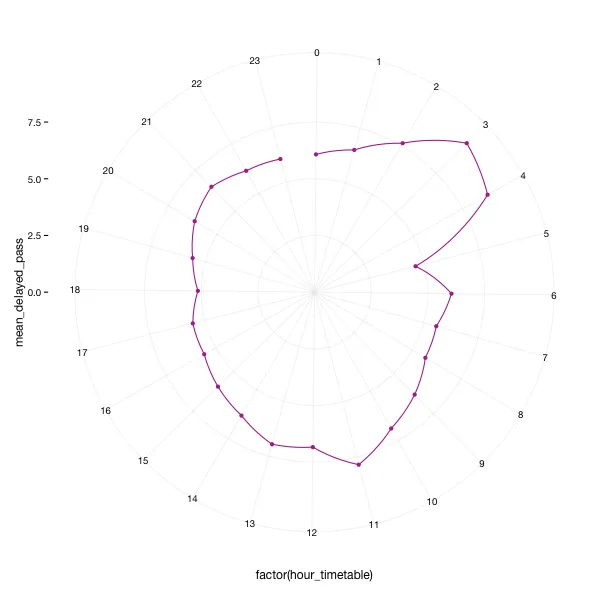
以下是数据:
hour_timetable  mean_delayed_pass
0   6.074
1   6.512
2   7.632
3   9.393
4   8.759
5   4.600
6   6.040
7   5.575
8   5.680
9   6.315
10  6.895
11  7.852
12  6.832
13  6.961
14  6.322
15  5.954
16  5.579
17  5.540
18  5.142
19  5.579
20  6.139
21  6.501
22  6.140
23  6.061
这里是代码:
library(ggplot2)
ggplot(data = test_vis, aes(x = factor(hour_timetable), y = mean_delayed_pass, group = 1)) +
   ylim(0, NA) +
   geom_point(color = 'purple', stat = 'identity') +
   geom_line(color = 'purple') +
   coord_polar(start = -0.12) # why offset?
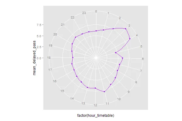
hour_timetable保留为数字变量而不是因子,则会获得一个无偏移的连接图。添加scale_x_continuous(breaks=0:22)可以包含所有小时格线。 - eipi10hour_timetable=0也被认为是“第24个”小时,因此您需要将24 6.074作为新行添加到数据中,以便第23个小时不会被解释为与0相同的时间点。抱歉,我忘了提到这一点。可能有更优雅的方法来处理数据的周期性,但至少它可以工作。 - eipi10