从我所看到的,boxplot()方法期望输入一系列原始值(数字),然后计算百分位数以绘制箱线图。
我想要一个方法,可以传入百分位数并获得相应的boxplot。
例如:
假设我运行了几个基准测试,并为每个基准测试测量了延迟(浮点值)。现在另外,我已经预先计算了这些值的百分位数。
因此,对于每个基准测试,我都有第25、50、75个百分位数以及最小值和最大值。
现在,给定这些数据,我想为基准测试绘制箱线图。
从我所看到的,boxplot()方法期望输入一系列原始值(数字),然后计算百分位数以绘制箱线图。
我想要一个方法,可以传入百分位数并获得相应的boxplot。
例如:
假设我运行了几个基准测试,并为每个基准测试测量了延迟(浮点值)。现在另外,我已经预先计算了这些值的百分位数。
因此,对于每个基准测试,我都有第25、50、75个百分位数以及最小值和最大值。
现在,给定这些数据,我想为基准测试绘制箱线图。
matplotlib.axes.Axes 类提供了一个 bxp 方法,可以基于百分位数值绘制箱形图。原始数据仅用于异常值,这是可选的。import matplotlib.pyplot as plt
fig, ax = plt.subplots()
boxes = [
{
'label' : "Male height",
'whislo': 162.6, # Bottom whisker position
'q1' : 170.2, # First quartile (25th percentile)
'med' : 175.7, # Median (50th percentile)
'q3' : 180.4, # Third quartile (75th percentile)
'whishi': 187.8, # Top whisker position
'fliers': [] # Outliers
}
]
ax.bxp(boxes, showfliers=False)
ax.set_ylabel("cm")
plt.savefig("boxplot.png")
plt.close()
这将生成以下图片: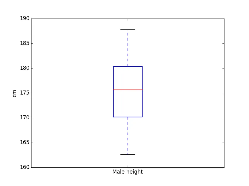
为了使用百分位数和异常值(如果有)来绘制箱形图,我创建了一个customized_box_plot函数,它基本上修改了基本箱形图的属性(从小样本数据生成),使其根据您的百分位数进行适配。
customized_box_plot函数
def customized_box_plot(percentiles, axes, redraw = True, *args, **kwargs):
    """
    Generates a customized boxplot based on the given percentile values
    """

    box_plot = axes.boxplot([[-9, -4, 2, 4, 9],]*n_box, *args, **kwargs)
    # Creates len(percentiles) no of box plots

    min_y, max_y = float('inf'), -float('inf')

    for box_no, (q1_start,
                 q2_start,
                 q3_start,
                 q4_start,
                 q4_end,
                 fliers_xy) in enumerate(percentiles):

        # Lower cap
        box_plot['caps'][2*box_no].set_ydata([q1_start, q1_start])
        # xdata is determined by the width of the box plot

        # Lower whiskers
        box_plot['whiskers'][2*box_no].set_ydata([q1_start, q2_start])

        # Higher cap
        box_plot['caps'][2*box_no + 1].set_ydata([q4_end, q4_end])

        # Higher whiskers
        box_plot['whiskers'][2*box_no + 1].set_ydata([q4_start, q4_end])

        # Box
        box_plot['boxes'][box_no].set_ydata([q2_start,
                                             q2_start,
                                             q4_start,
                                             q4_start,
                                             q2_start])

        # Median
        box_plot['medians'][box_no].set_ydata([q3_start, q3_start])

        # Outliers
        if fliers_xy is not None and len(fliers_xy[0]) != 0:
            # If outliers exist
            box_plot['fliers'][box_no].set(xdata = fliers_xy[0],
                                           ydata = fliers_xy[1])

            min_y = min(q1_start, min_y, fliers_xy[1].min())
            max_y = max(q4_end, max_y, fliers_xy[1].max())

        else:
            min_y = min(q1_start, min_y)
            max_y = max(q4_end, max_y)

        # The y axis is rescaled to fit the new box plot completely with 10%
        # of the maximum value at both ends
        axes.set_ylim([min_y*1.1, max_y*1.1])

    # If redraw is set to true, the canvas is updated.
    if redraw:
        ax.figure.canvas.draw()

    return box_plot
用法
使用逆逻辑(代码在最后)从此 示例 中提取了百分位数值。
>>> percentiles
(-1.0597368367634488, 0.3977683984966961, 1.0298955252405229, 1.6693981537742526, 3.4951447843464449)
(-0.90494930553559483, 0.36916539612108634, 1.0303658700697103, 1.6874542731392828, 3.4951447843464449)
(0.13744105279440233, 1.3300645202649739, 2.6131540656339483, 4.8763411136047647, 9.5751914834437937)
(0.22786243898199182, 1.4120860286080519, 2.637650402506837, 4.9067126578493259, 9.4660357513550899)
(0.0064696168078617741, 0.30586770128093388, 0.70774153557312702, 1.5241965711101928, 3.3092932063051976)
(0.007009744579241136, 0.28627373934008982, 0.66039691869500572, 1.4772725266672091, 3.221716765477217)
(-2.2621660374110544, 5.1901313713883352, 7.7178532139979357, 11.277744848353247, 20.155971739152388)
(-2.2621660374110544, 5.1884411864079532, 7.3357079047721054, 10.792299385806913, 18.842012119715388)
(2.5417888074435702, 5.885996170695587, 7.7271286220368598, 8.9207423361593179, 10.846938621419374)
(2.5971767318505856, 5.753551925927133, 7.6569980004033464, 8.8161056254143233, 10.846938621419374)
注意:为使语言简洁,我没有显示异常向量,它们是每个百分位数组的第6个元素。
还要注意,由于这些kwargs/args只是传递给boxplot方法,因此可以使用所有通常的附加kwargs / args:
>>> fig, ax = plt.subplots()
>>> b = customized_box_plot(percentiles, ax, redraw=True, notch=0, sym='+', vert=1, whis=1.5)
>>> plt.show()
说明
boxplot方法返回一个字典,将箱线图的组成部分映射到创建的各个matplotlib.lines.Line2D实例上。
引用自matplotlib.pyplot.boxplot文档:
该字典具有以下键(假设为纵向箱线图):
boxes:显示四分位数和中位数的置信区间(如果已启用)的箱线图主体。
medians:每个箱子中位数处的水平线。
whiskers:垂直线延伸到最极端的 n 个异常值数据点。 caps:在须端的水平线。
fliers:表示超出须限范围的数据点(异常值)。
means:表示均值的点或线。
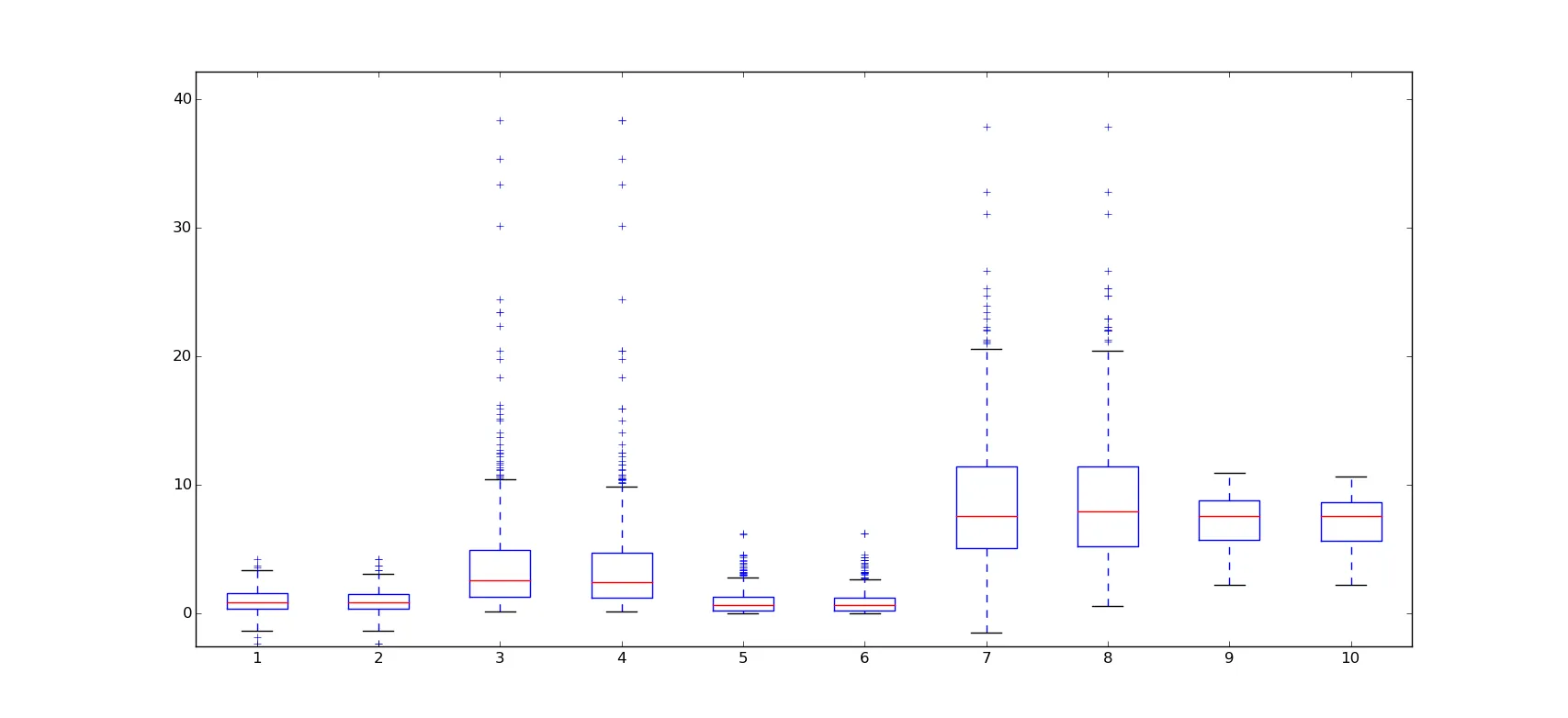
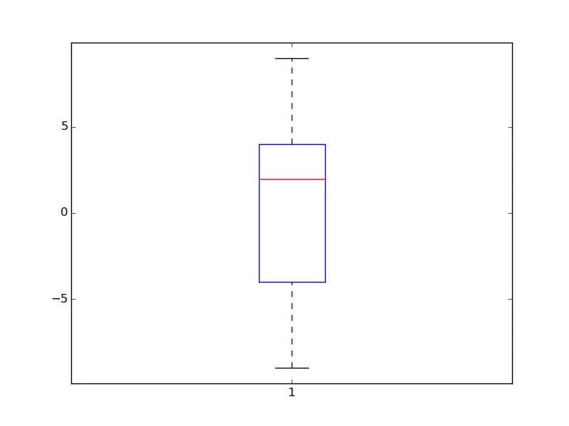
例如,观察一个小样本数据的boxplot,数据为[-9, -4, 2, 4, 9]
>>> b = ax.boxplot([[-9, -4, 2, 4, 9],])
>>> b
{'boxes': [<matplotlib.lines.Line2D at 0x7fe1f5b21350>],
'caps': [<matplotlib.lines.Line2D at 0x7fe1f54d4e50>,
<matplotlib.lines.Line2D at 0x7fe1f54d0e50>],
'fliers': [<matplotlib.lines.Line2D at 0x7fe1f5b317d0>],
'means': [],
'medians': [<matplotlib.lines.Line2D at 0x7fe1f63549d0>],
'whiskers': [<matplotlib.lines.Line2D at 0x7fe1f5b22e10>,
             <matplotlib.lines.Line2D at 0x7fe20c54a510>]}

>>> plt.show()
matplotlib.lines.Line2D 对象有两个方法我将在我的函数中广泛使用: set_xdata (或 set_ydata )和 get_xdata (或 get_ydata )。
使用这些方法,我们可以修改基础箱线图的组成线条的位置以符合你的百分位数值(这就是 customized_box_plot 函数所做的)。在修改组成线条的位置之后,您可以使用 figure.canvas.draw() 重新绘制画布。
总结从百分位到各个Line2D对象坐标的映射。
Y坐标:
q4_end)对应于顶部的 cap Line2D 对象。q1_start)对应于底部的 cap Line2D 对象。q3_start)中位数Line2D对象。q1_start和q2_start -下边缘; q4_start和q4_end -上边缘)n形线条,在下部有一个帽子限制。 n 形线条的极端值对应于 q2_start 和 q4_start。X坐标:
从箱线图字典检索百分位数的 INVERSE FUNCTION:
def get_percentiles_from_box_plots(bp):
    percentiles = []
    for i in range(len(bp['boxes'])):
        percentiles.append((bp['caps'][2*i].get_ydata()[0],
                           bp['boxes'][i].get_ydata()[0],
                           bp['medians'][i].get_ydata()[0],
                           bp['boxes'][i].get_ydata()[2],
                           bp['caps'][2*i + 1].get_ydata()[0],
                           (bp['fliers'][i].get_xdata(),
                            bp['fliers'][i].get_ydata())))
    return percentiles
注意: 我没有制作完全定制的箱线图方法的原因是,内置的箱线图提供了许多功能,无法完全再现。
如果我解释了一些过于明显的内容,请原谅我。
def customized_box_plot(percentiles, axes, redraw = True, *args, **kwargs):
    """
    Generates a customized boxplot based on the given percentile values
    """
    n_box = len(percentiles)
    box_plot = axes.boxplot([[-9, -4, 2, 4, 9],]*n_box, *args, **kwargs)
    # Creates len(percentiles) no of box plots

    min_y, max_y = float('inf'), -float('inf')

    for box_no, pdata in enumerate(percentiles):
        if len(pdata) == 6:
            (q1_start, q2_start, q3_start, q4_start, q4_end, fliers_xy) = pdata
        elif len(pdata) == 5:
            (q1_start, q2_start, q3_start, q4_start, q4_end) = pdata
            fliers_xy = None
        else:
            raise ValueError("Percentile arrays for customized_box_plot must have either 5 or 6 values")

        # Lower cap
        box_plot['caps'][2*box_no].set_ydata([q1_start, q1_start])
        # xdata is determined by the width of the box plot

        # Lower whiskers
        box_plot['whiskers'][2*box_no].set_ydata([q1_start, q2_start])

        # Higher cap
        box_plot['caps'][2*box_no + 1].set_ydata([q4_end, q4_end])

        # Higher whiskers
        box_plot['whiskers'][2*box_no + 1].set_ydata([q4_start, q4_end])

        # Box
        path = box_plot['boxes'][box_no].get_path()
        path.vertices[0][1] = q2_start
        path.vertices[1][1] = q2_start
        path.vertices[2][1] = q4_start
        path.vertices[3][1] = q4_start
        path.vertices[4][1] = q2_start

        # Median
        box_plot['medians'][box_no].set_ydata([q3_start, q3_start])

        # Outliers
        if fliers_xy is not None and len(fliers_xy[0]) != 0:
            # If outliers exist
            box_plot['fliers'][box_no].set(xdata = fliers_xy[0],
                                           ydata = fliers_xy[1])

            min_y = min(q1_start, min_y, fliers_xy[1].min())
            max_y = max(q4_end, max_y, fliers_xy[1].max())

        else:
            min_y = min(q1_start, min_y)
            max_y = max(q4_end, max_y)

        # The y axis is rescaled to fit the new box plot completely with 10%
        # of the maximum value at both ends
        axes.set_ylim([min_y*1.1, max_y*1.1])

    # If redraw is set to true, the canvas is updated.
    if redraw:
        ax.figure.canvas.draw()

    return box_plot
ax.set_xticklabels(x_ticks_labels, rotation='vertical', fontsize=18)。谢谢。 - Rotkivdef boxplot(df, ax=None, box_width=0.2, whisker_size=20, mean_size=10, median_size = 10 , line_width=1.5, xoffset=0,
color=0):
"""Plots a boxplot from existing percentiles.
Parameters
----------
df: pandas DataFrame
ax: pandas AxesSubplot
if to plot on en existing axes
box_width: float
whisker_size: float
size of the bar at the end of each whisker
mean_size: float
size of the mean symbol
color: int or rgb(list)
If int particular color of property cycler is taken. Example of rgb: [1,0,0] (red)
Returns
-------
f, a, boxes, vlines, whisker_tips, mean, median
"""
if type(color) == int:
color = plt.rcParams['axes.prop_cycle'].by_key()['color'][color]
if ax:
a = ax
f = a.get_figure()
else:
f, a = plt.subplots()
boxes = []
vlines = []
xn = []
for row in df.iterrows():
x = row[0] + xoffset
xn.append(x)
# box
y = row[1][25]
height = row[1][75] - row[1][25]
box = plt.Rectangle((x - box_width / 2, y), box_width, height)
a.add_patch(box)
boxes.append(box)
# whiskers
y = (row[1][95] + row[1][5]) / 2
vl = a.vlines(x, row[1][5], row[1][95])
vlines.append(vl)
for b in boxes:
b.set_linewidth(line_width)
b.set_facecolor([1, 1, 1, 1])
b.set_edgecolor(color)
b.set_zorder(2)
for vl in vlines:
vl.set_color(color)
vl.set_linewidth(line_width)
vl.set_zorder(1)
whisker_tips = []
if whisker_size:
g, = a.plot(xn, df[5], ls='')
whisker_tips.append(g)
g, = a.plot(xn, df[95], ls='')
whisker_tips.append(g)
for wt in whisker_tips:
wt.set_markeredgewidth(line_width)
wt.set_color(color)
wt.set_markersize(whisker_size)
wt.set_marker('_')
mean = None
if mean_size:
g, = a.plot(xn, df['mean'], ls='')
g.set_marker('o')
g.set_markersize(mean_size)
g.set_zorder(20)
g.set_markerfacecolor('None')
g.set_markeredgewidth(line_width)
g.set_markeredgecolor(color)
mean = g
median = None
if median_size:
g, = a.plot(xn, df['median'], ls='')
g.set_marker('_')
g.set_markersize(median_size)
g.set_zorder(20)
g.set_markeredgewidth(line_width)
g.set_markeredgecolor(color)
median = g
a.set_ylim(np.nanmin(df), np.nanmax(df))
return f, a, boxes, vlines, whisker_tips, mean, median
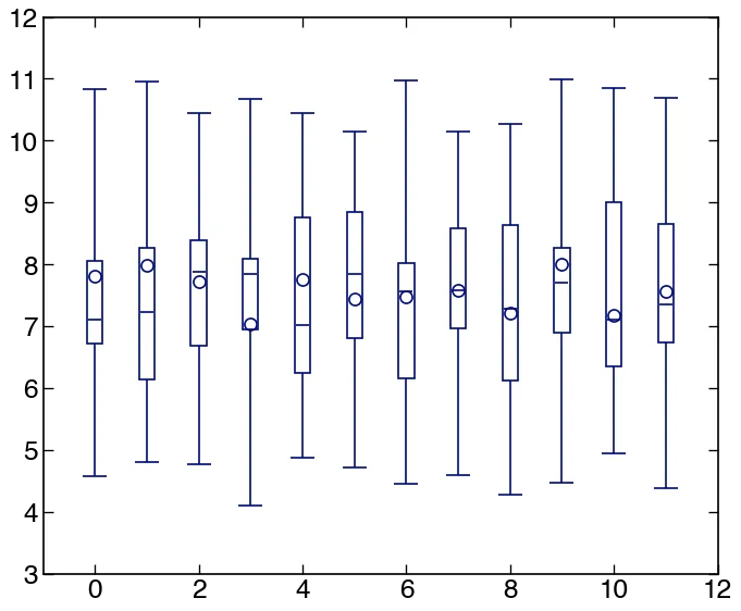
import numpy as np
import pandas as pd
import matplotlib.pylab as plt

nopts = 12
df = pd.DataFrame()
df['mean'] = np.random.random(nopts) + 7
df['median'] = np.random.random(nopts) + 7
df[5] = np.random.random(nopts) + 4
df[25] = np.random.random(nopts) + 6
df[75] = np.random.random(nopts) + 8
df[95] = np.random.random(nopts) + 10
out = boxplot(df)