我有三个数据集以及它们的误差向量。我想在同一张图上绘制它们,其中数据集放在同一个y轴上(左侧),误差放在同一张图上但是使用不同的轴(右侧)。
函数plotyy可以实现在每个轴上绘制一个图,但如何针对多个图进行操作呢?
使用plotyy()可以同时显示多行y值。
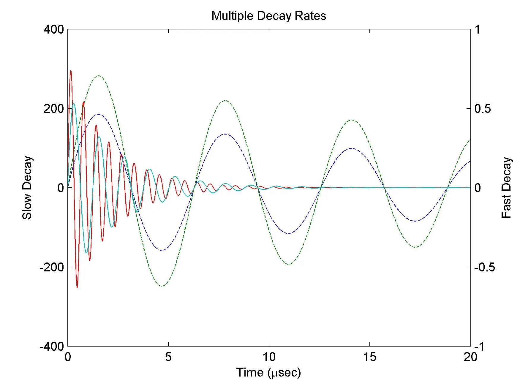
以下是Matlab帮助文档中的示例:
x = 0:0.01:20;
y1 = [200*exp(-0.05*x).*sin(x);
      300*exp(-0.04*x).*sin(x)];
y2 = [0.8*exp(-0.5*x).*sin(10*x);
      0.6*exp(-0.4*x).*sin(5*x)];
[AX,H1,H2] = plotyy(x,y1,x,y2);

set(get(AX(1),'Ylabel'),'String','Slow Decay')
set(get(AX(2),'Ylabel'),'String','Fast Decay')

xlabel('Time (\musec)')
title('Multiple Decay Rates')

set(H1,'LineStyle','--')
set(H2,'LineStyle',':')
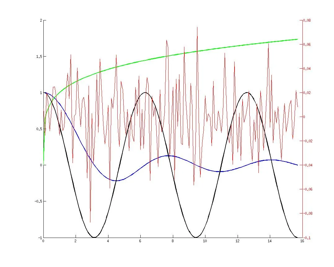
我认为您应该手动创建新的轴:
figure(1); clf, hold on

x1 = 0:0.1:5*pi;
y1 = sin(x1)./x1;

x2 = 0:0.1:5*pi;
y2 = x2.^(0.2);

x3 = 0:0.1:5*pi;
y3 = cos(x3);

plot(x1,y1, 'b', 'linewidth', 2)
plot(x2,y2, 'g', 'linewidth', 2)
plot(x3,y3, 'k', 'linewidth', 2)


ax1 = gca;
ax2 = axes('Position', get(ax1,'Position'),...
           'YAxisLocation','right',...
           'Color' , 'none',...
           'YColor', 'r');
linkaxes([ax1 ax2], 'x')

x4 = x3;
y4 = 0.025*randn(size(y3));

line(x4, y4, 'color', 'r', 'parent', ax2)
输出:
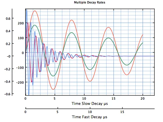
这里是使用@natan建议的Waterloo代码:
x = 0:0.01:20;
y1 = [200*exp(-0.05*x).*sin(x);300*exp(-0.04*x).*sin(x)];
y2 = [0.8*exp(-0.5*x).*sin(10*x);0.6*exp(-0.4*x).*sin(5*x)];
f=GXFigure();
ax=subplot(f,1,1,1);
p1=line(ax, x, y1(1,:), 'LineColor', 'SEAGREEN');
p2=line(p1, [], y1(2,:), 'LineColor', 'TOMATO');
ax.getObject().getView().setXLabel(sprintf('Time Slow Decay %cs', char(181)));
layer1=kcl.waterloo.graphics.GJGraph.createInstance();
ax.getObject().getView().add(layer1);
p3=line(wwrap(layer1), x, y2(1,:), 'LineColor', 'CORNFLOWERBLUE');
p4=line(p3, x, y2(2,:), 'LineColor', 'CRIMSON');
layer1.setXLabel(sprintf('Time Fast Decay %cs', char(181)));
ax.getObject().setTitleText('Multiple Decay Rates');
生成结果如下:
其他示例请参见此处。
这里有个你可以尝试的东西:
% Example data
x = [1 2 3];
yd1 = [1 1 1];
yd2 = [2 2 2];
yd3 = [3 3 3];
ye1 = [0.1 0.2 0.3];
ye2 = [0.2 0.3 0.4];
ye3 = [0.3 0.4 0.5];
% Create two axes
ax1 = axes();
ax2 = axes();
% Plot your data
line(x, yd1, 'Parent', ax1, 'Color', 'b');
line(x, yd2, 'Parent', ax1, 'Color', 'b');
line(x, yd3, 'Parent', ax1, 'Color', 'b');
line(x, ye1, 'Parent', ax2, 'Color', 'r');
line(x, ye2, 'Parent', ax2, 'Color', 'r');
line(x, ye3, 'Parent', ax2, 'Color', 'r');
% Modify axes properties
set(ax1, 'ylim', [-10 4]);
set(ax2, 'Color', 'none', 'YAxisLocation', 'right', 'XTick', []);
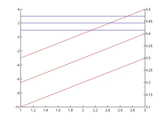
我使用了line而不是plot,因为plot在y轴刻度上给我带来了一些问题。更多信息在这里。
这是绘制两个y轴的最简单方法,它允许您使用与普通绘图相同的标签和边界设置器:ylim、ylabel等。
来自文档。
yyaxis left;
plot(x, y_left);
ylim([0, 100]); % sets the limits for the left y axis
ylabel('left axis');

yyaxis right;
plot(x, y_right);
ylim([0, 100]); % sets the limits for the right y axis
ylabel('right axis');