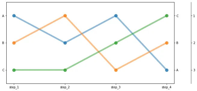
我有一张排名数据的表格,想要将其可视化为凸起图或斜坡图,例如: 
我有一个绘制它的想法,但如果有一件事是我从pandas学到了的,那就是通常有某种组合的melt、merge、pivot和fiddle可以在一行代码中解决。也就是说,优雅的pandas,而不是混乱的pandas。
数据看起来有点像这样:(更多数据请点击这里)
| 版次名称 | 来源 | |
|---|---|---|
| 2562 | 第3版 | gq |
| 2956 | 第8版 | warontherocks |
| 10168 | 第12版 | aeon.co |
| 1137 | 第14版 | hbr.org |
| 4573 | 第13版 | thesmartnik |
| 7143 | 第16版 | vijayboyapati.medium |
| 9674 | 第15版 | medium |
| 5555 | 第9版 | smh.au |
| 8831 | 第11版 | salon |
| 8215 | 第14版 | thegospelcoalition.org |
每一行均表示一篇文章,来源代表该文章的来源。目标是找出每个版本中哪些来源最多地贡献了文章。
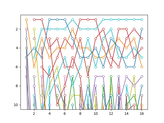
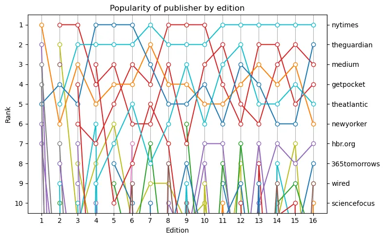
这里是我尝试制作一个不太好的峰值图:
all_sources = set(sources)
source_rankings = {}
for s in all_sources:
    source_rankings[s]={}

for ed in printed.groupby("ed_name"):
    df = ed[1]
    vc = df.source.value_counts()
    for i, x in enumerate(vc.index):
        source_rankings[x][ed[0]] = i+1
ranks = pd.DataFrame(source_rankings)

cols_to_drop = []
for name, values in ranks.iteritems():
    interesting = any([x>30 for x in list(values) if not math.isnan(x)])
    # print(name, interesting)
    if interesting:
        cols_to_drop.append(name)
only_interesting = ranks.drop(labels=cols_to_drop, axis='columns')

only_interesting.sort_index(
    axis=0, inplace=True,
    key=lambda col: [int(x.split("_")[1]) for x in col],
    ascending=False
    )

linestyles = ['-', '--', '-.', ':']

plt.plot(only_interesting, alpha=0.8, linewidth=1)
plt.ylim(25, 0)
plt.gca().invert_xaxis()
plt.xticks(rotation=70)
plt.title("Popularity of publisher by edition")

editions_that_rank_threshold = 10
for name, values in only_interesting.iteritems():
    if len(values[values.isna() == False]) > editions_that_rank_threshold:
        for i, x in values.iteritems():
            if not math.isnan(x):
                # print(name, i, x)
                plt.annotate(xy=(i,x), text=name)
                plt.plot(values, linewidth=5, linestyle=sample(linestyles,1)[0])
                break

plt.xlabel("Edition")
plt.ylabel("Cardinal Rank (1 at the top)")
plt.close()
得到的结果大致如下:
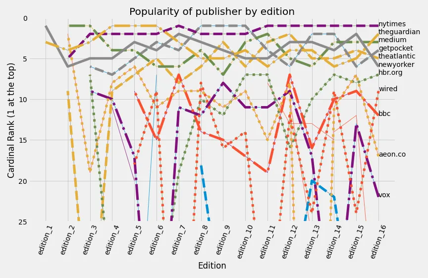
可以说,这个结果远远不能令人满意。虽然使用标准的matplotlib方法可以解决很多问题,但我不愿这样做,因为它感觉不够优雅,而且可能会错过内置的bumpchart方法。
这个问题问了一个类似的问题,但是答案将其解决为斜率图。斜率图看起来很好,但那是另一种类型的图表。
有更优雅的方法吗?