更新:现在这个问题已经容易多了,请参阅http://docs.bokeh.org/en/latest/docs/user_guide/annotations.html#color-bars
很抱歉我没有一个好的答案来简化Bokeh操作,但我之前手动完成过类似的任务。
因为我通常希望将这些图例从我的图中移开,所以我会制作一个新的图形,然后使用像hplot或gridplot这样的工具将它们组装在一起。
这里有一个示例:https://github.com/birdsarah/pycon_2015_bokeh_talk/blob/master/washmap/washmap/water_map.py#L179
对于你的情况,绘图应该非常直接。如果你制作了这样的数据源:
| value | color
| 1     | blue
.....
| 9     | red
那么你可以这样做:
legend = figure(tools=None)
legend.toolbar_location=None
legend.rect(x=0.5, y='value', fill_color='color', width=1, height=1, source=source)
layout = hplot(main, legend)
show(legend)
不过,这要求你知道你的数值对应的颜色。您可以将调色板传递给热图图表调用-如此处所示:http://docs.bokeh.org/en/latest/docs/gallery/cat_heatmap_chart.html,然后您就可以使用它来构建新的数据源。
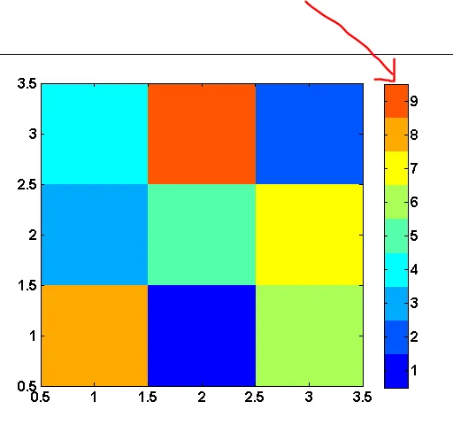
我相当确定至少有一个有关色彩映射的问题。我知道我刚刚为图例外添加了一个问题。
1
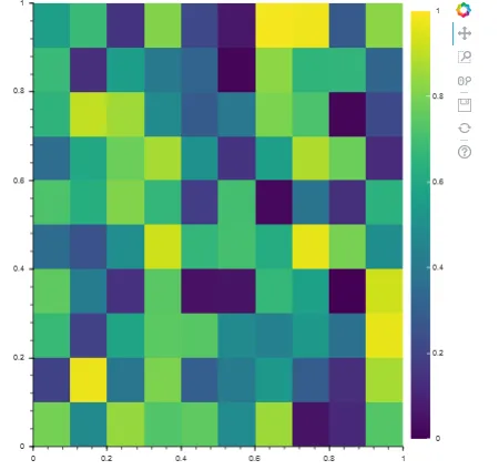
由于其他答案看起来很复杂,这里提供一个易于理解的代码片段,用于在bokeh热力图上生成色条。
import numpy as np
from bokeh.plotting import figure, show
from bokeh.models import LinearColorMapper, BasicTicker, ColorBar


data = np.random.rand(10,10)

color_mapper = LinearColorMapper(palette="Viridis256", low=0, high=1)

plot = figure(x_range=(0,1), y_range=(0,1))
plot.image(image=[data], color_mapper=color_mapper,
           dh=[1.0], dw=[1.0], x=[0], y=[0])

color_bar = ColorBar(color_mapper=color_mapper, ticker= BasicTicker(),
                     location=(0,0))

plot.add_layout(color_bar, 'right')

show(plot)
这份文档对我非常有用:
http://docs.bokeh.org/en/dev/docs/user_guide/annotations.html#color-bars
试一下:
以下是基于birdsarah的响应松散的代码,用于生成色条:
def generate_colorbar(palette, low=0, high=15, plot_height = 100, plot_width = 500, orientation = 'h'):

    y = np.linspace(low,high,len(palette))
    dy = y[1]-y[0]
    if orientation.lower()=='v':
        fig = bp.figure(tools="", x_range = [0, 1], y_range = [low, high], plot_width = plot_width, plot_height=plot_height)
        fig.toolbar_location=None
        fig.xaxis.visible = None
        fig.rect(x=0.5, y=y, color=palette, width=1, height = dy)
    elif orientation.lower()=='h':
        fig = bp.figure(tools="", y_range = [0, 1], x_range = [low, high],plot_width = plot_width, plot_height=plot_height)
        fig.toolbar_location=None
        fig.yaxis.visible = None
        fig.rect(x=y, y=0.5, color=palette, width=dy, height = 1)
    return fig
此外,如果您有兴趣模拟matplot lib颜色映射,请尝试使用以下内容:
import matplotlib as mpl
def return_bokeh_colormap(name):
    cm = mpl.cm.get_cmap(name)
    colormap = [rgb_to_hex(tuple((np.array(cm(x))*255).astype(np.int))) for x in range(0,cm.N)]
    return colormap
def rgb_to_hex(rgb):
    return '#%02x%02x%02x' % rgb[0:3]
2
palette = getattr(bk.palettes, palette) if hasattr(bk.palettes, palette) else return_bokeh_colormap(palette)。 - user2561747这也是我心愿清单上的重点。如果绘制的数据发生变化(例如,通过三维数据集的一个维度移动),它还需要自动调整范围。下面的代码可以做一些人们可能会发现有用的事情。诀窍是向色条添加一个额外的轴,您可以通过数据源在数据更改时进行控制。
import numpy

from bokeh.plotting import Figure

from bokeh.models import ColumnDataSource, Plot, LinearAxis
from bokeh.models.mappers import LinearColorMapper
from bokeh.models.ranges import Range1d
from bokeh.models.widgets import Slider
from bokeh.models.widgets.layouts import VBox

from bokeh.core.properties import Instance

from bokeh.palettes import RdYlBu11

from bokeh.io import curdoc

class Colourbar(VBox):

    plot = Instance(Plot)
    cbar = Instance(Plot)

    power = Instance(Slider)

    datasrc = Instance(ColumnDataSource)
    cbarrange = Instance(ColumnDataSource)

    cmap = Instance(LinearColorMapper)

    def __init__(self):

        self.__view_model__ = "VBox"
        self.__subtype__ = "MyApp"

        super(Colourbar,self).__init__()

        numslices = 6
        x = numpy.linspace(1,2,11)
        y = numpy.linspace(2,4,21)
        Z = numpy.ndarray([numslices,y.size,x.size])
        for i in range(numslices):
            for j in range(y.size):
                for k in range(x.size):
                    Z[i,j,k] = (y[j]*x[k])**(i+1) + y[j]*x[k]

        self.power = Slider(title = 'Power',name = 'Power',start = 1,end = numslices,step = 1,
                            value = round(numslices/2))
        self.power.on_change('value',self.inputchange)

        z = Z[self.power.value]
        self.datasrc = ColumnDataSource(data={'x':x,'y':y,'z':[z],'Z':Z})

        self.cmap = LinearColorMapper(palette = RdYlBu11)

        r = Range1d(start = z.min(),end = z.max())
        self.cbarrange = ColumnDataSource(data = {'range':[r]})

        self.plot = Figure(title="Colourmap plot",x_axis_label = 'x',y_axis_label = 'y',
                           x_range = [x[0],x[-1]],y_range=[y[0],y[-1]],
                           plot_height = 500,plot_width = 500)

        dx = x[1] - x[0]
        dy = y[1] - y[0]

        self.plot.image('z',source = self.datasrc,x = x[0]-dx/2, y = y[0]-dy/2,
                        dw = [x[-1]-x[0]+dx],dh = [y[-1]-y[0]+dy],
                        color_mapper = self.cmap)

        self.generate_colorbar()

        self.children.append(self.power)
        self.children.append(self.plot)
        self.children.append(self.cbar)

    def generate_colorbar(self,cbarlength = 500,cbarwidth = 50):

        pal = RdYlBu11

        minVal = self.datasrc.data['z'][0].min()
        maxVal = self.datasrc.data['z'][0].max()
        vals = numpy.linspace(minVal,maxVal,len(pal))

        self.cbar = Figure(tools = "",x_range = [minVal,maxVal],y_range = [0,1],
                           plot_width = cbarlength,plot_height = cbarwidth)

        self.cbar.toolbar_location = None
        self.cbar.min_border_left = 10
        self.cbar.min_border_right = 10
        self.cbar.min_border_top = 0
        self.cbar.min_border_bottom = 0
        self.cbar.xaxis.visible = None
        self.cbar.yaxis.visible = None
        self.cbar.extra_x_ranges = {'xrange':self.cbarrange.data['range'][0]}
        self.cbar.add_layout(LinearAxis(x_range_name = 'xrange'),'below')

        for r in self.cbar.renderers:
            if type(r).__name__ == 'Grid':
                r.grid_line_color = None

        self.cbar.rect(x = vals,y = 0.5,color = pal,width = vals[1]-vals[0],height = 1)

    def updatez(self):

        data = self.datasrc.data
        newdata = data
        z = data['z']
        z[0] = data['Z'][self.power.value - 1]
        newdata['z'] = z
        self.datasrc.trigger('data',data,newdata)

    def updatecbar(self):

        minVal = self.datasrc.data['z'][0].min()
        maxVal = self.datasrc.data['z'][0].max()
        self.cbarrange.data['range'][0].start = minVal
        self.cbarrange.data['range'][0].end = maxVal

    def inputchange(self,attrname,old,new):

        self.updatez()
        self.updatecbar()

curdoc().add_root(Colourbar())
原文链接