我正在处理一个目前看起来是这样的情节:
我想要的是这样的东西:
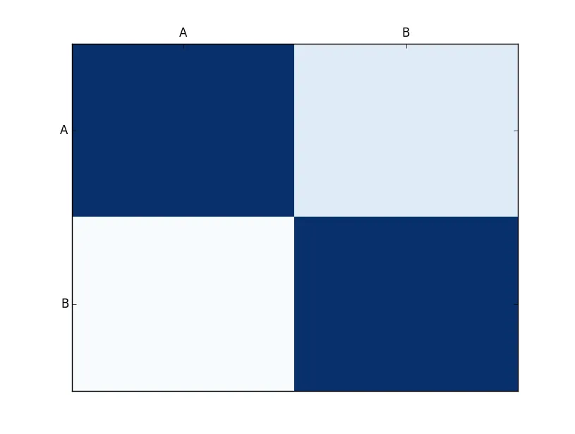
import matplotlib.pyplot as plt
import numpy as np
column_labels = ['A','B']
row_labels = ['A','B']
data = np.random.rand(2,2)
print(type(data))
data = np.array([[1, 0.232], [0.119, 1]])
fig, ax = plt.subplots()
heatmap = ax.pcolor(data, cmap=plt.cm.Blues)

# put the major ticks at the middle of each cell
ax.set_xticks(np.arange(data.shape[0])+0.5, minor=False)
ax.set_yticks(np.arange(data.shape[1])+0.5, minor=False)

# want a more natural, table-like display
ax.invert_yaxis()
ax.xaxis.tick_top()

ax.set_xticklabels(row_labels, minor=False)
ax.set_yticklabels(column_labels, minor=False)
plt.show()
我想要的是这样的东西:
我在哪里可以看到彩色条以及它们上的数值。我需要在我的代码中添加什么来实现这个功能?
谢谢
fig.colorbar(heatmap)吗? - wflynny