能否只使用Matplotlib绘制一张表格?如果取消注释该行代码:
plt.bar(index, data[row], bar_width, bottom=y_offset, color=colors[row])
能否只使用Matplotlib绘制一张表格?如果取消注释该行代码:
plt.bar(index, data[row], bar_width, bottom=y_offset, color=colors[row])
这是将 pandas 数据帧直接写入 matplotlib 表格的另一种选项:
import numpy as np
import pandas as pd
import matplotlib.pyplot as plt
fig, ax = plt.subplots()
# hide axes
fig.patch.set_visible(False)
ax.axis('off')
ax.axis('tight')
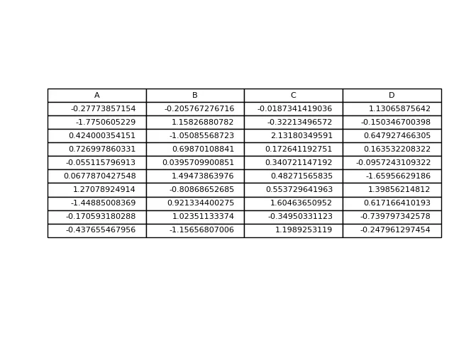
df = pd.DataFrame(np.random.randn(10, 4), columns=list('ABCD'))
ax.table(cellText=df.values, colLabels=df.columns, loc='center')
fig.tight_layout()
plt.show()
如果你只是想改变这个示例并将表格放在顶部,那么在表格声明中使用loc='top'即可。
the_table = ax.table(cellText=cell_text,
                      rowLabels=rows,
                      rowColours=colors,
                      colLabels=columns,
                      loc='top')
然后用以下方式调整情节,
plt.subplots_adjust(left=0.2, top=0.8)
一种更加灵活的选项是使用子图将表格放在自己的轴上,
import numpy as np
import matplotlib.pyplot as plt
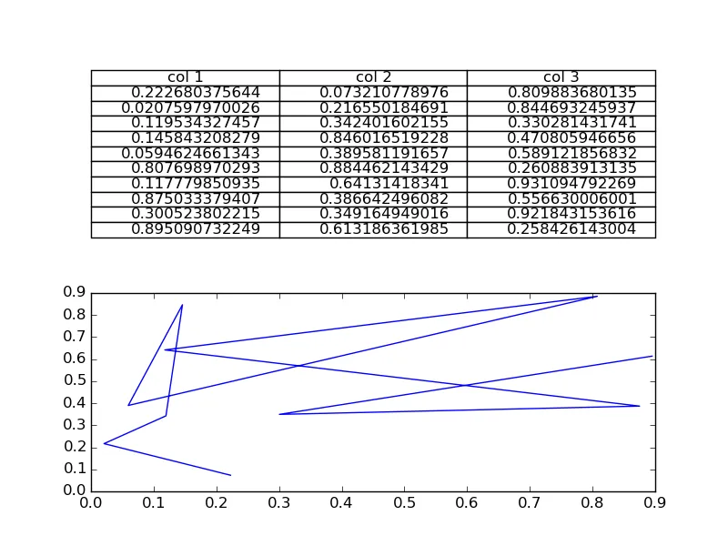
fig, axs =plt.subplots(2,1)
clust_data = np.random.random((10,3))
collabel=("col 1", "col 2", "col 3")
axs[0].axis('tight')
axs[0].axis('off')
the_table = axs[0].table(cellText=clust_data,colLabels=collabel,loc='center')
axs[1].plot(clust_data[:,0],clust_data[:,1])
plt.show()
它看起来像这样:
然后,您可以根据需要自由调整轴的位置。
fig,axs = plt.subplots(3,1)。 - Ed Smithfontsize=fs作为额外的参数,尝试不同的fs值可能会起作用(请参见https://matplotlib.org/3.1.1/api/_as_gen/matplotlib.pyplot.table.html)。如果你无法解决这个问题,最好提出一个新的问题。 - Ed Smith不确定是否已经有答案了,但是如果你只想在一个图形窗口中显示表格,那么你可以隐藏坐标轴:
fig, ax = plt.subplots()

# Hide axes
ax.xaxis.set_visible(False)
ax.yaxis.set_visible(False)

# Table from Ed Smith answer
clust_data = np.random.random((10,3))
collabel=("col 1", "col 2", "col 3")
ax.table(cellText=clust_data,colLabels=collabel,loc='center')
#axs[1].plot(clust_data[:,0],clust_data[:,1]) # Remove this if you don't need it
axs[1].axis("off")  # This will leave the table alone in the window
cellColours选项(https://matplotlib.org/3.1.1/api/_as_gen/matplotlib.pyplot.table.html)。如果不清楚如何交替进行操作,建议提出一个新问题。 - Ed Smith