不久之前,我编写了几个函数来显示普通线性模型的结果,并将颜色编码数据点,可以在3D(使用rgl进行交互)或2D(使用等高线图)中呈现:
plotImage=function(model=NULL,plotx=NULL,ploty=NULL,plotPoints=T,plotContours=T,plotLegend=F,npp=1000,xlab=NULL,ylab=NULL,zlab=NULL,xlim=NULL,ylim=NULL,pch=16,cex=1.2,lwd=0.1,col.palette=NULL) {
n=npp
require(rockchalk)
require(aqfig)
require(colorRamps)
require(colorspace)
require(MASS)
mf=model.frame(model);emf=rockchalk::model.data(model)
if (is.null(xlab)) xlab=plotx
if (is.null(ylab)) ylab=ploty
if (is.null(zlab)) zlab=names(mf)[[1]]
if (is.null(col.palette)) col.palette=rev(rainbow_hcl(1000,c=100))
x=emf[,plotx];y=emf[,ploty];z=mf[,1]
if (is.null(xlim)) xlim=c(min(x)*0.95,max(x)*1.05)
if (is.null(ylim)) ylim=c(min(y)*0.95,max(y)*1.05)
preds=predictOMatic(model,predVals=c(plotx,ploty),n=npp,divider="seq")
zpred=matrix(preds[,"fit"],npp,npp)
zlim=c(min(c(preds$fit,z)),max(c(preds$fit,z)))
par(mai=c(1.2,1.2,0.5,1.2),fin=c(6.5,6))
graphics::image(x=seq(xlim[1],xlim[2],len=npp),y=seq(ylim[1],ylim[2],len=npp),z=zpred,xlab=xlab,ylab=ylab,col=col.palette,useRaster=T,xaxs="i",yaxs="i")
if (plotContours) graphics::contour(x=seq(xlim[1],xlim[2],len=npp),y=seq(ylim[1],ylim[2],len=npp),z=zpred,xlab=xlab,ylab=ylab,add=T,method="edge")
if (plotPoints) {cols1=col.palette[(z-zlim[1])*999/diff(zlim)+1]
pch1=rep(pch,length(n))
cols2=adjustcolor(cols1,offset=c(-0.3,-0.3,-0.3,1))
pch2=pch-15
points(c(rbind(x,x)),c(rbind(y,y)), cex=cex,col=c(rbind(cols1,cols2)),pch=c(rbind(pch1,pch2)),lwd=lwd) }
box()
if (plotLegend) vertical.image.legend(zlim=zlim,col=col.palette)
}
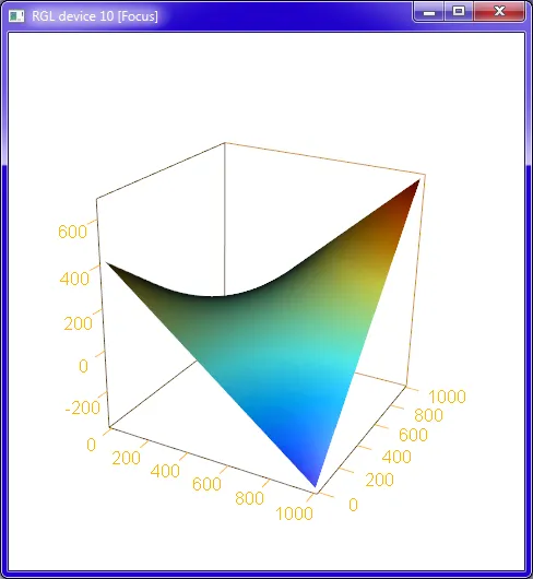
plotPlaneFancy=function(model=NULL,plotx1=NULL,plotx2=NULL,plotPoints=T,plotDroplines=T,npp=50,x1lab=NULL,x2lab=NULL,ylab=NULL,x1lim=NULL,x2lim=NULL,cex=1.5,col.palette=NULL,segcol="black",segalpha=0.5,interval="none",confcol="lightgrey",confalpha=0.4,pointsalpha=1,lit=T,outfile="graph.png",aspect=c(1,1,0.3),zoom=1,userMatrix=matrix(c(0.80,-0.60,0.022,0,0.23,0.34,0.91,0,-0.55,-0.72,0.41,0,0,0,0,1),ncol=4,byrow=T),windowRect=c(0,29,1920,1032)) {
require(rockchalk)
require(rgl)
require(colorRamps)
require(colorspace)
require(MASS)
mf=model.frame(model);emf=rockchalk::model.data(model)
if (is.null(x1lab)) x1lab=plotx1
if (is.null(x2lab)) x2lab=plotx2
if (is.null(ylab)) ylab=names(mf)[[1]]
if (is.null(col.palette)) col.palette=rev(rainbow_hcl(1000,c=100))
x1=emf[,plotx1]
x2=emf[,plotx2]
y=mf[,1]
if (is.null(x1lim)) x1lim=c(min(x1),max(x1))
if (is.null(x2lim)) x2lim=c(min(x2),max(x2))
preds=predictOMatic(model,predVals=c(plotx1,plotx2),n=npp,divider="seq",interval=interval)
ylim=c(min(c(preds$fit,y)),max(c(preds$fit,y)))
open3d(zoom=zoom,userMatrix=userMatrix,windowRect=windowRect)
if (plotPoints) plot3d(x=x1,y=x2,z=y,type="s",col=col.palette[(y-min(y))*999/diff(range(y))+1],size=cex,aspect=aspect,xlab=x1lab,ylab=x2lab,zlab=ylab,lit=lit,alpha=pointsalpha)
if (!plotPoints) plot3d(x=x1,y=x2,z=y,type="n",col=col.palette[(y-min(y))*999/diff(range(y))+1],size=cex,aspect=aspect,xlab=x1lab,ylab=x2lab,zlab=ylab)
if ("lwr" %in% names(preds)) persp3d(x=unique(preds[,plotx1]),y=unique(preds[,plotx2]),z=matrix(preds[,"lwr"],npp,npp),color=confcol, alpha=confalpha, lit=lit, back="lines",add=TRUE)
ypred=matrix(preds[,"fit"],npp,npp)
cols=col.palette[(ypred-min(ypred))*999/diff(range(ypred))+1]
persp3d(x=unique(preds[,plotx1]),y=unique(preds[,plotx2]),z=ypred,color=cols, alpha=0.7, lit=lit, back="lines",add=TRUE)
if ("upr" %in% names(preds)) persp3d(x=unique(preds[,plotx1]),y=unique(preds[,plotx2]),z=matrix(preds[,"upr"],npp,npp),color=confcol, alpha=confalpha, lit=lit, back="lines",add=TRUE)
if (plotDroplines) segments3d(x=rep(x1,each=2),y=rep(x2,each=2),z=matrix(t(cbind(y,fitted(model))),nc=1),col=segcol,lty=2,alpha=segalpha)
if (!is.null(outfile)) rgl.snapshot(outfile, fmt="png", top=TRUE)
}
以下是您的模型输出结果:
这是您的模型输出结果:
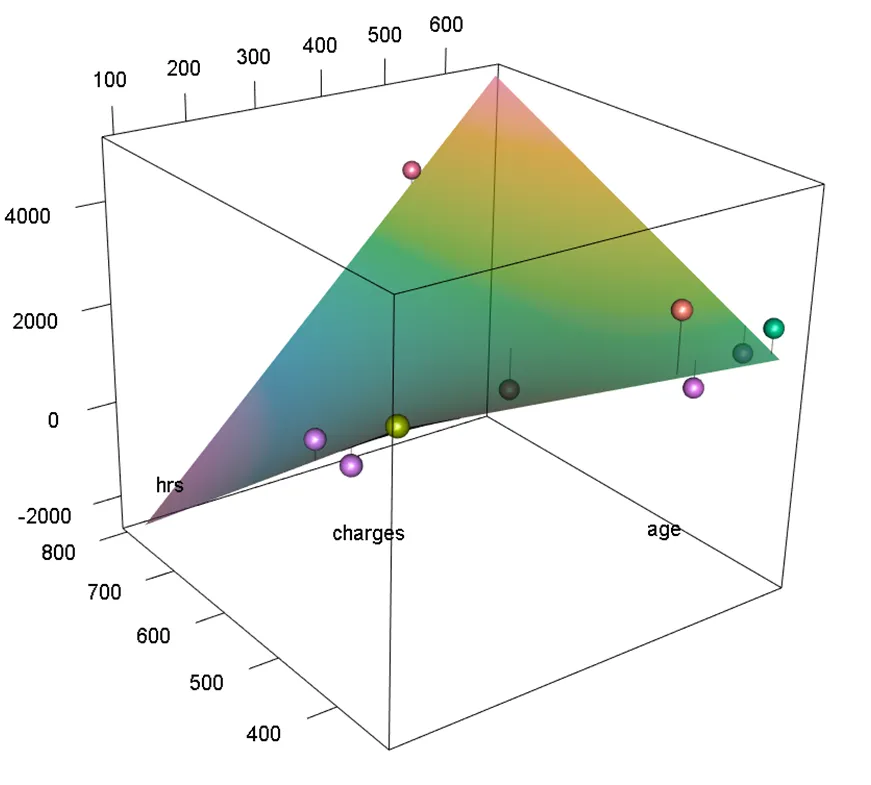
data=data.frame(age=c(530.6071,408.6071,108.0357,106.6071,669.4643,556.4643,665.4643,508.4643,106.0357),
hrs=c(792.10,489.70,463.00,404.15,384.65,358.15,343.85,342.35,335.25),
charges=c(3474.60,1247.06,1697.07,1676.33,1701.13,1630.30,2468.83,3366.44,2876.82))
library(MASS)
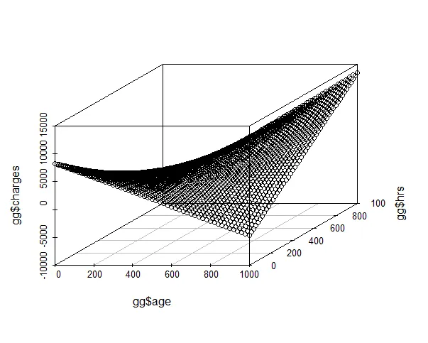
fit1=rlm( charges~age+hrs+age*hrs, data)
plotPlaneFancy(fit1, plotx1 = "age", plotx2 = "hrs")
plotPlaneFancy(fit1, plotx1 = "age", plotx2 = "hrs",interval="confidence")
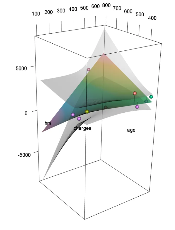
(或者 interval="prediction" 显示 95% 预测区间)
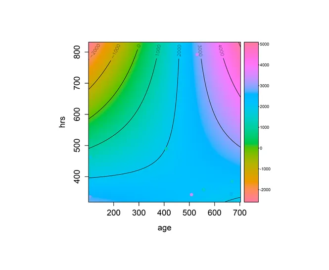
plotImage(fit1,plotx="age",ploty="hrs",plotContours=T,plotLegend=T)

hrs, age_vs_hrs_charges_cleaned的变量。哦,等等...你没有在逗号后使用空格,并且你使用的是等宽字体。不好的习惯!我进行了一些编辑。 - IRTFM