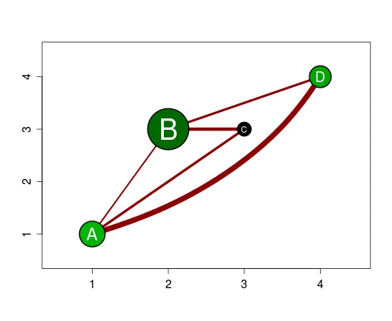
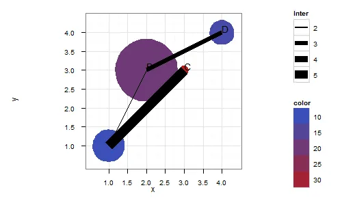
我有以下类型的数据(尽管数据点的数量非常大)
# property data
name <- c("A", "B", "C", "D")
diameter <- c(4.3, 8.3,1.2, 3.3)
X <- c( 1, 2, 3, 4)
Y <- c(1, 3, 3, 4)
colr <- c(10, 20, 34, 12)
propdata <- data.frame (name, diameter, X, Y, colr)


# interaction data
name1 <- c("A", "A", "A", "B", "B")
name2 <- c("B", "C", "D", "C", "D")
score <- c(1.1, 2.2, 5.4, 3.1, 2.0)
relation <- data.frame (name1, name2, score)
我想创建一个类似于以下的图表,使其具有以下属性。
(
1) diameter of circles is governed by propdata$diameter
(2) Position in xy field is governed by cordinates of propdata$X and propdata$y
(3) Fill color of the circle is controlled by propdata$colr
 (4) Interaction is governed by relation data.frame, name1
  and name2 elements will be connected and weight of the line is govenmened
  by relation$score.
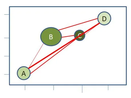
是否可以使用现有的R基础或任何流行的图形软件创建这样的图表,或者需要更专业的软件。
编辑:
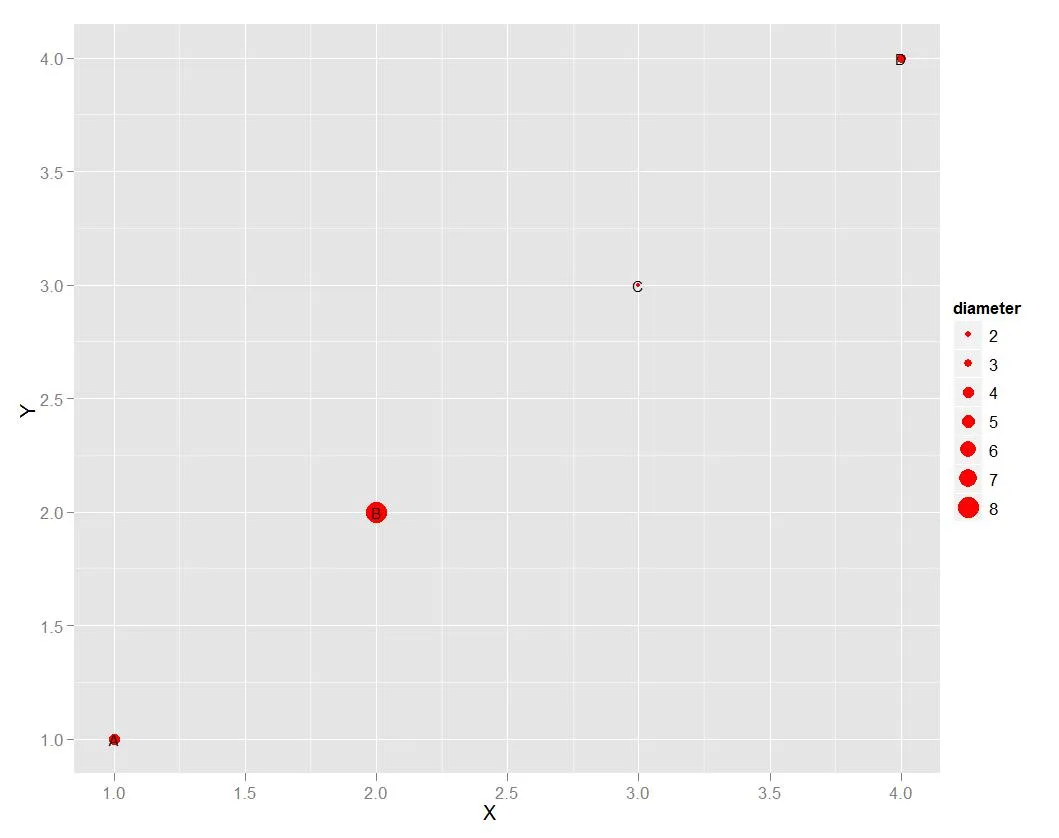
使用气泡图,我只能做到这一步:
 p <- ggplot(propdata, aes(X,Y,size = diameter, label=name))
p <- p + geom_point(colour= "red")+geom_text(size=3) # colour = colr does not work
p